FOR THE WEEKLY
LOVE OF ARCHITECTURE
LOVE OF ARCHITECTURE
… Double Standards deserve extra credit for a redesign that feels clear and contemporary both where the print magazine and the bauwelt.de website are concerned …
Rob Alderson
for It’s Nice That
for It’s Nice That
BAUWELT
Challenge
- Redesigning means restructuring and coming up with an all new visual strategy for this over 104 years old publication. From the printed version to a whole new app to the website ... all in approach from one design strategy.
No pressure on us at all
Insight
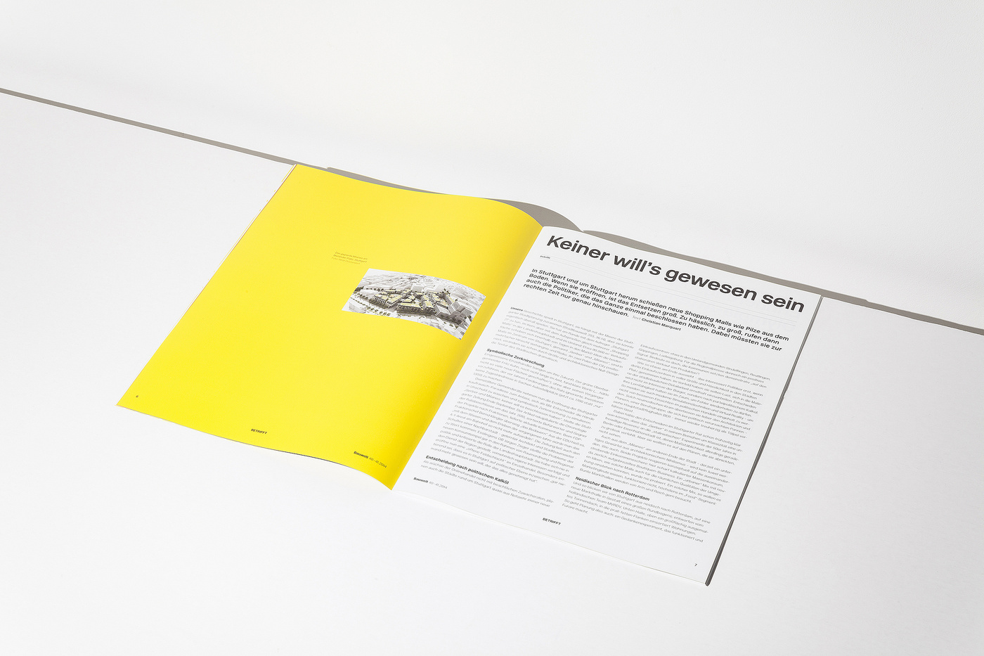
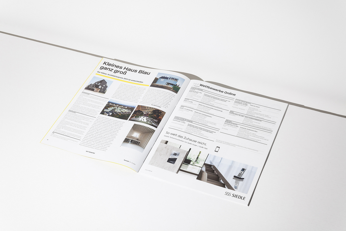
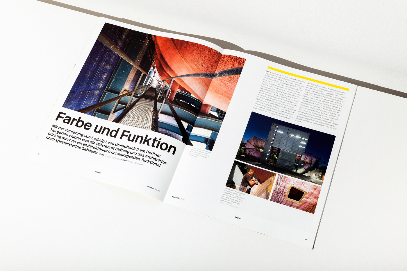
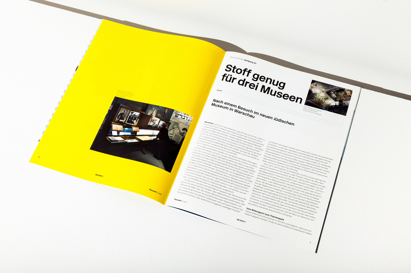
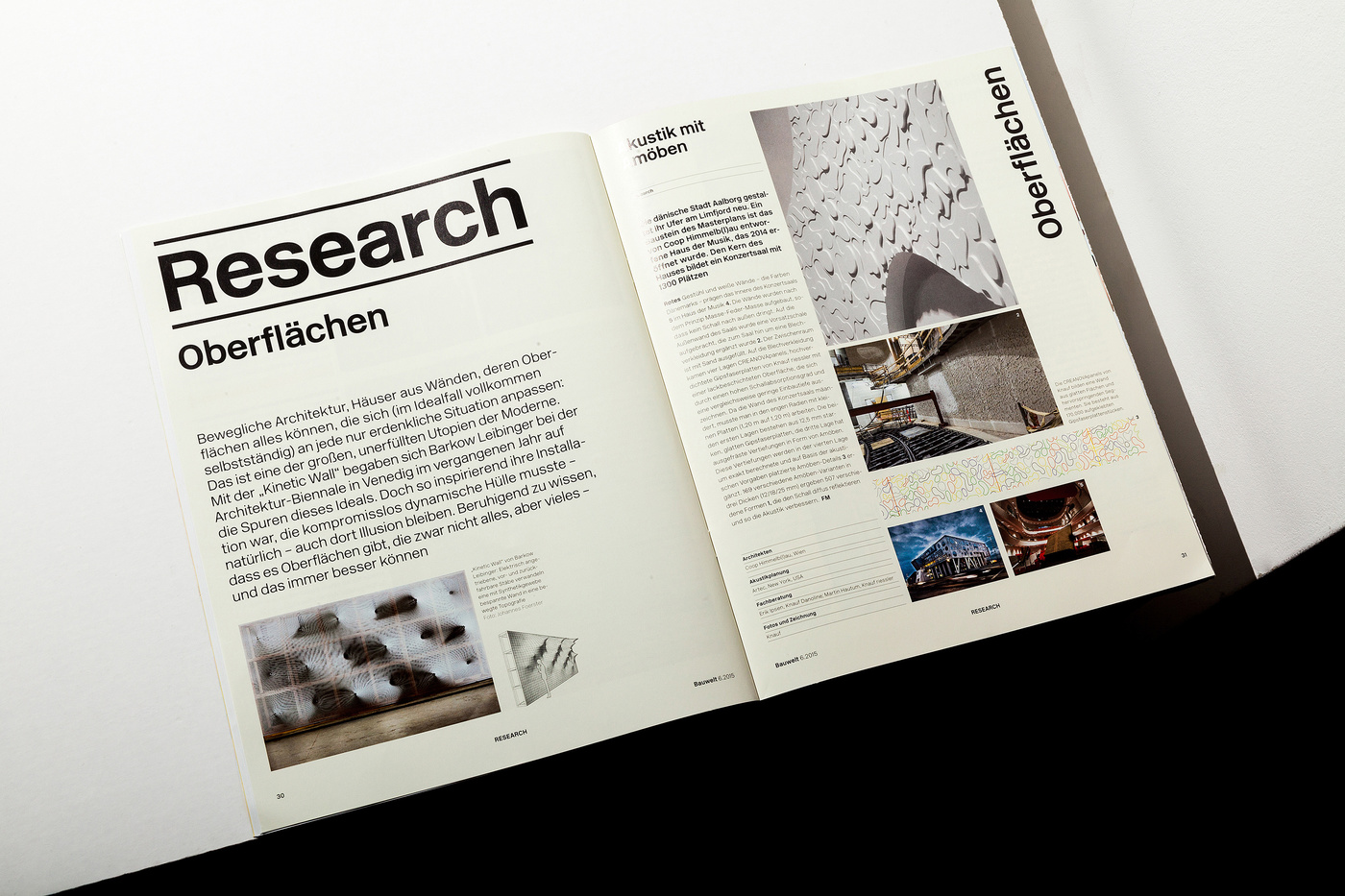
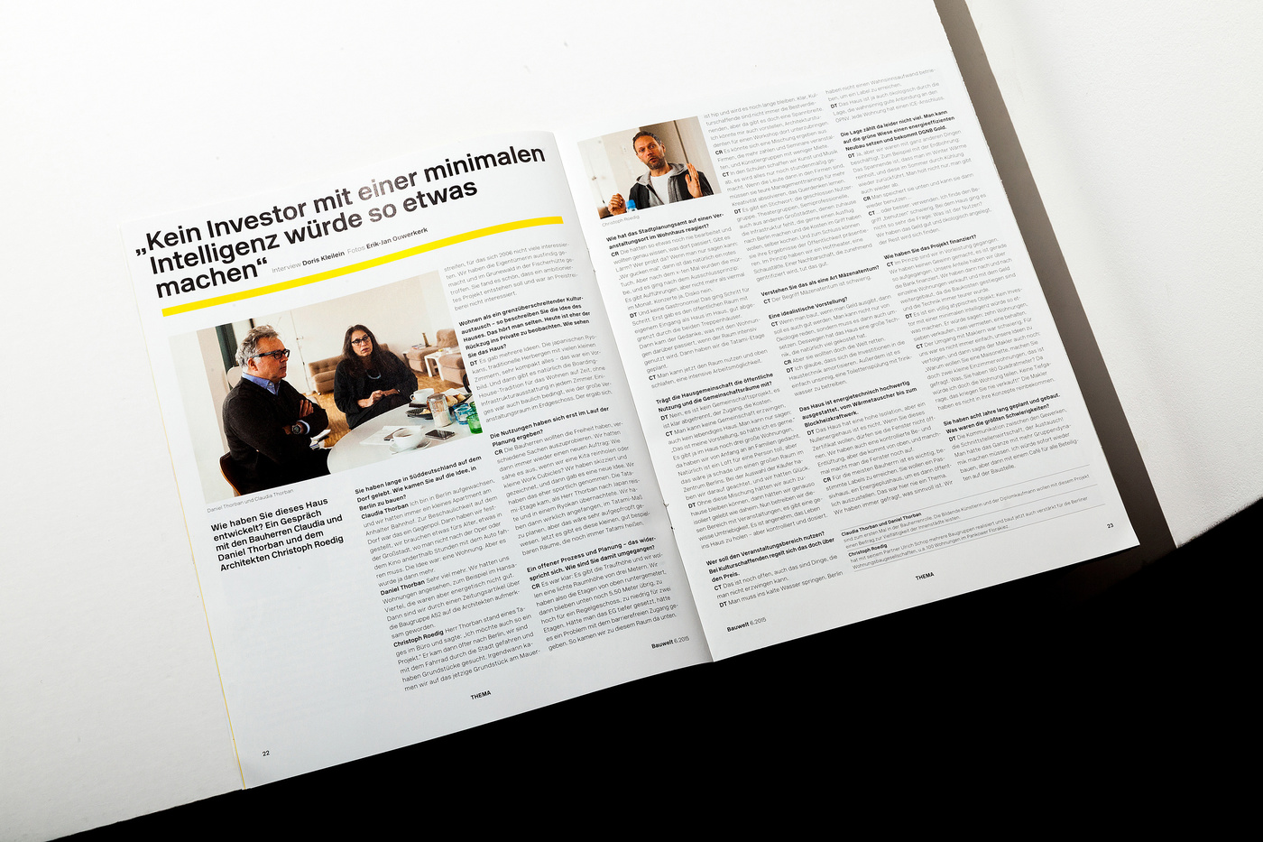
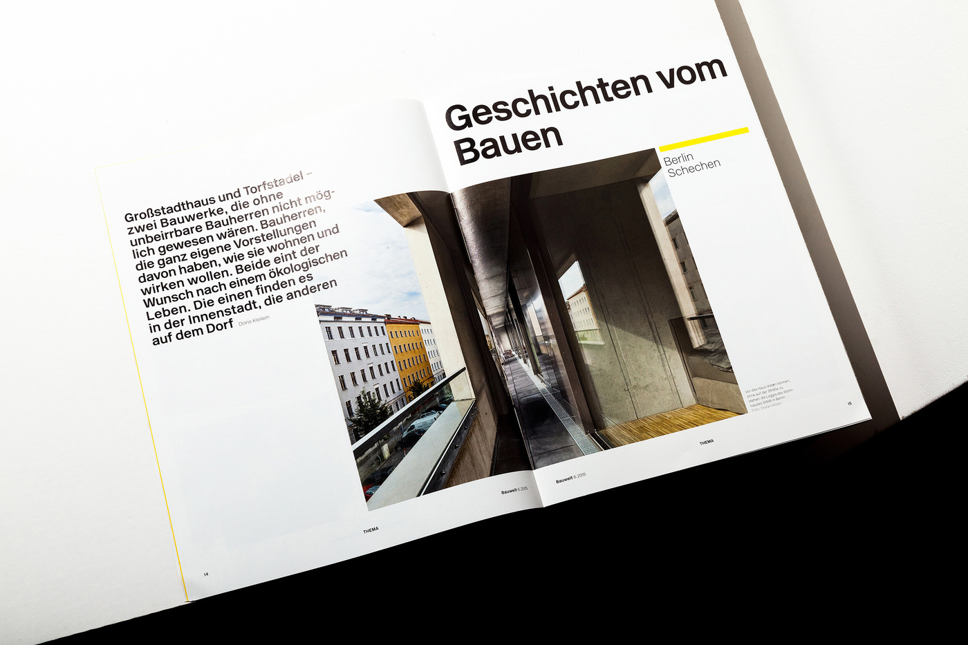
- We reshuffled the whole magazine, from new categories to a new approach how to treat imagery and balancing out compositions on the pages.
Solution
- The unique approach was to build a very strict grid the inhouse designers can’t go wrong with. The NEW RAIL ALPHABET typeface was helping us to signal to the readers that this is all about clarity and a pure soluution. A very simple no knick-knacks visual strategy that helps to find your way through the publication and yet, a rigid and flexible grid to create an atmosphere of very diverse projects. We like strong, solid frameworks that force us to find smart ways to create solutions that surprise even us.
Result
- Raving reviews on ITSNICETHAT to DESKTOP MAGAZINE and a special mention at the German Design Awards, above all, for us, stands that the magazine is now more attractive to a younger audience --- not to bad at the age of 104
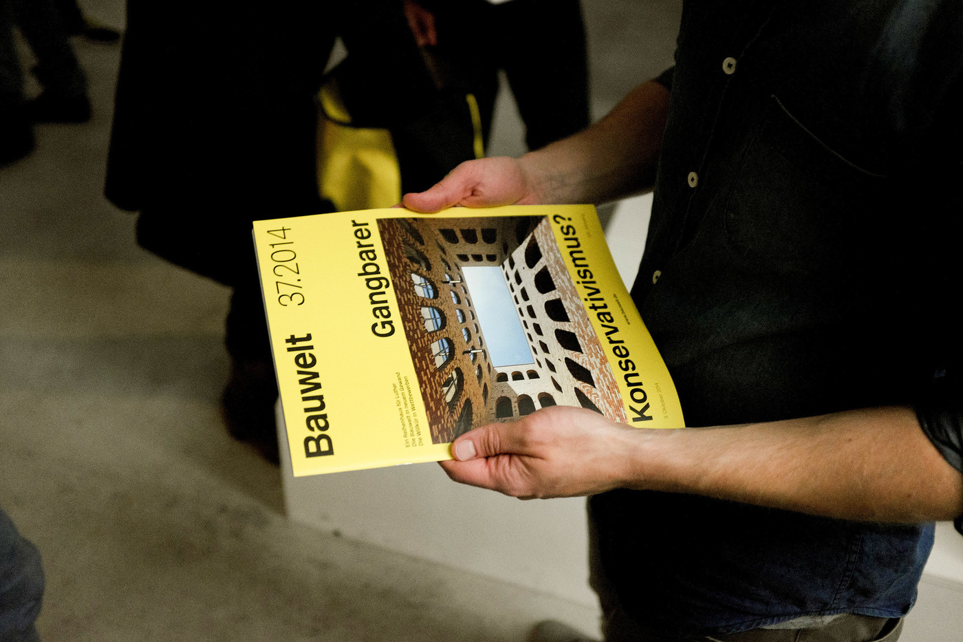
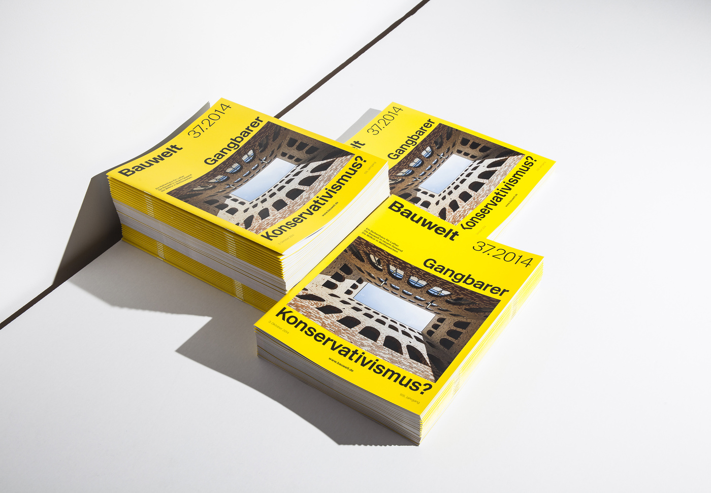
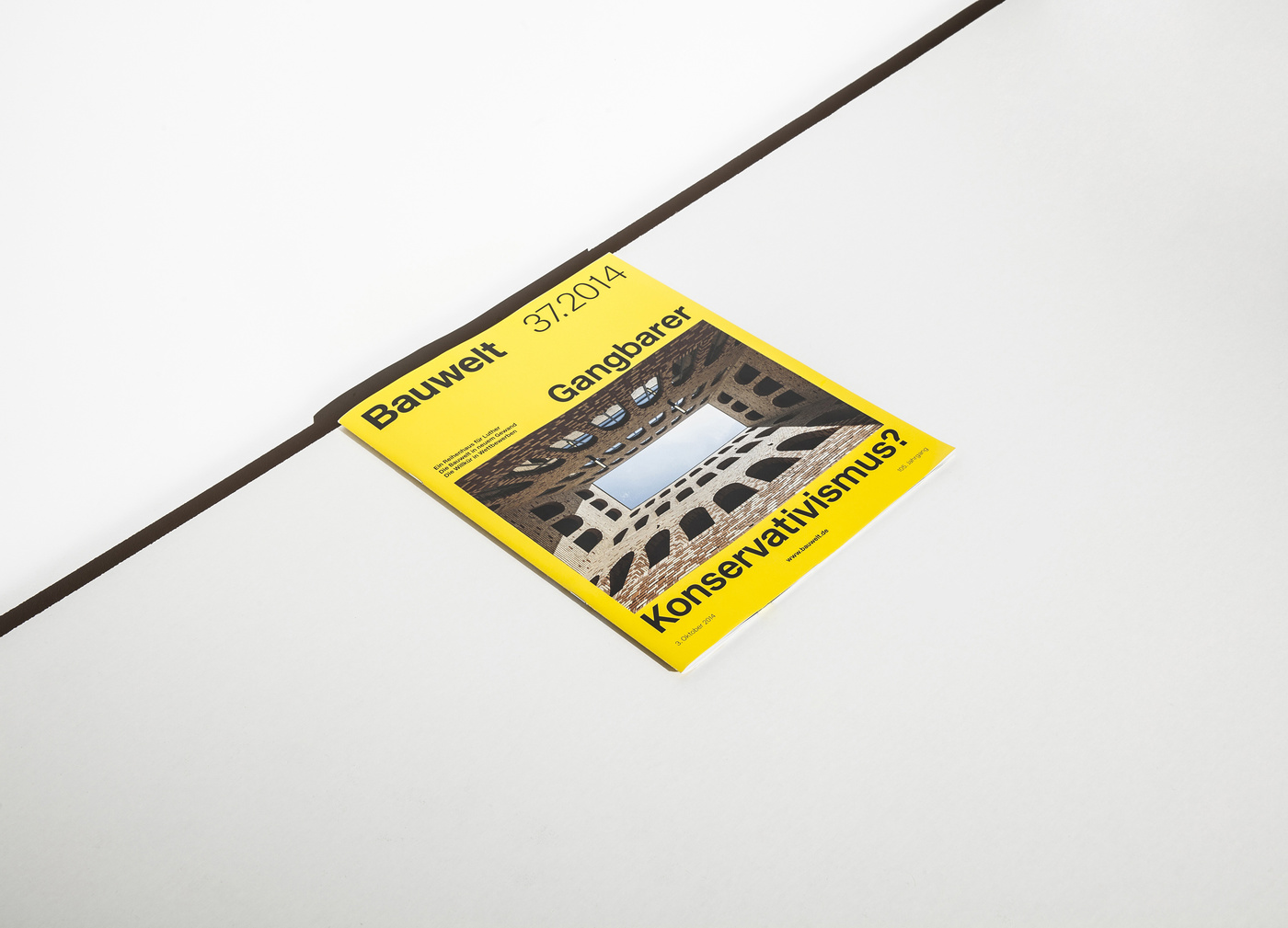
FIRST ISSUE
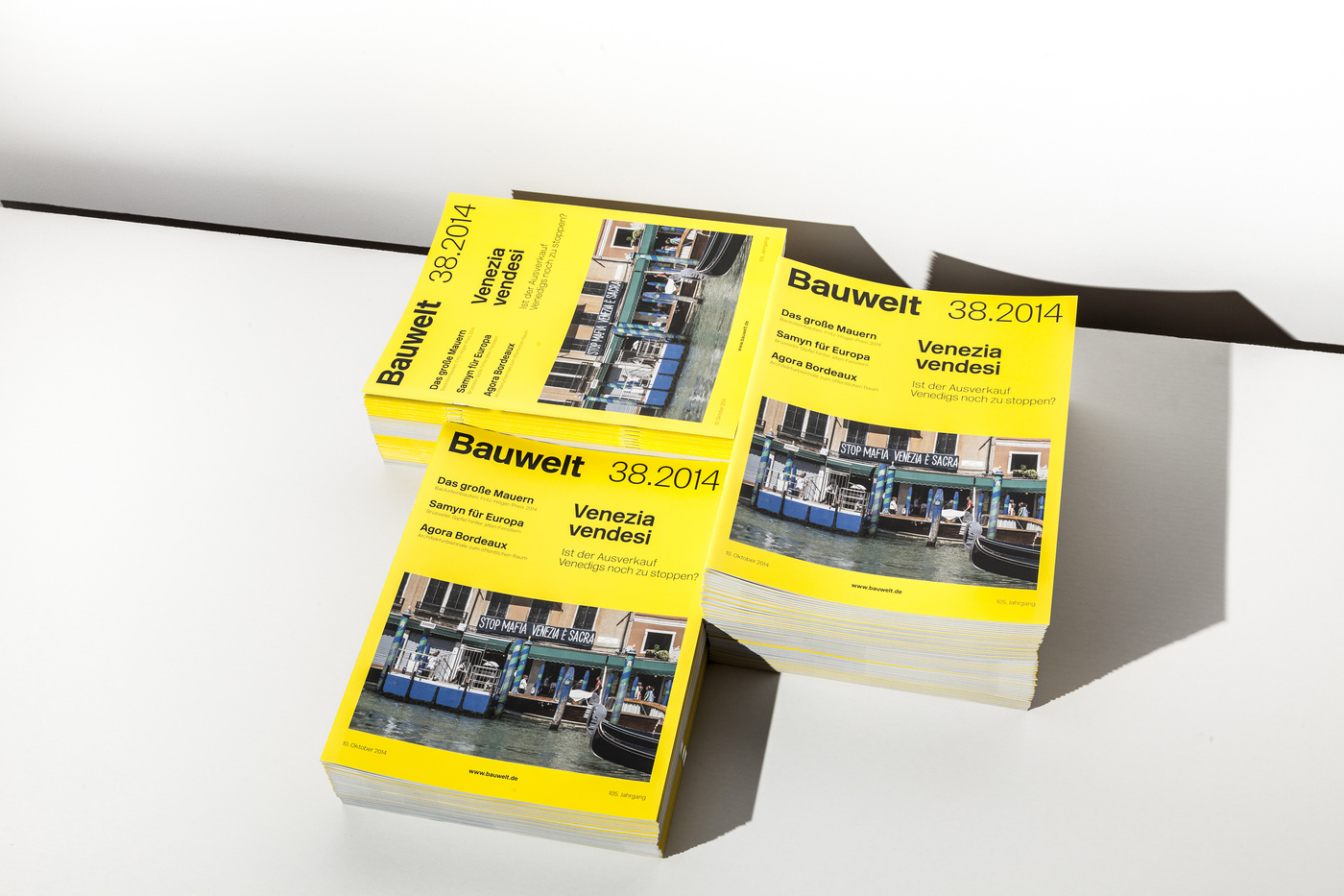
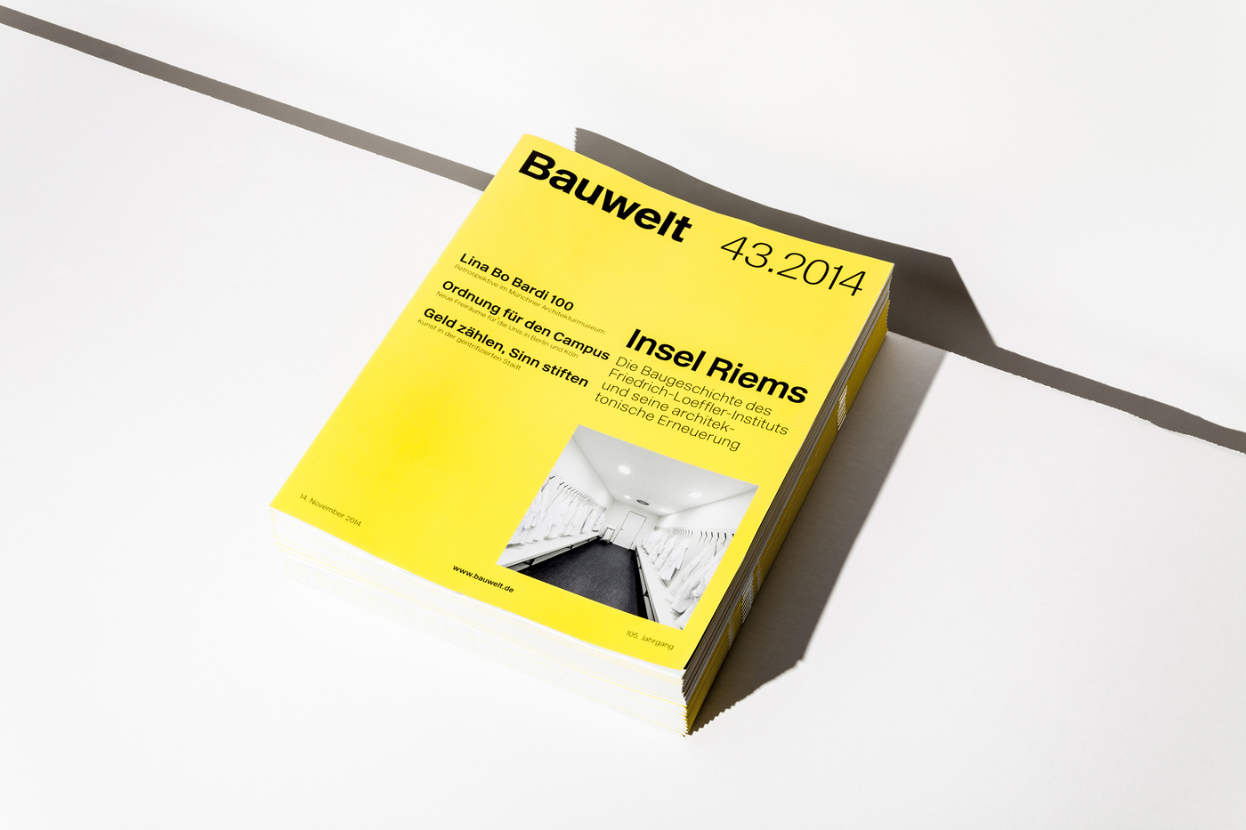
37.2014
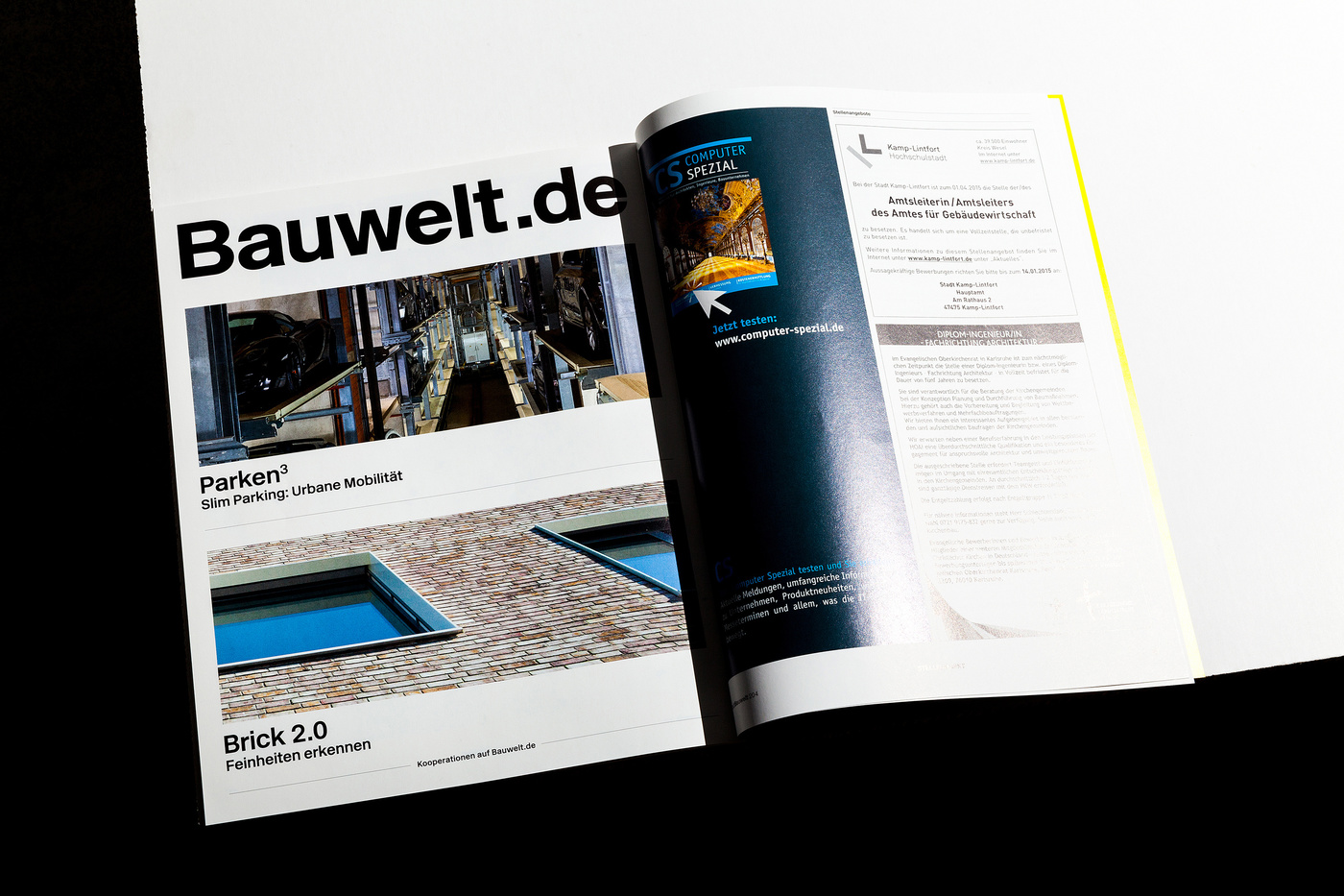
THE NEW LOOK
THE NEW LOOK

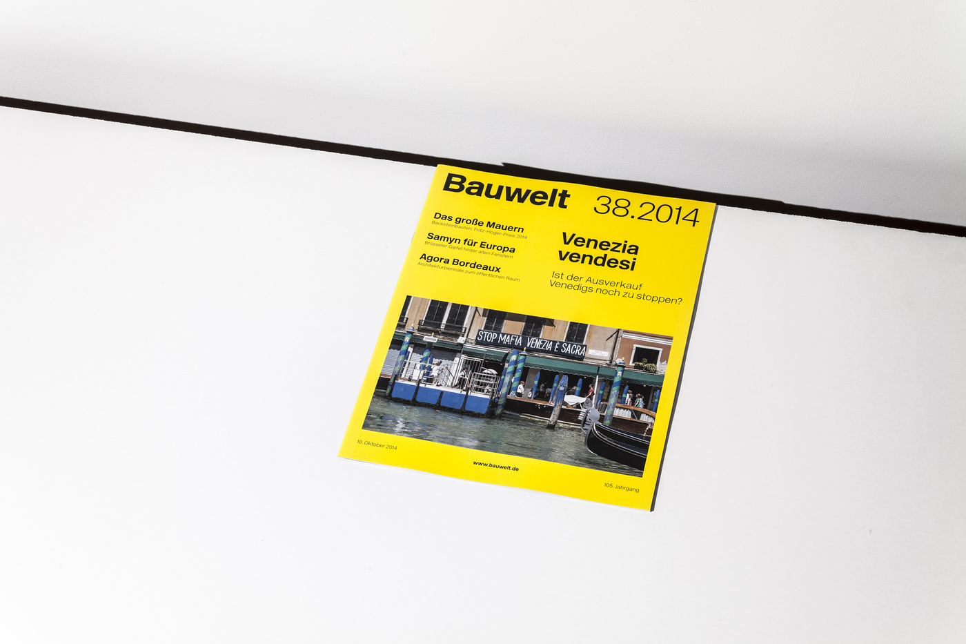
38.2014
WHAT’S ON, IT’S IN
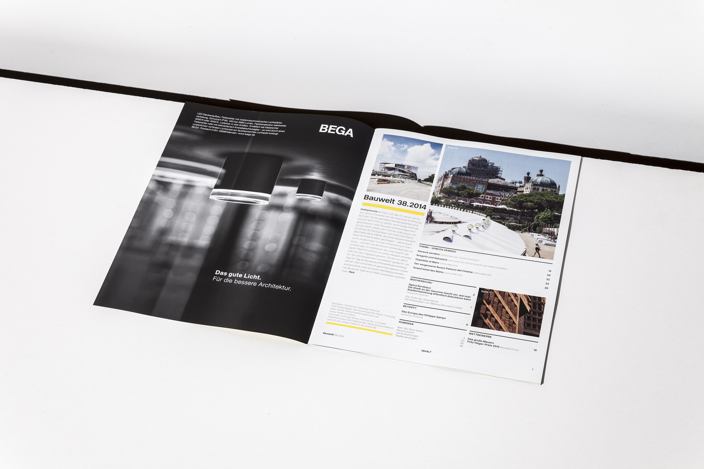
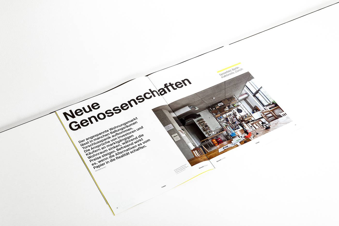
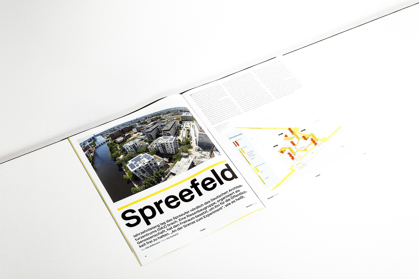
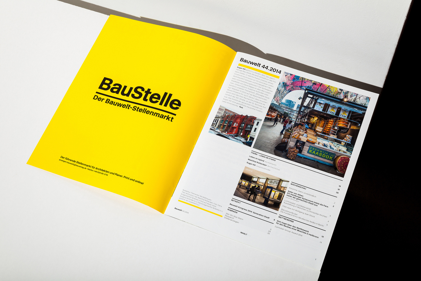
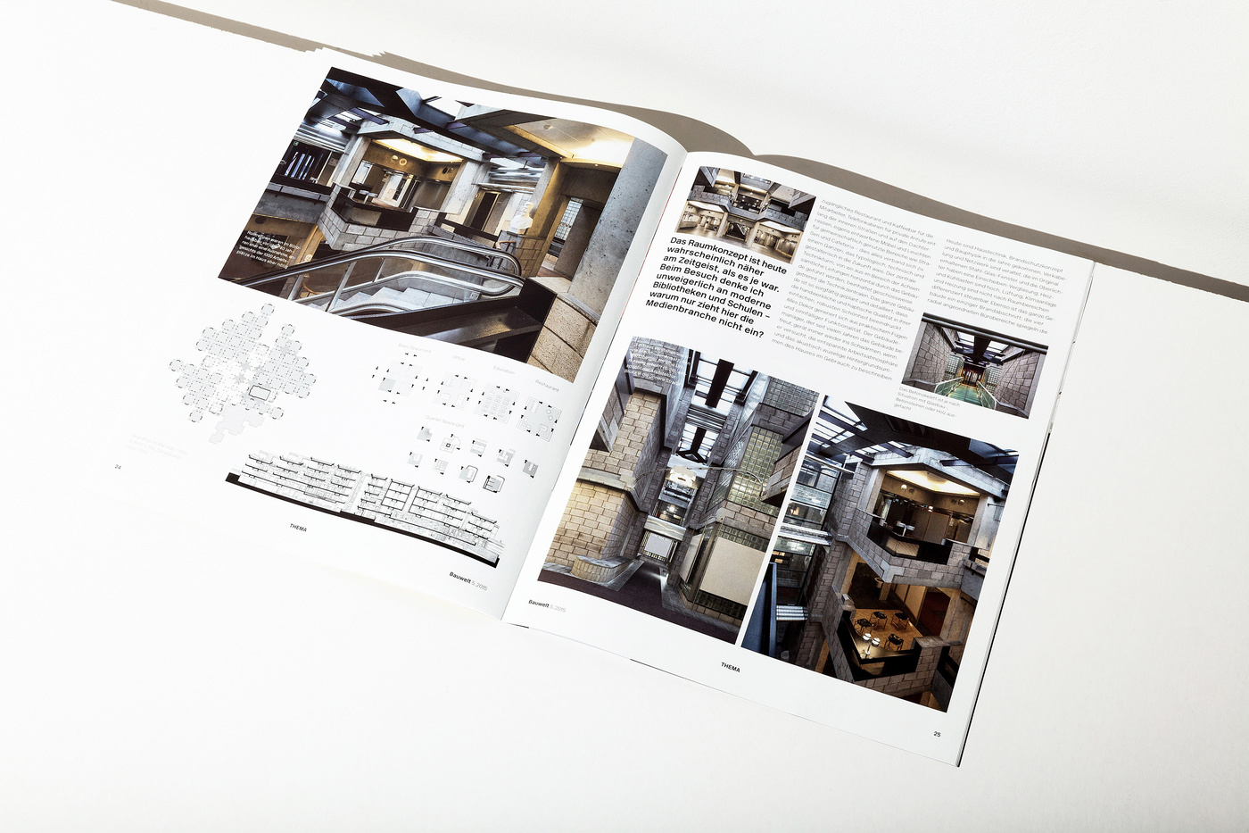
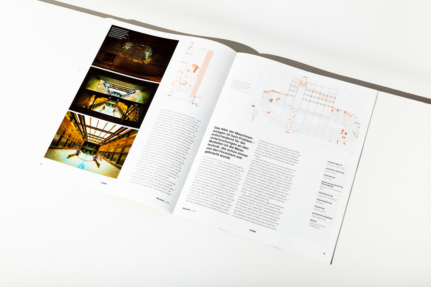
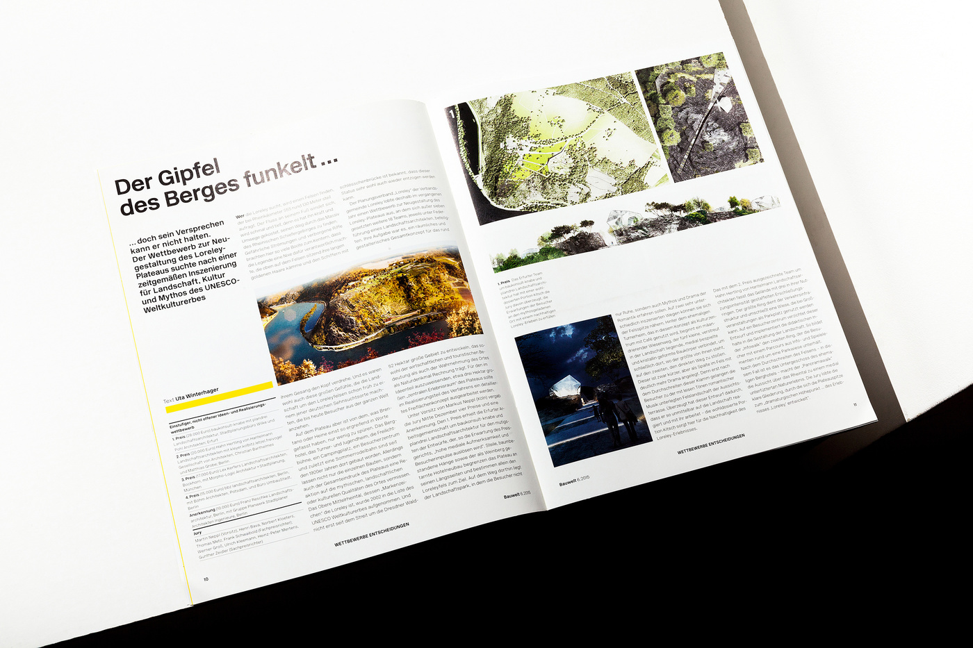
For over 104 years, Bauwelt has been providing weekly reports on current architectural and urban developments in Europe and around the world.
The architecture journal is a forum for analysis and commentary surrounding current issues in architecture. Bauwelt obtains viewpoints, provides material for discussion and forms the opinions of competent readers from building authorities and leading architecture firms that make decisions about a large number of contracts.
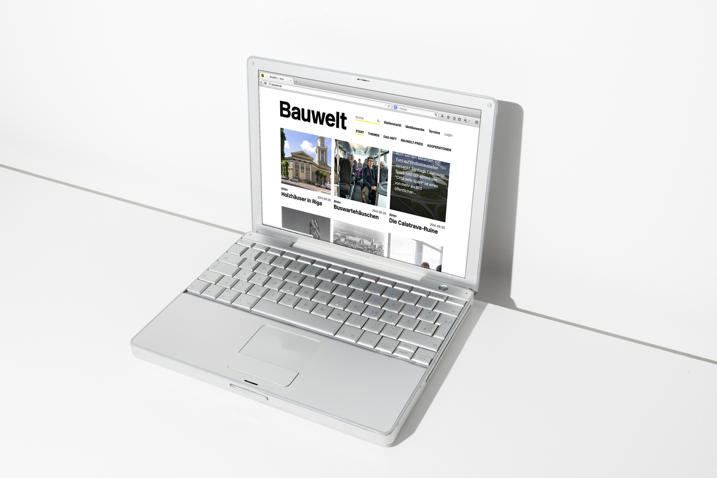
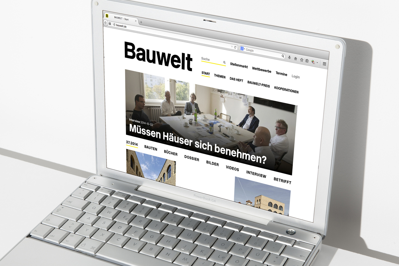
At bauwelt.de, the target group of architects, civil engineers, interior designers, urban planners, and lighting planners receive daily updates and additional online posts, films, photo galleries, dossiers, and debates related to the central topic of a current issue.
The weekly newsletter addresses 20,000 registered recipients and includes additional features, such as a preview of the upcoming issue.
… well … this much said about the importance of the Bauwelt Magazine in the world of architects, NO PRESSURE ON US THEN to redesign the whole range of products, the print magazine, the online version and the app.
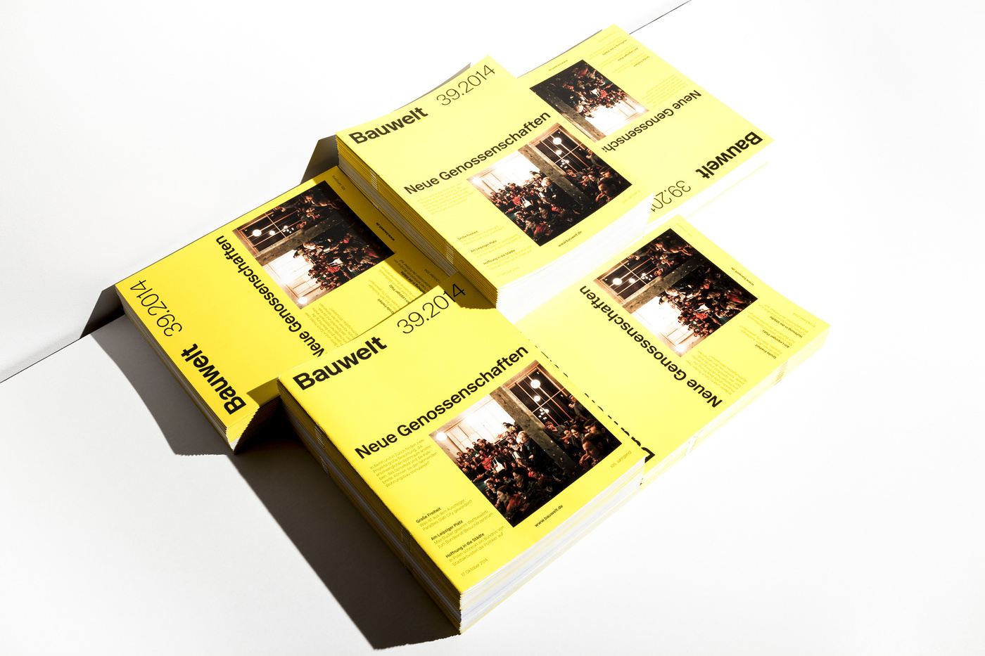
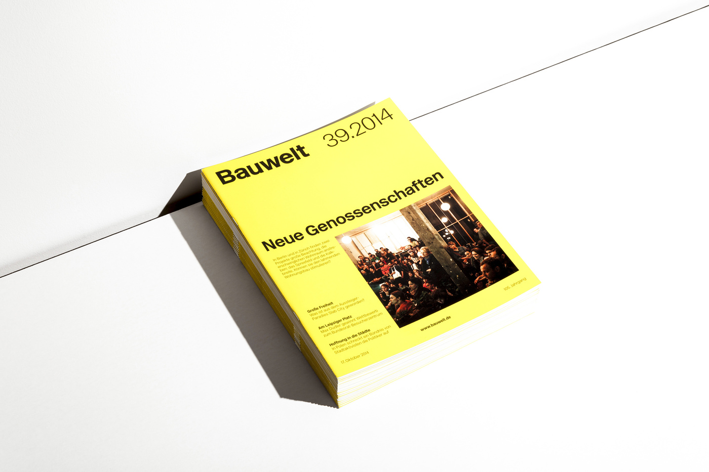
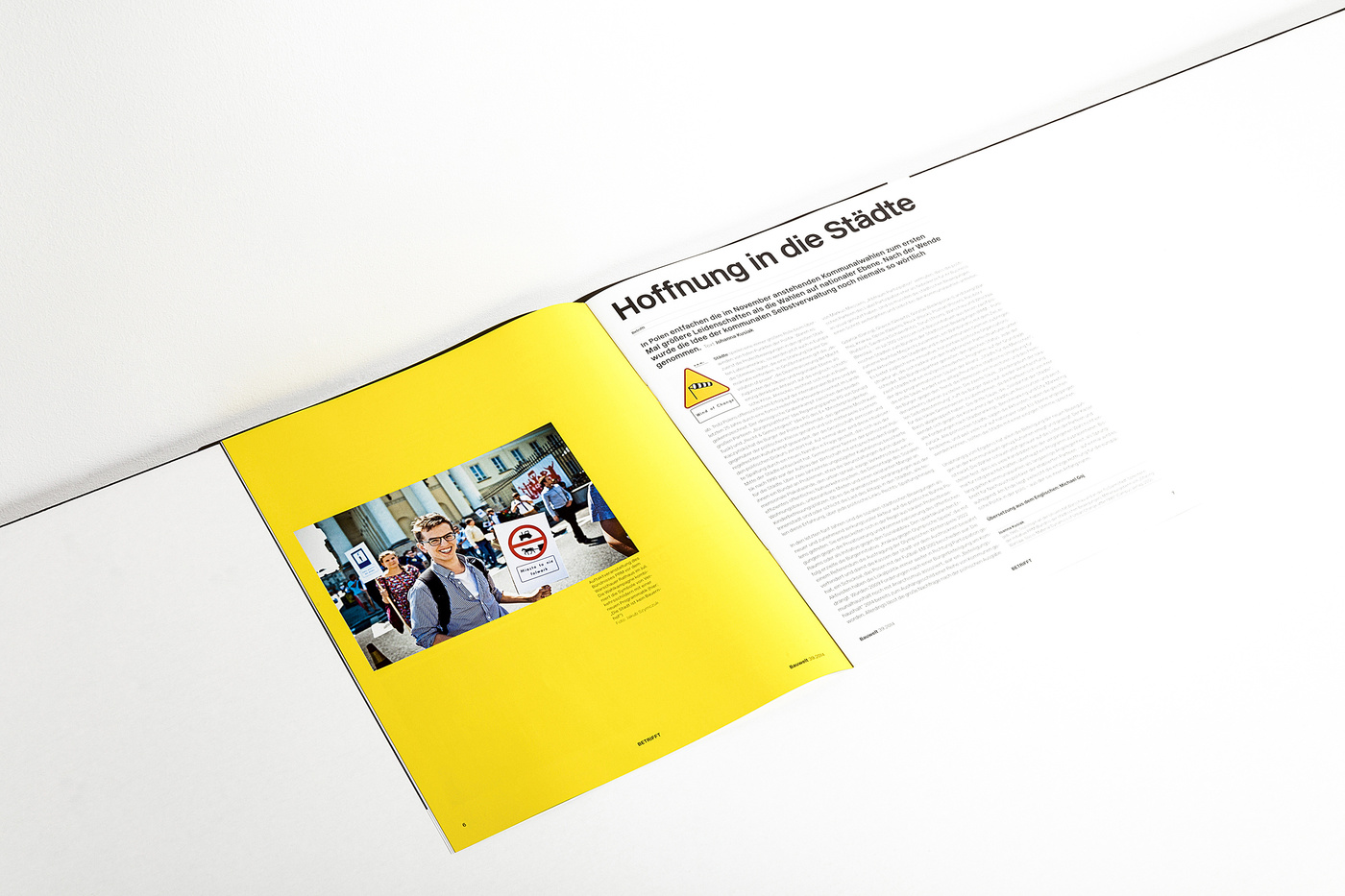
39.2014
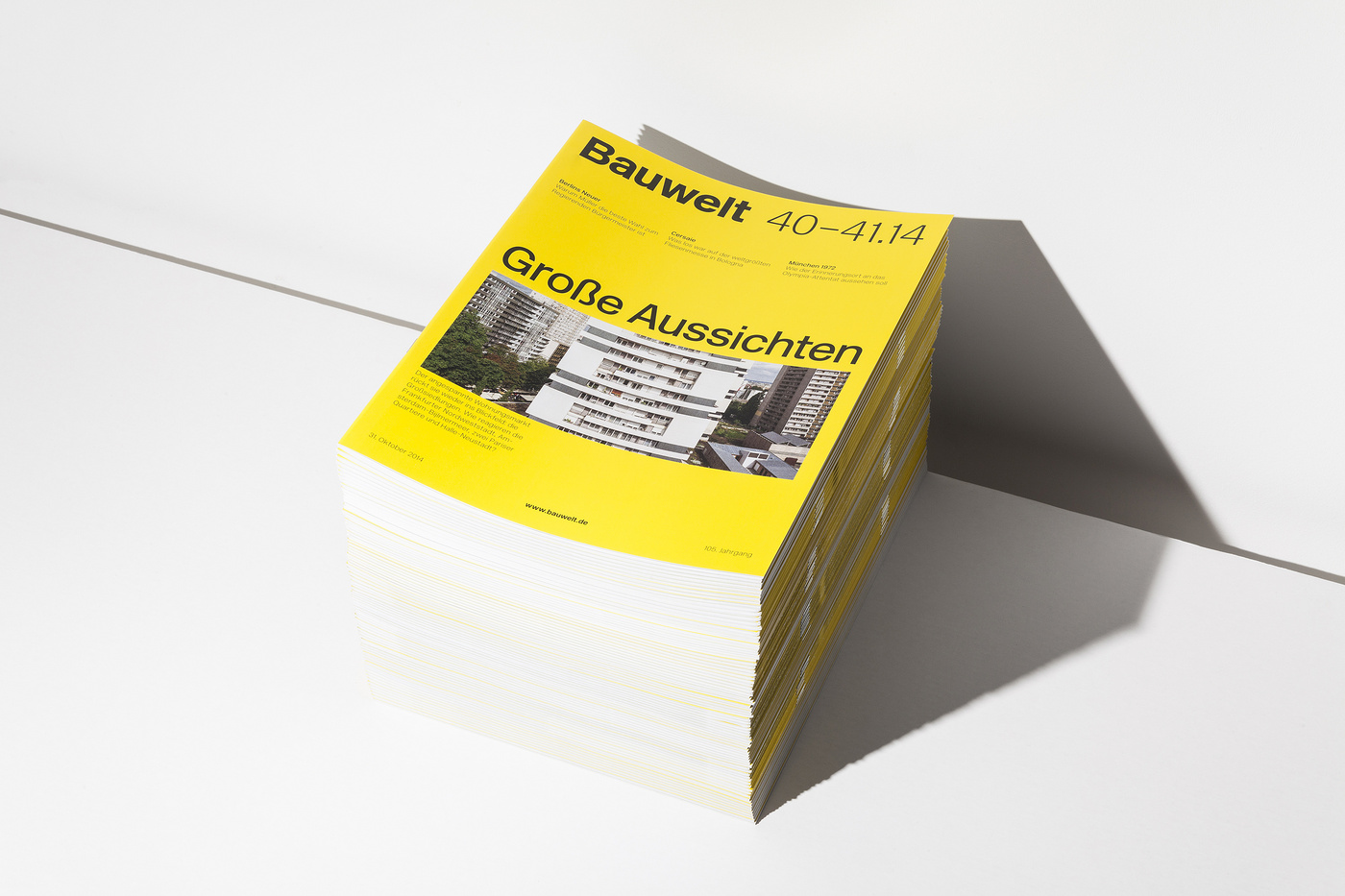
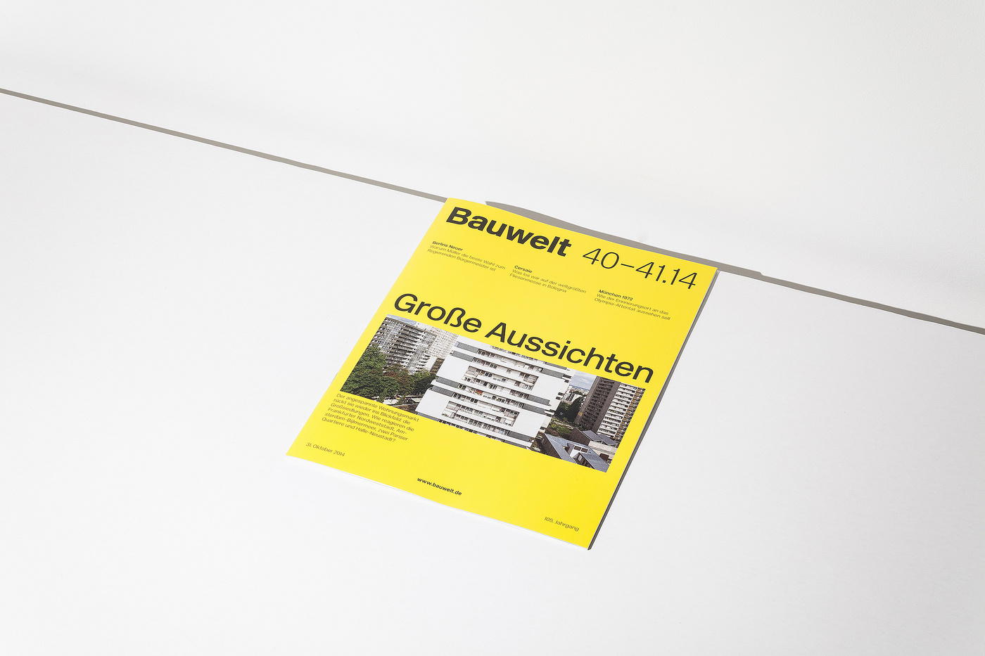
40.–41.2014
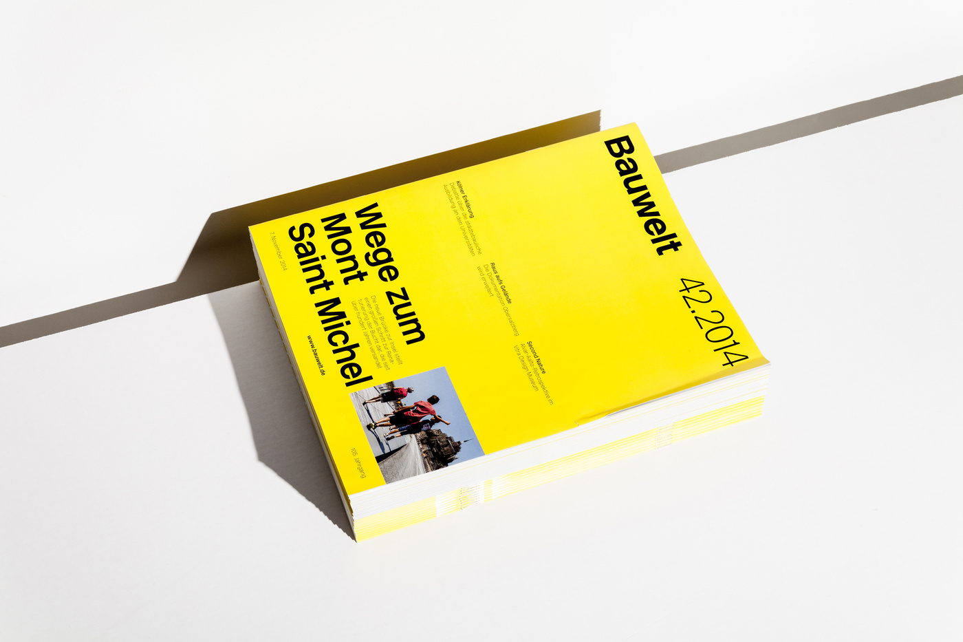
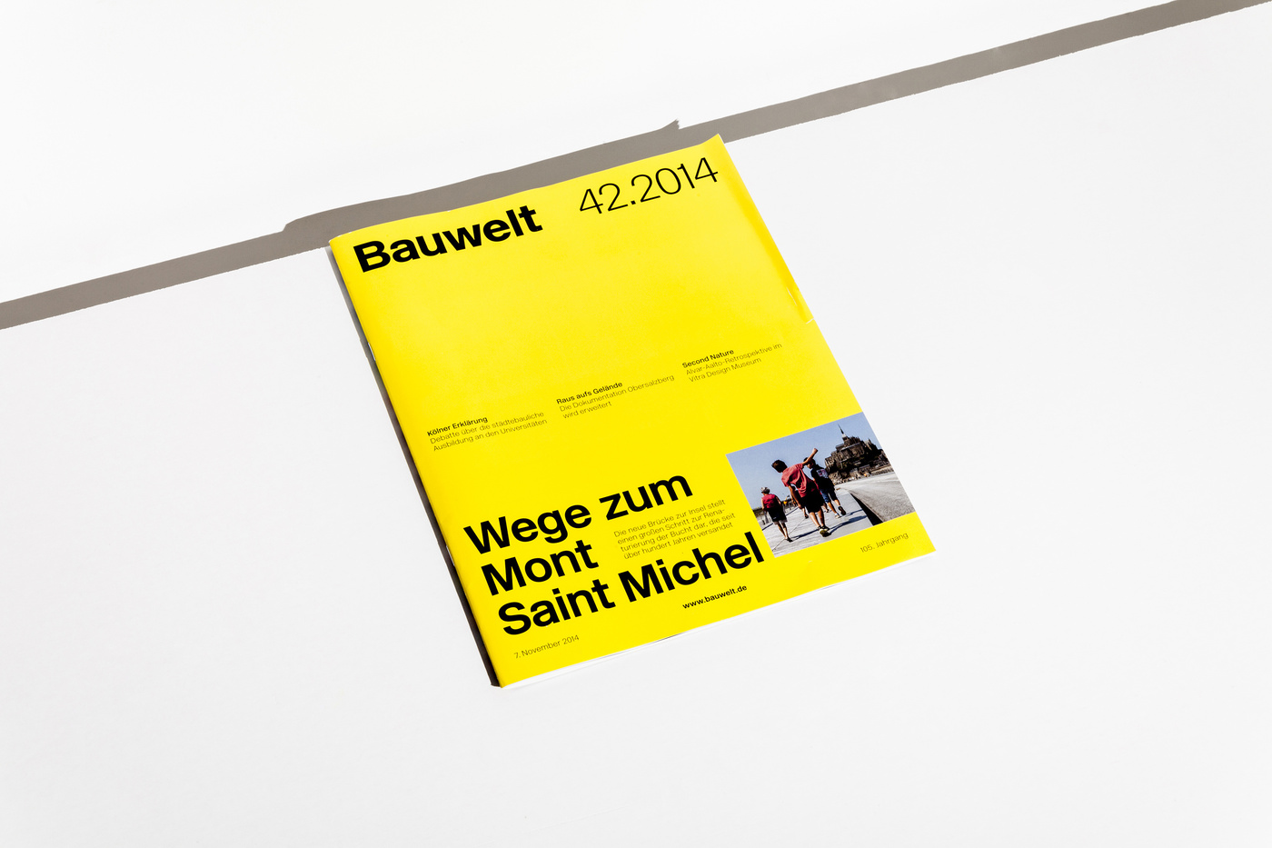
42.2014
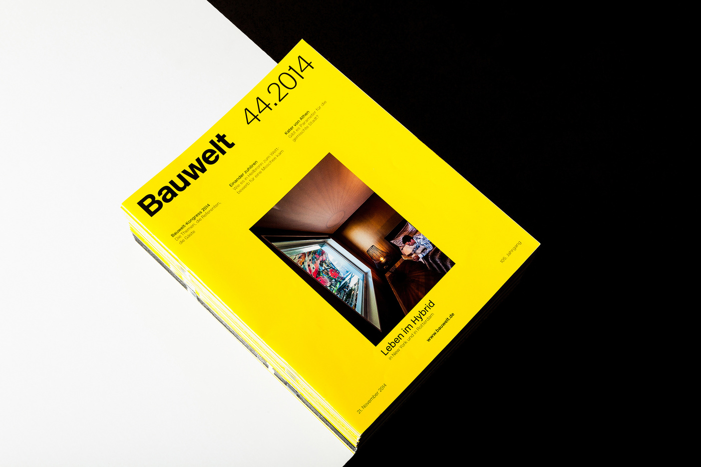
43.2014
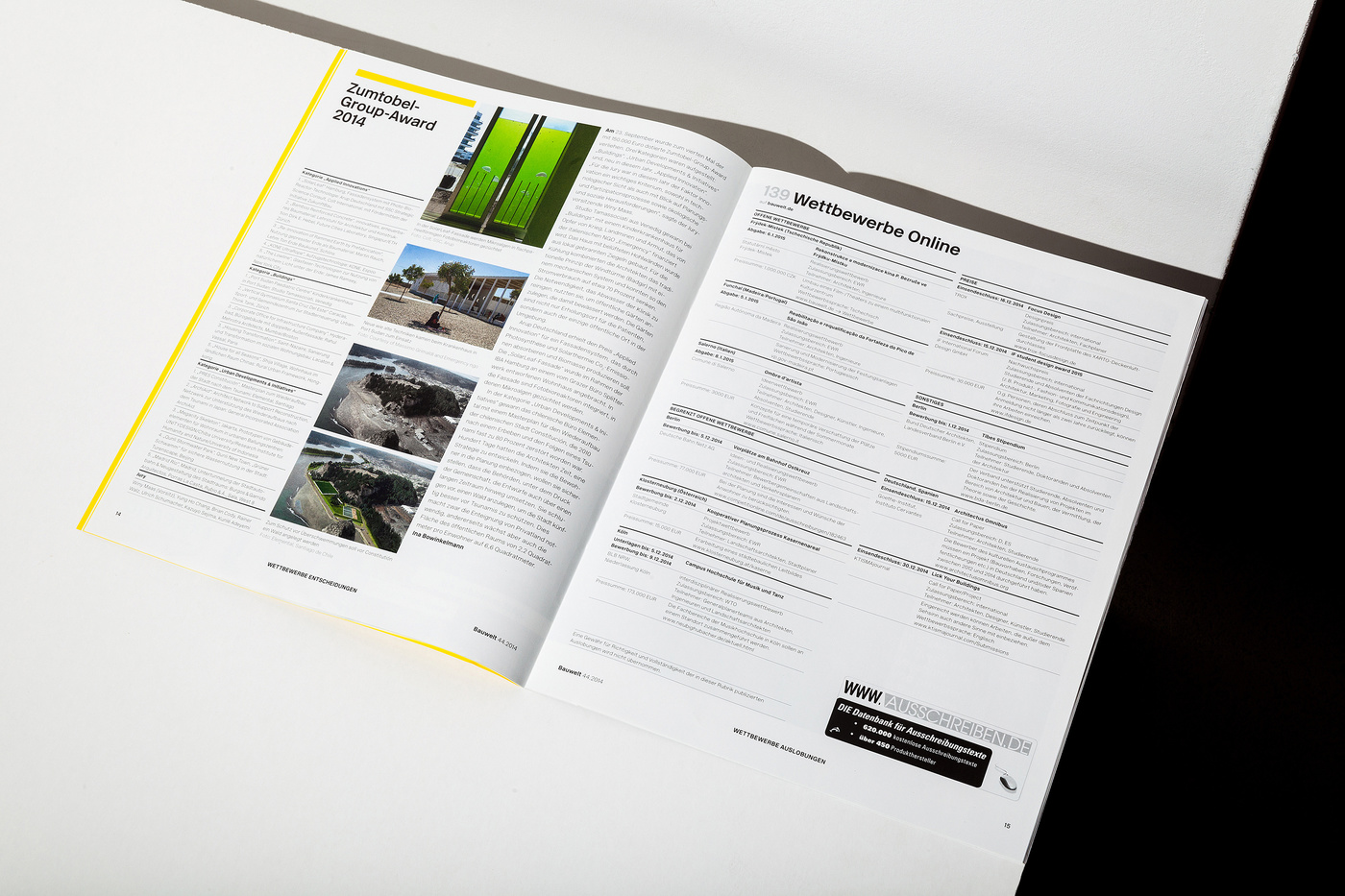
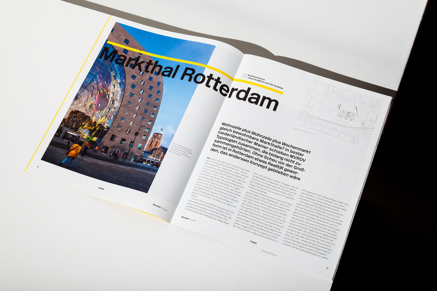
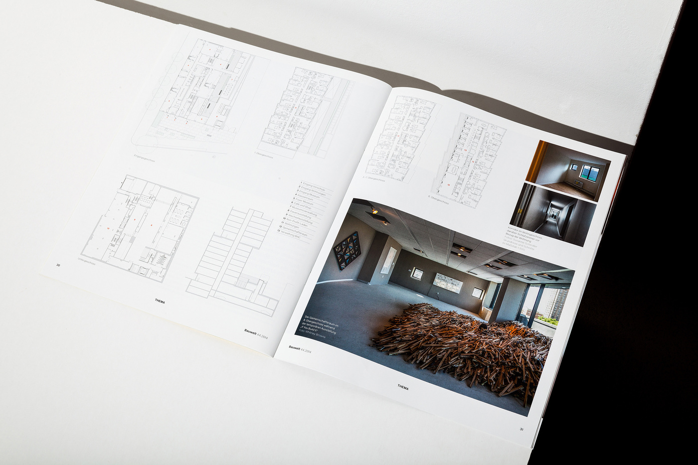
44.2014
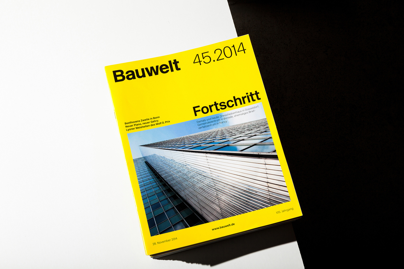
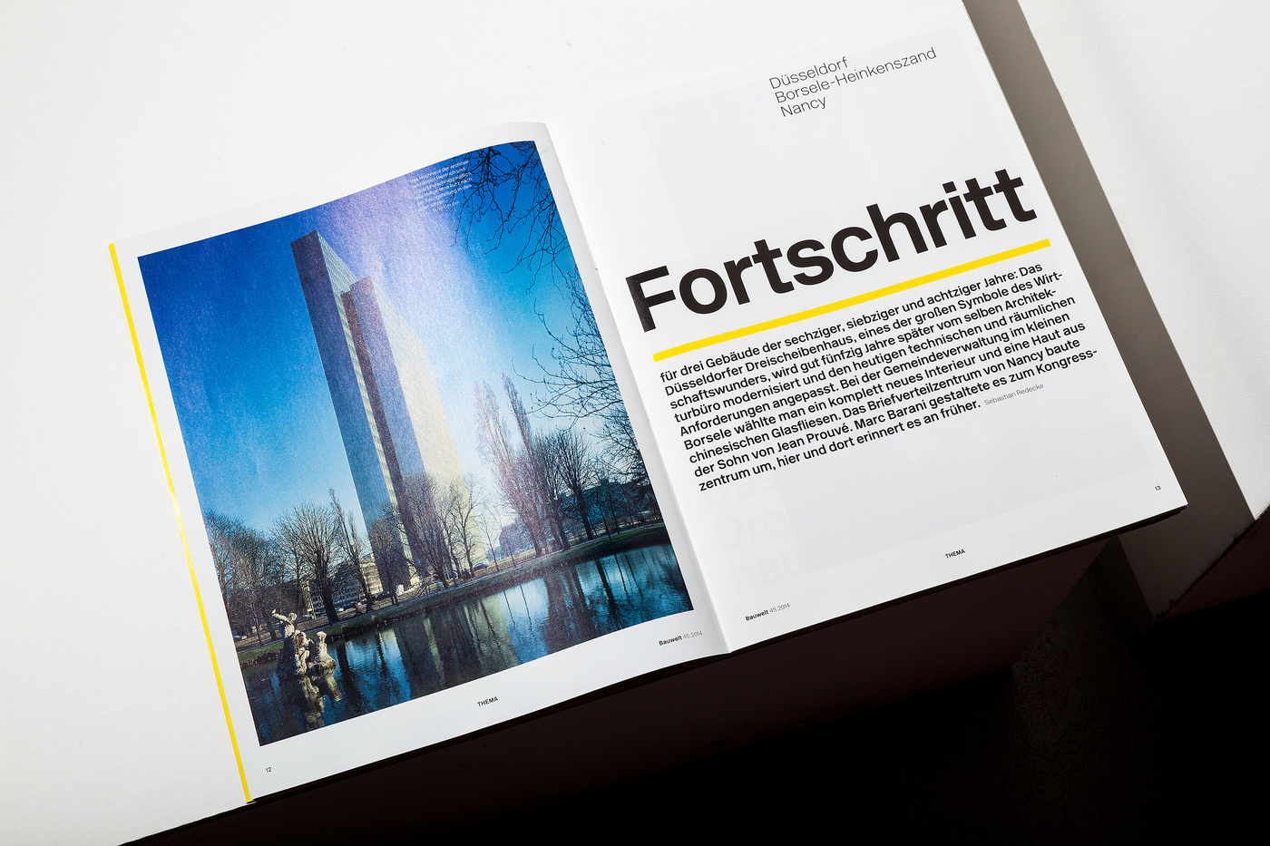
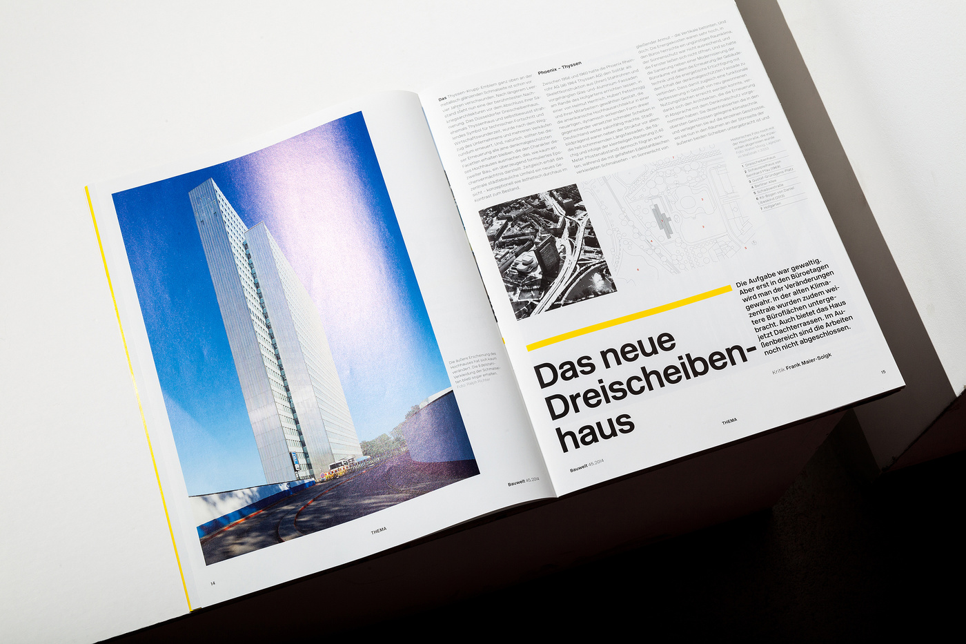
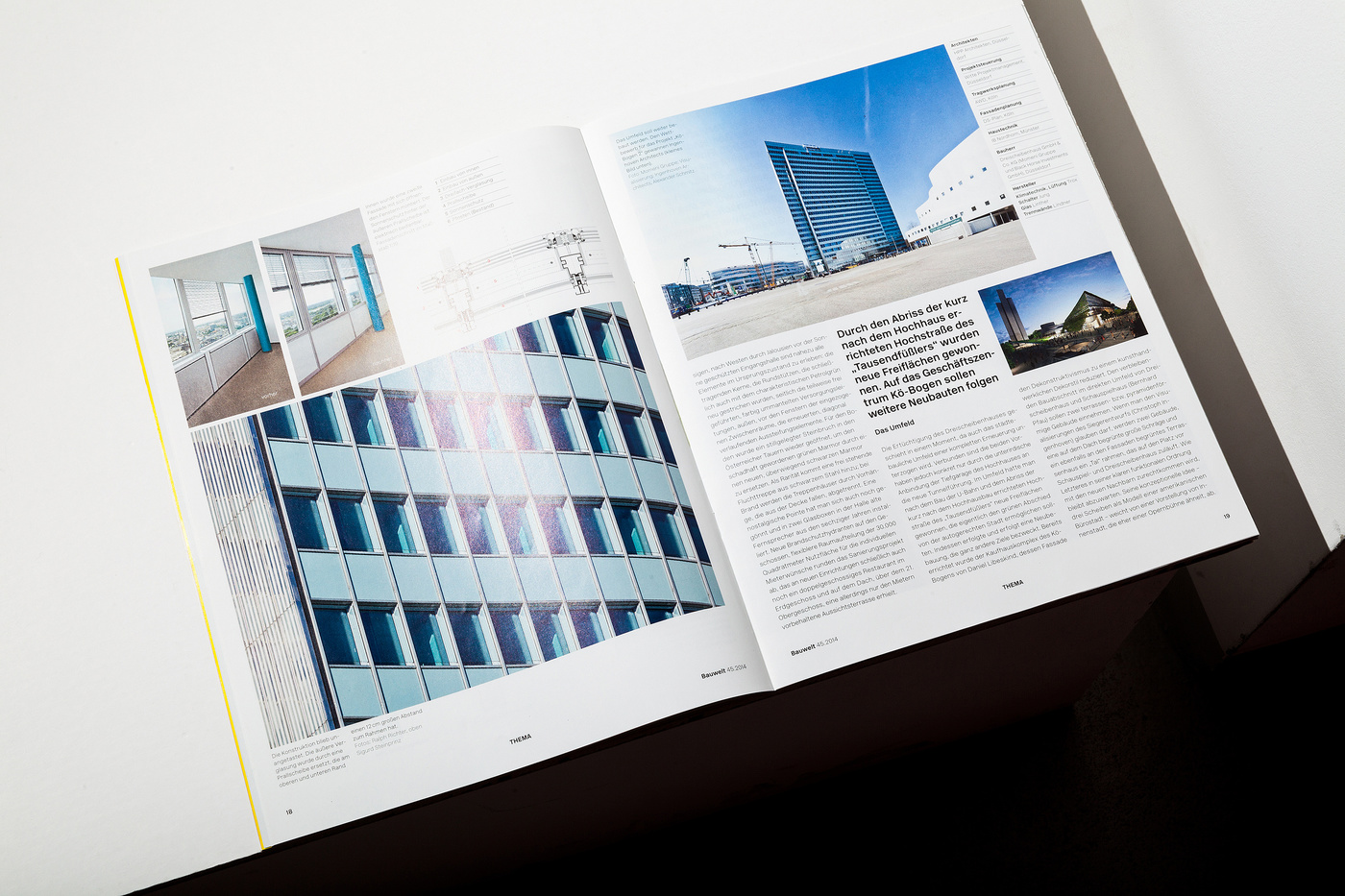
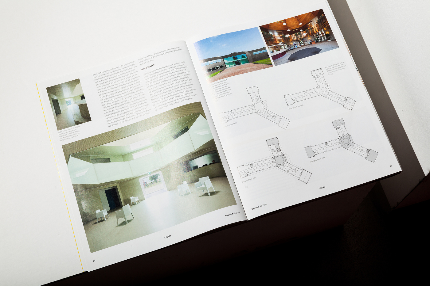
45.2014
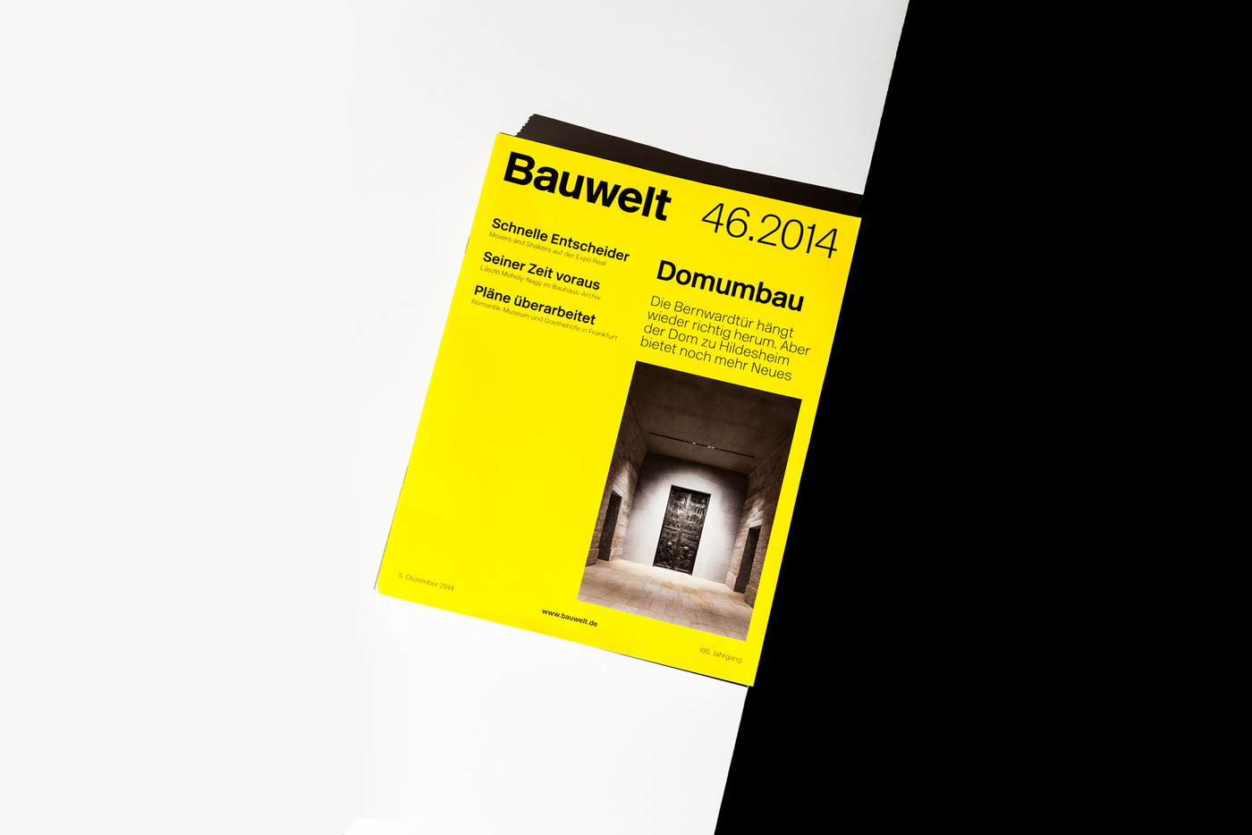
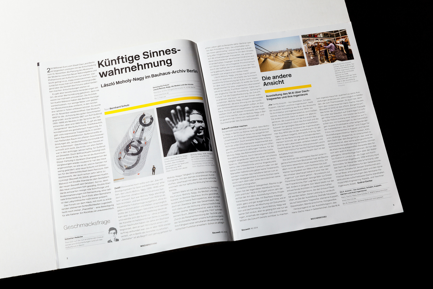
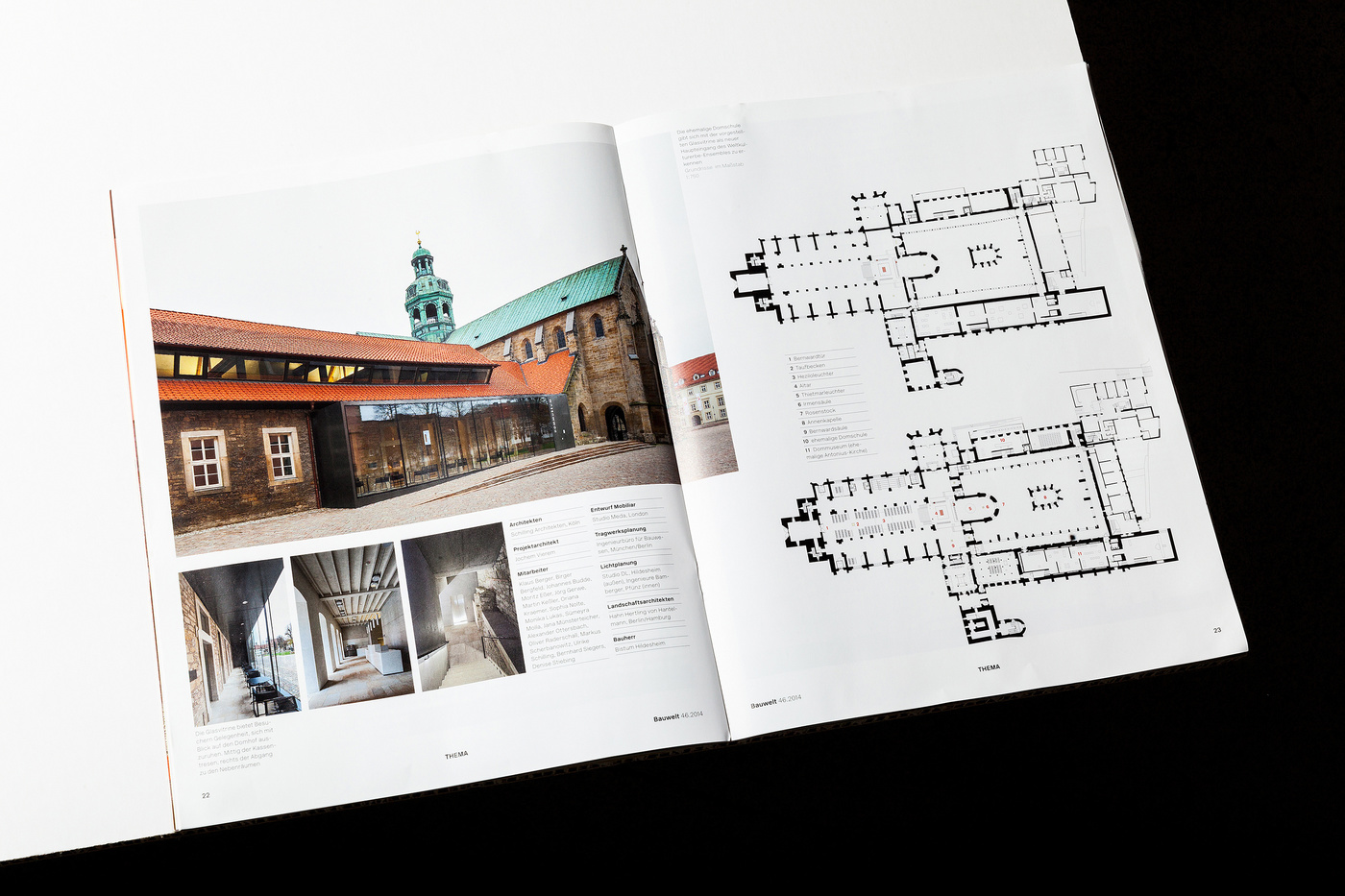
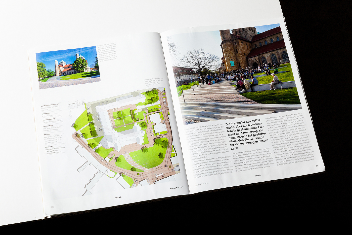
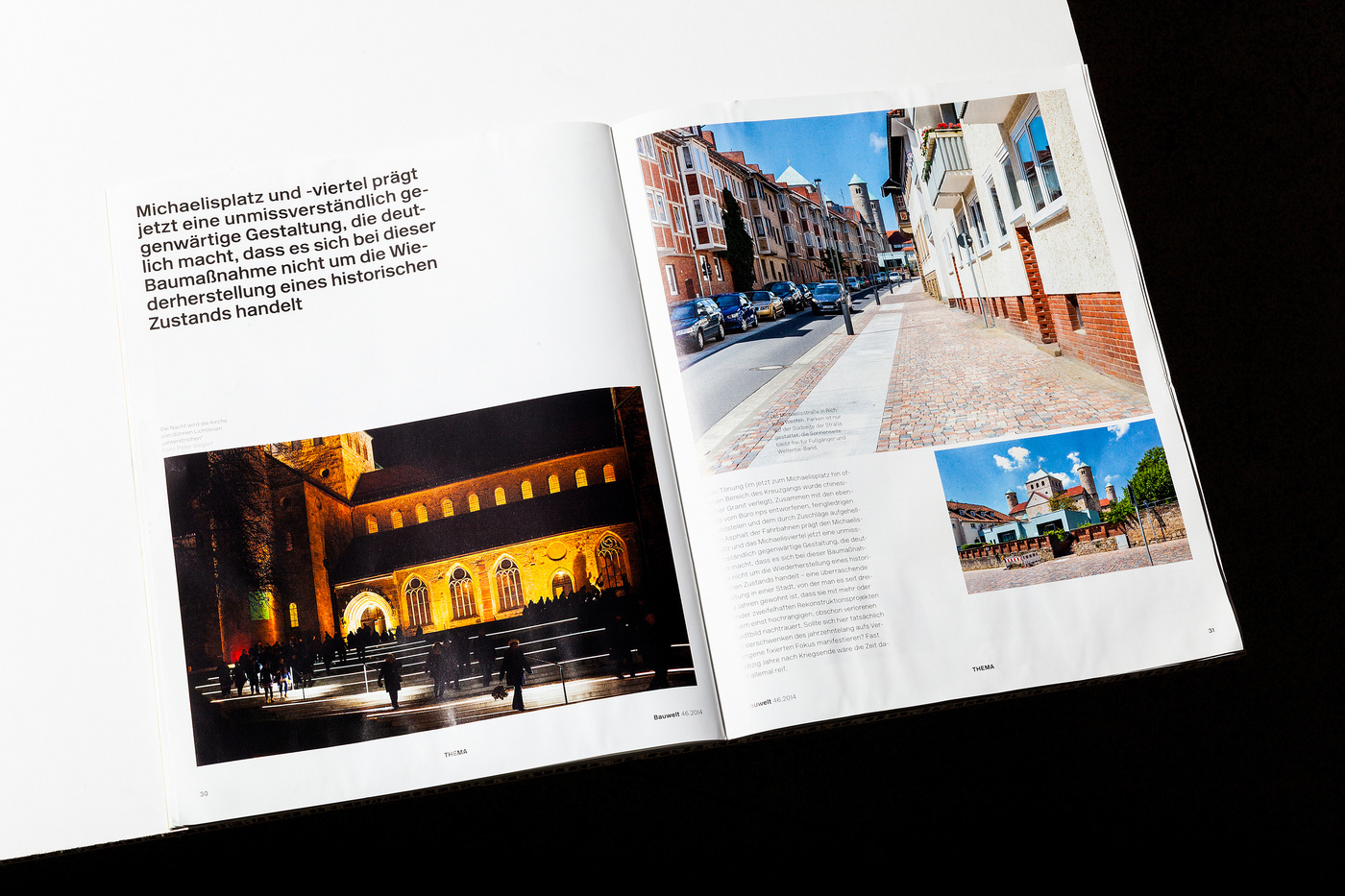
46.2014
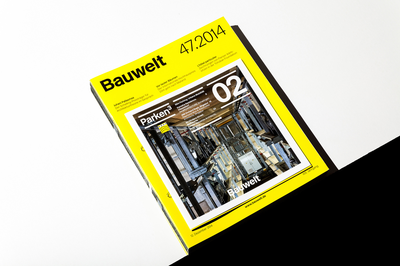
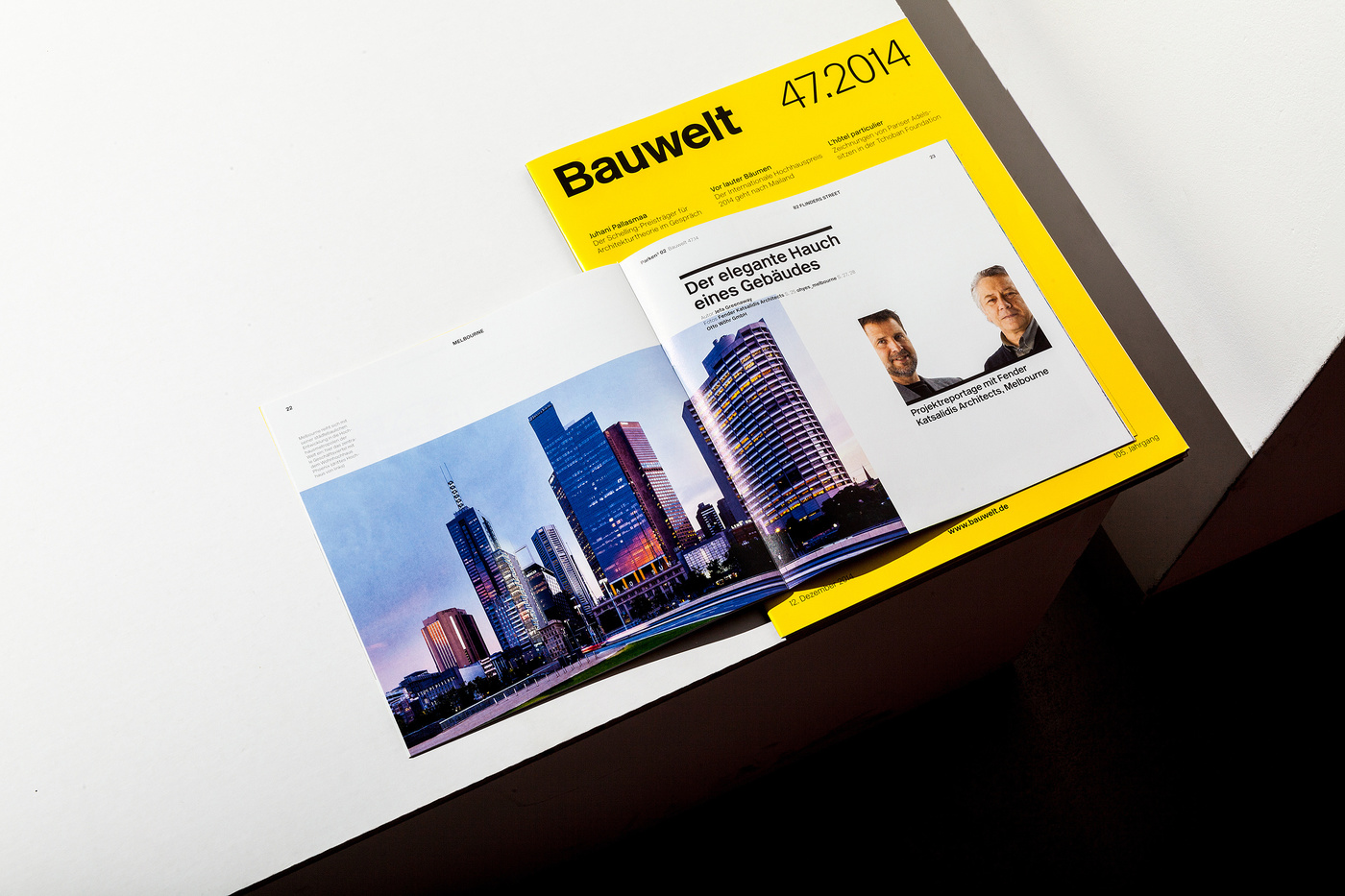
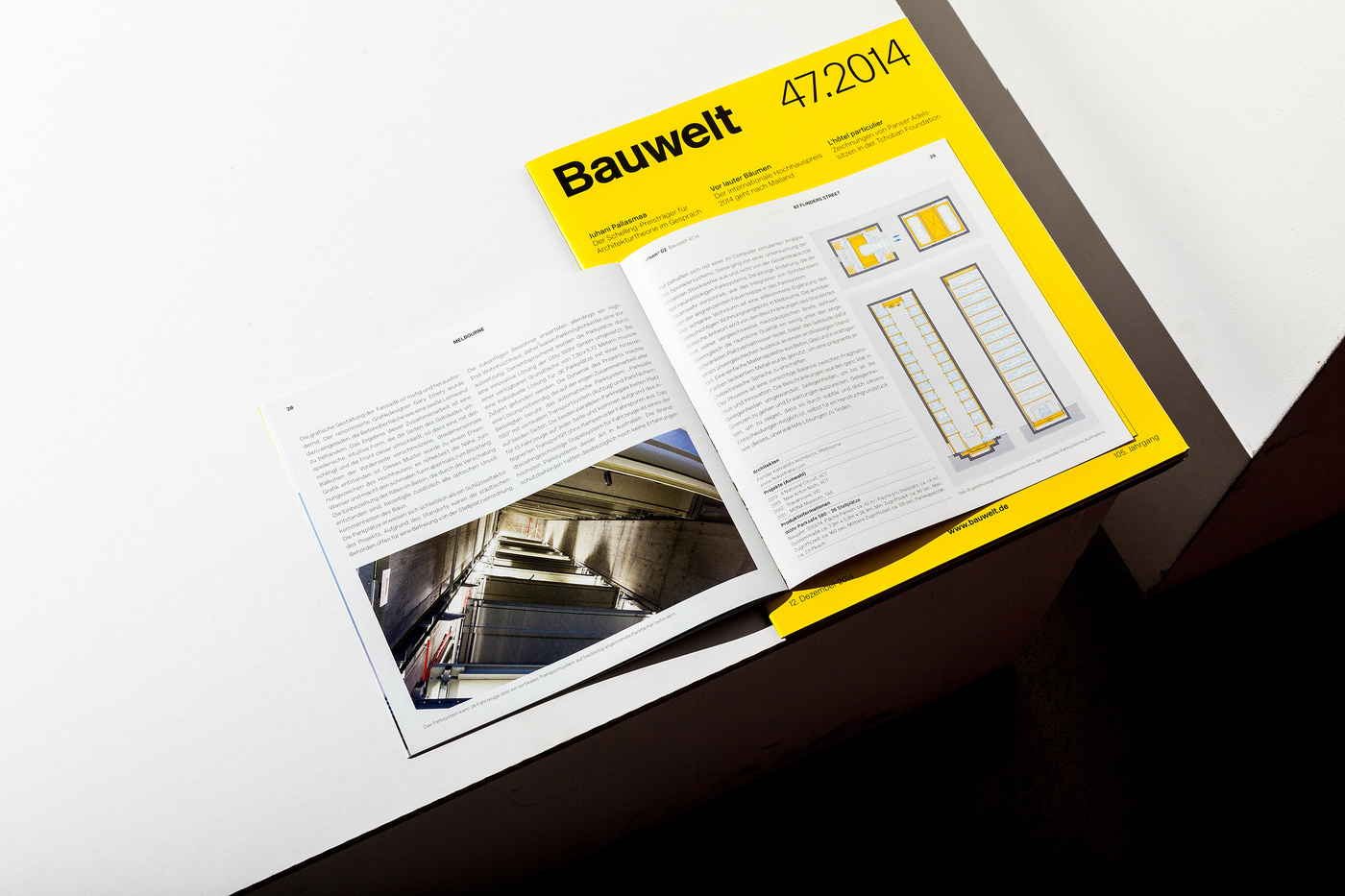
47.2014
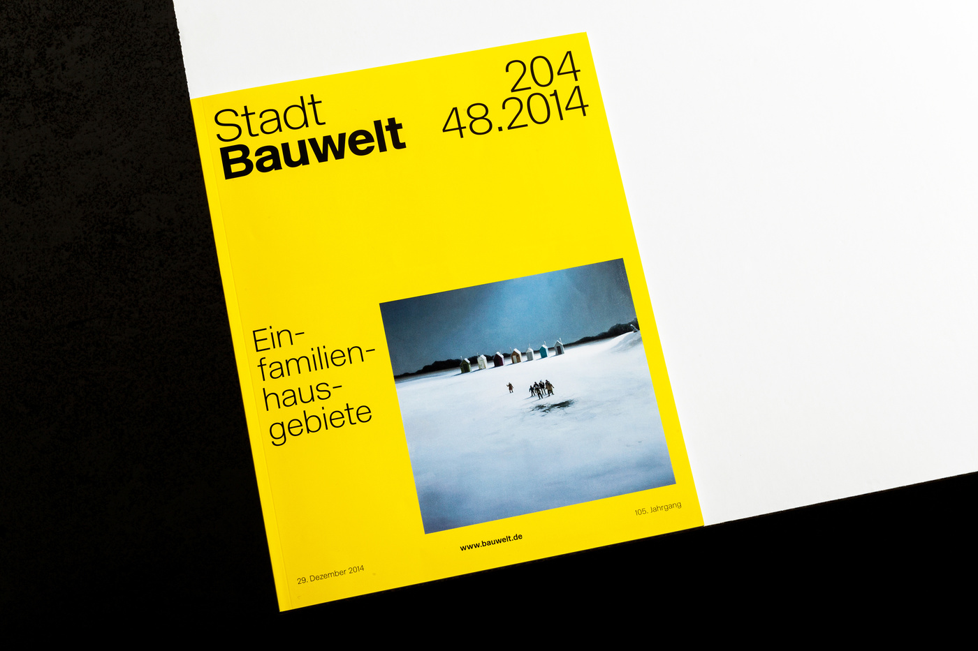
48.2014
There is more – I know
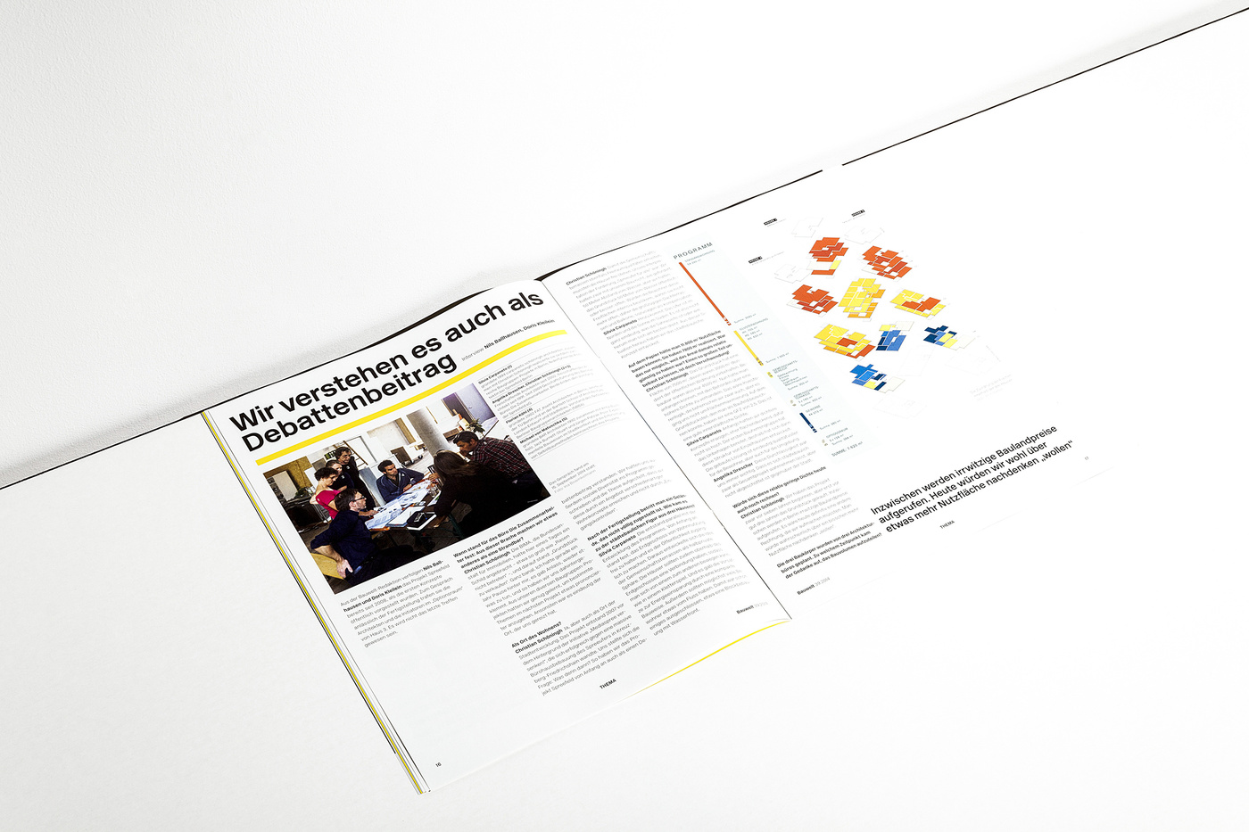
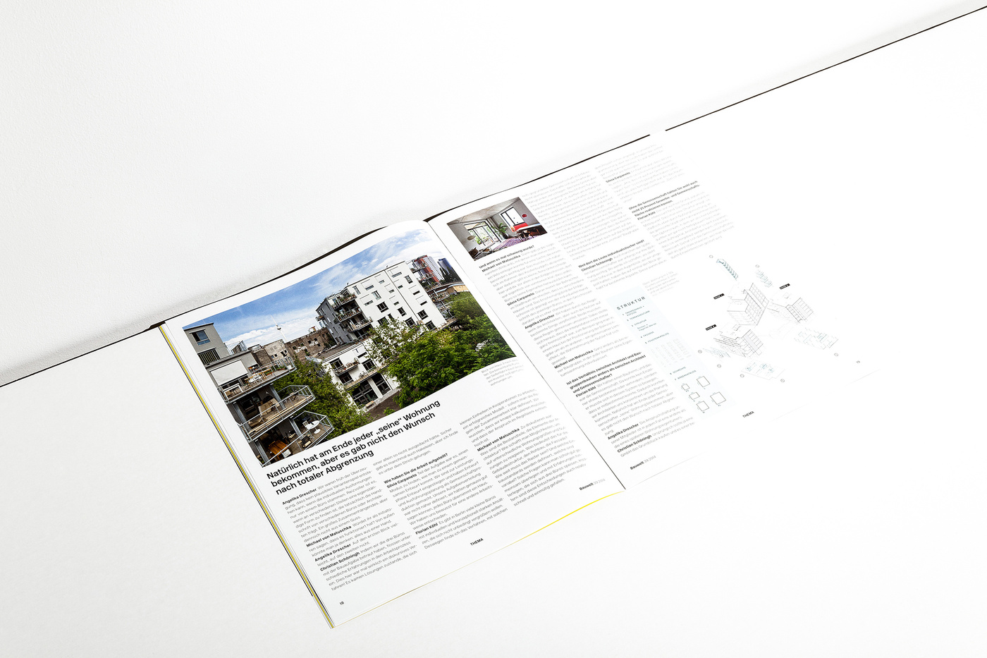
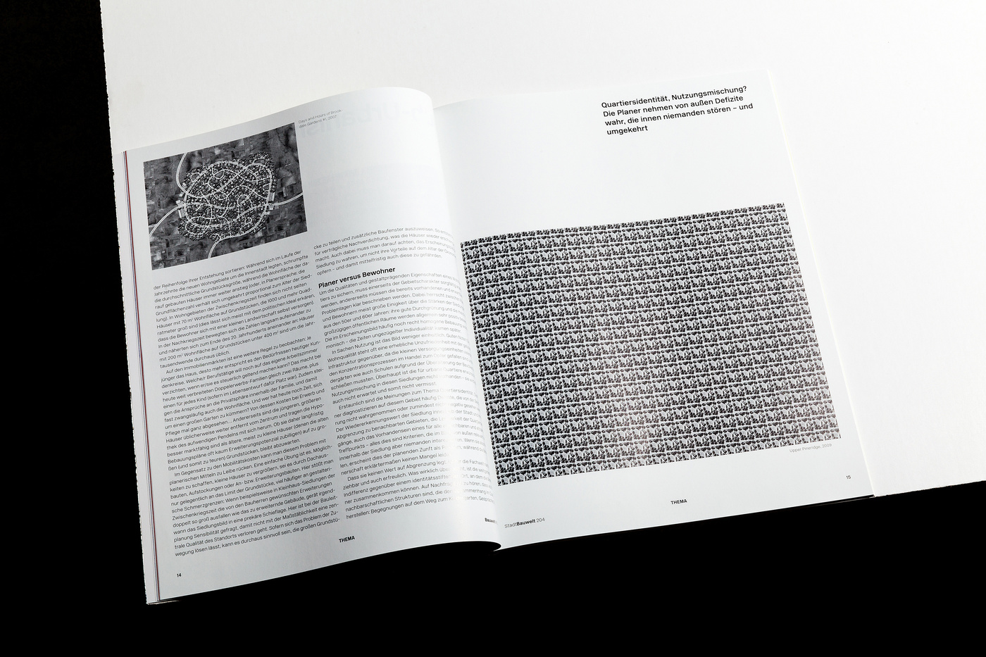
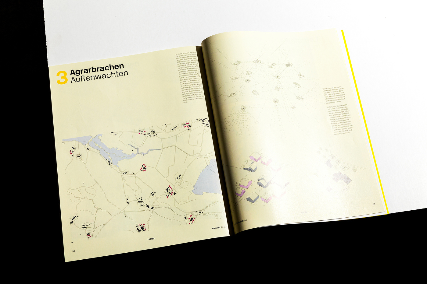
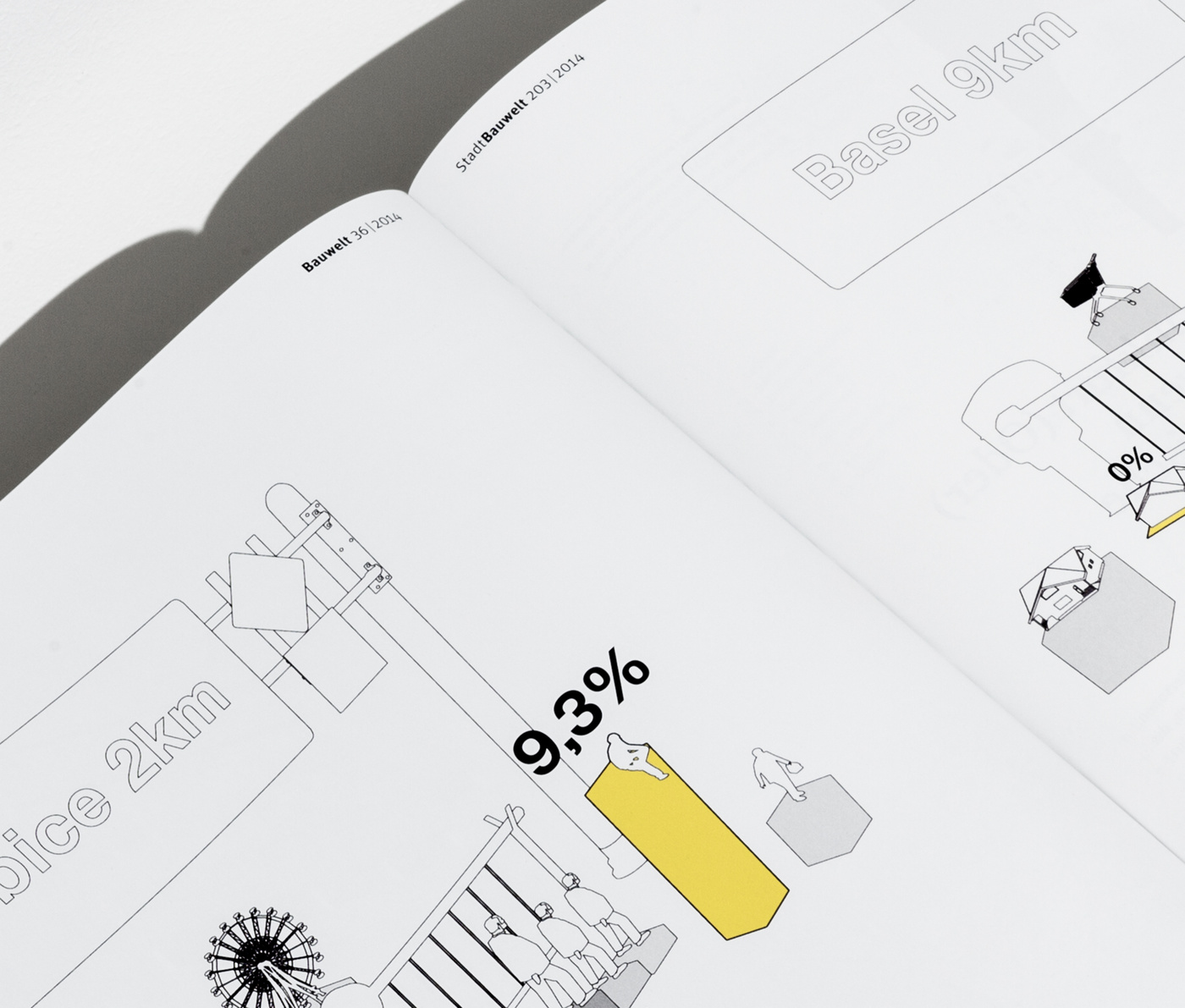
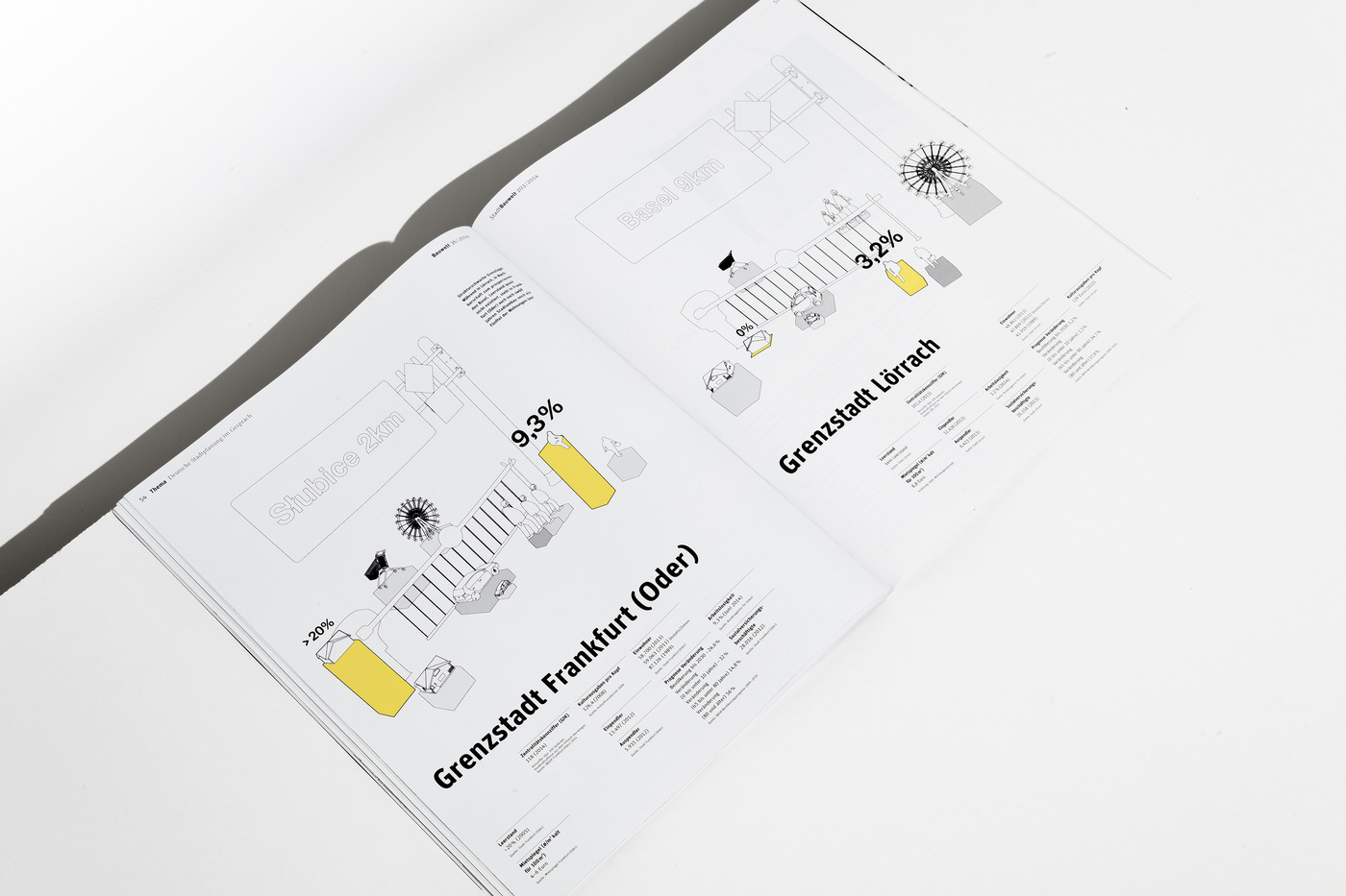
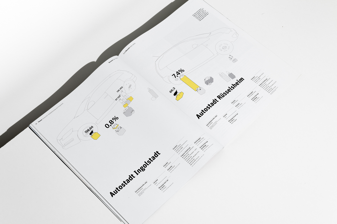
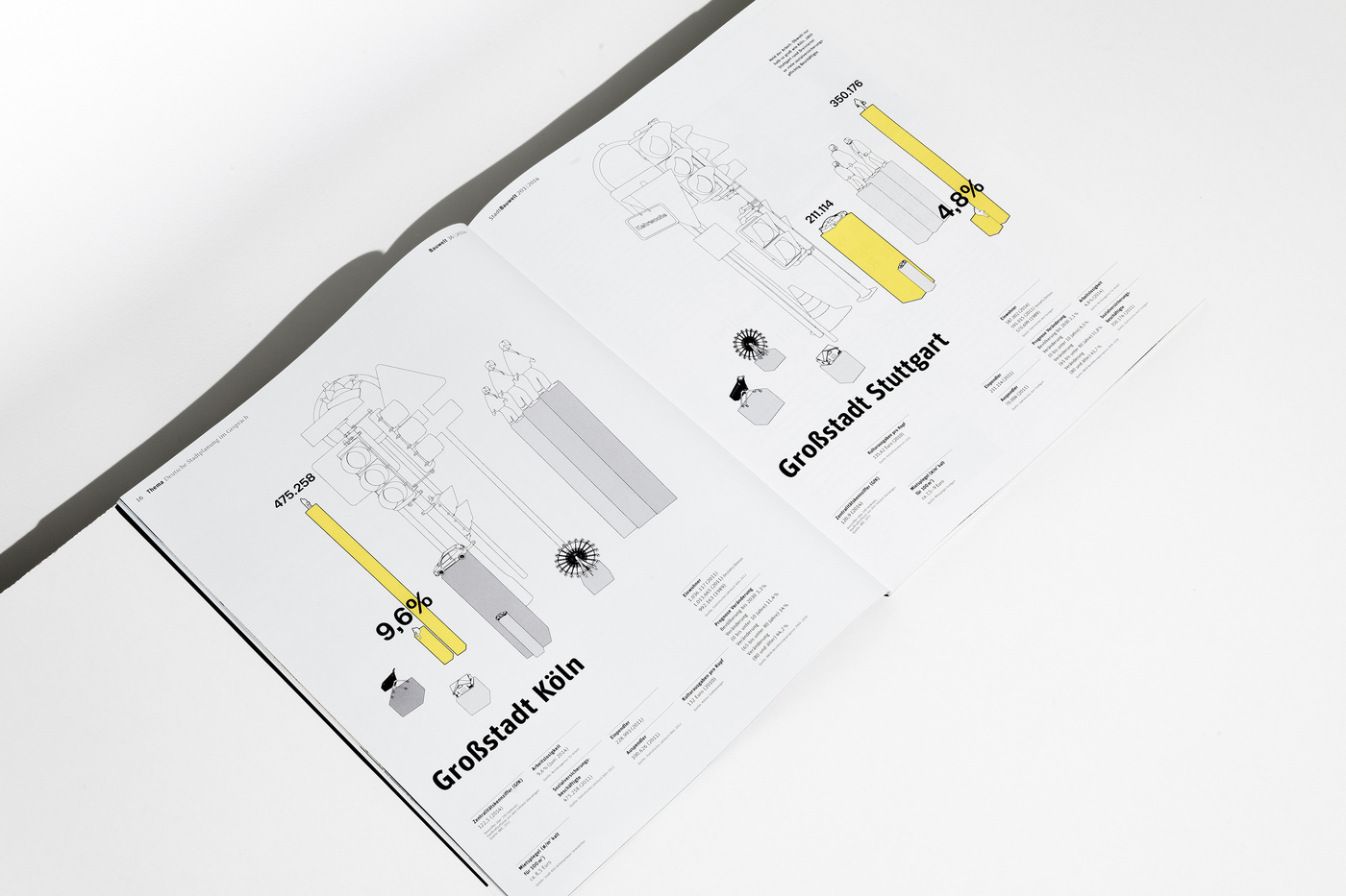
Ever since we are confronted with information graphics, sent in to use for several publications we’re working on, we get a bit annoyed. Is it just us, or don’t they all look in one way or the other the same? There are the flimsy, really hard to read data processed ones, and there are the 3D ones that might look funky but don’t carry much information and their functionality is more window dressing than anything else. Don't the designers, who are working on these graphics, want to understand themselves what this information graphics are about? It’s like typesetting a book without having read the tiniest bit of copy. We now got to the point to develop the information graphics ourselves. Giving every bit of information the space it needs to be understood. And on top of that, as a bonus, we’ve given us the task to generate a corporate design for every client’s information graphics, so they all get more distinguishable from each other. New rules, new game. Bring it on.
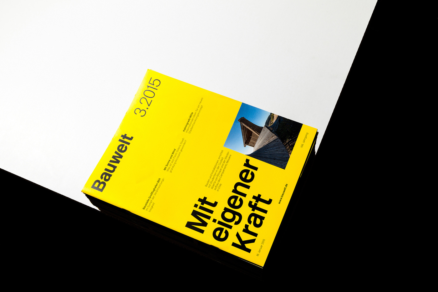
1–2.2015
03.2015
04.2015
05.2015
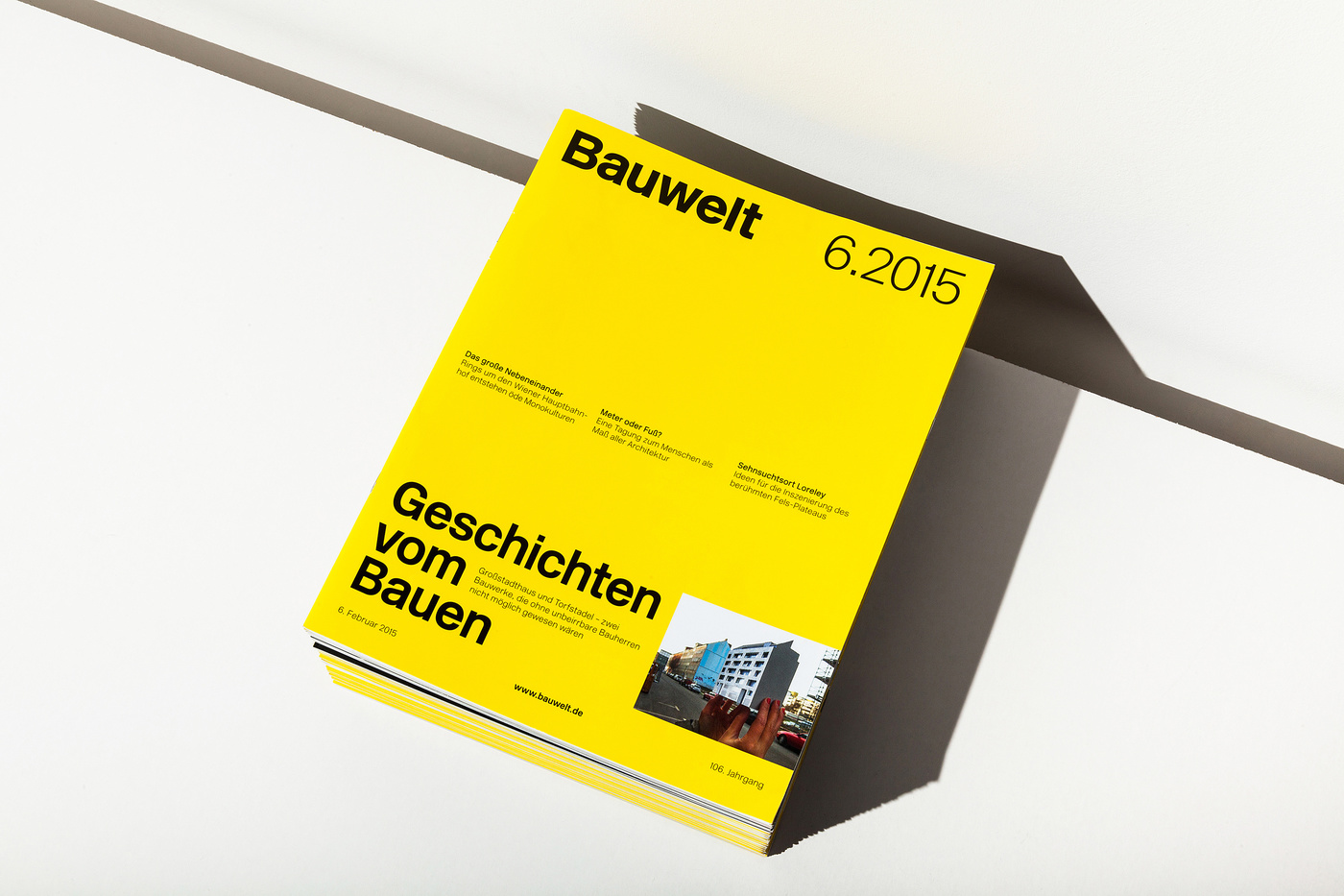
06.2015
... AND MANY MORE TO COME