
3 2 1 – MUNICH,
HERE WE COME
HERE WE COME
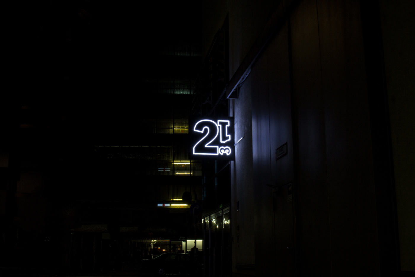
The Kammerspiele guidance system
MÜNCHNER KAMMERSPIELE
Challenge
- It’s almost a rule when a new director starts at a new theatre, he’s challanging his audience first, not with a new approach to plays, but with a new corporate to create a scent for what’s to come.
Insight
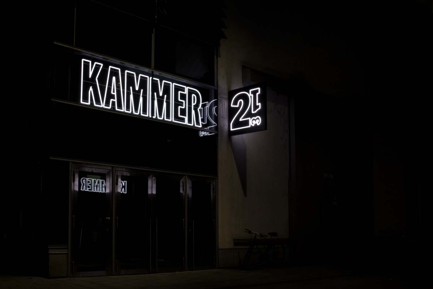
- With the Muenchner Kammerspiele, Matthias Lilienthal, the director, is no exception. His take on theatre in general is everything but classic drama. He is interpreting theatre from a very different perspective. This is what he was asking us to do too. Interpreting the corporate of this very traditional theatre from a completely angle. Translating KAMMER (chamber/compartment) into the logo and general design.
Solution
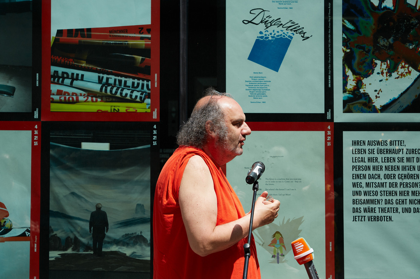
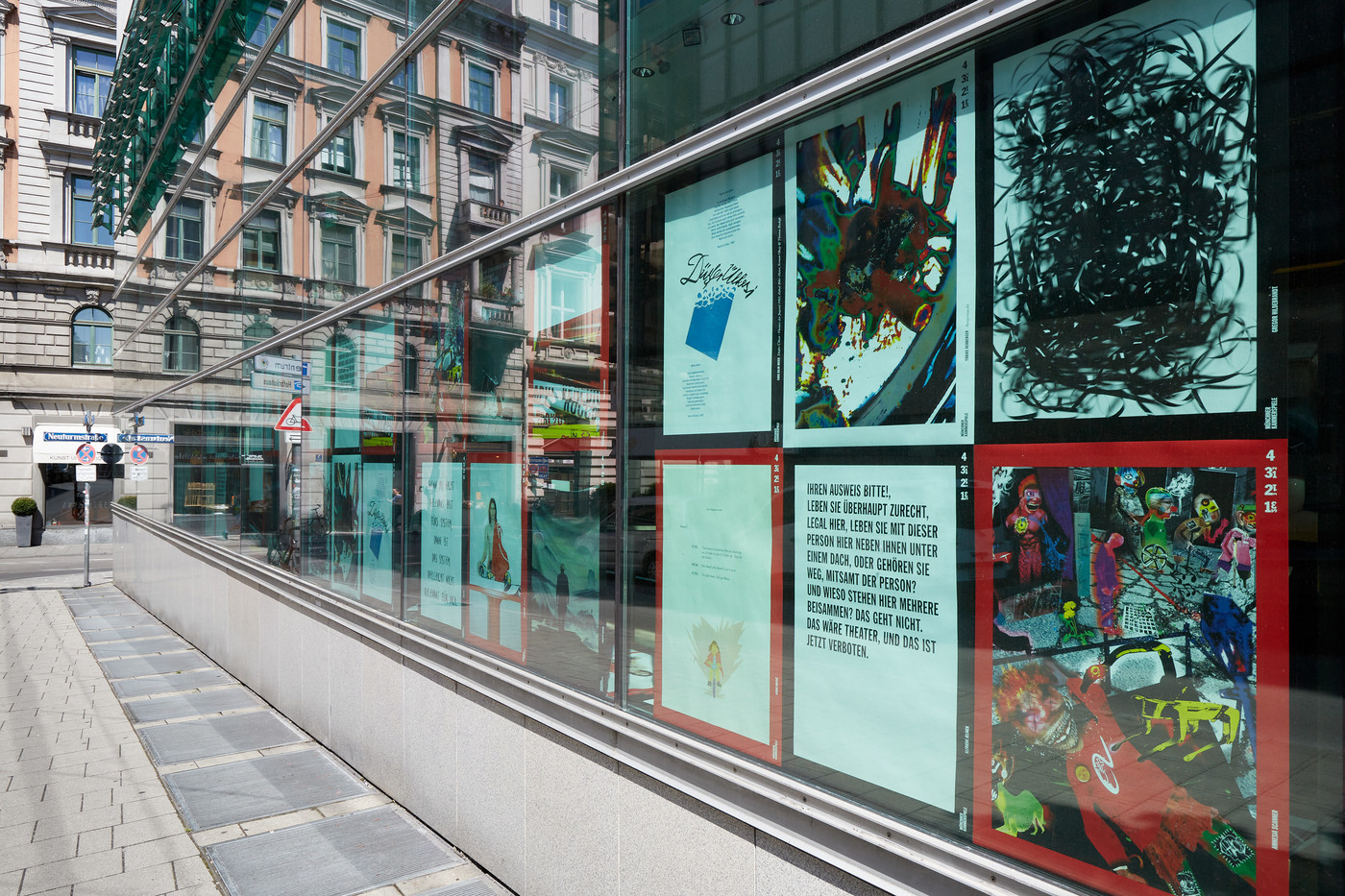
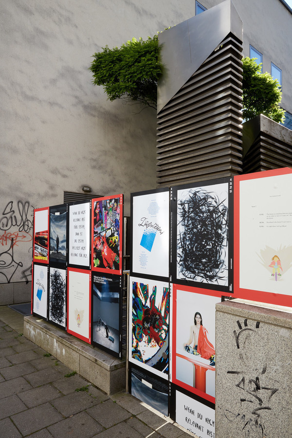
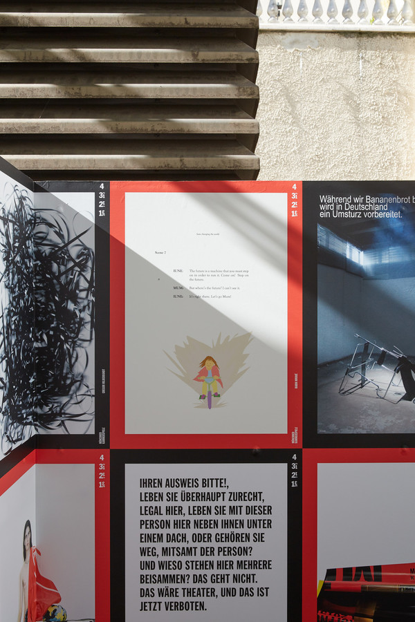
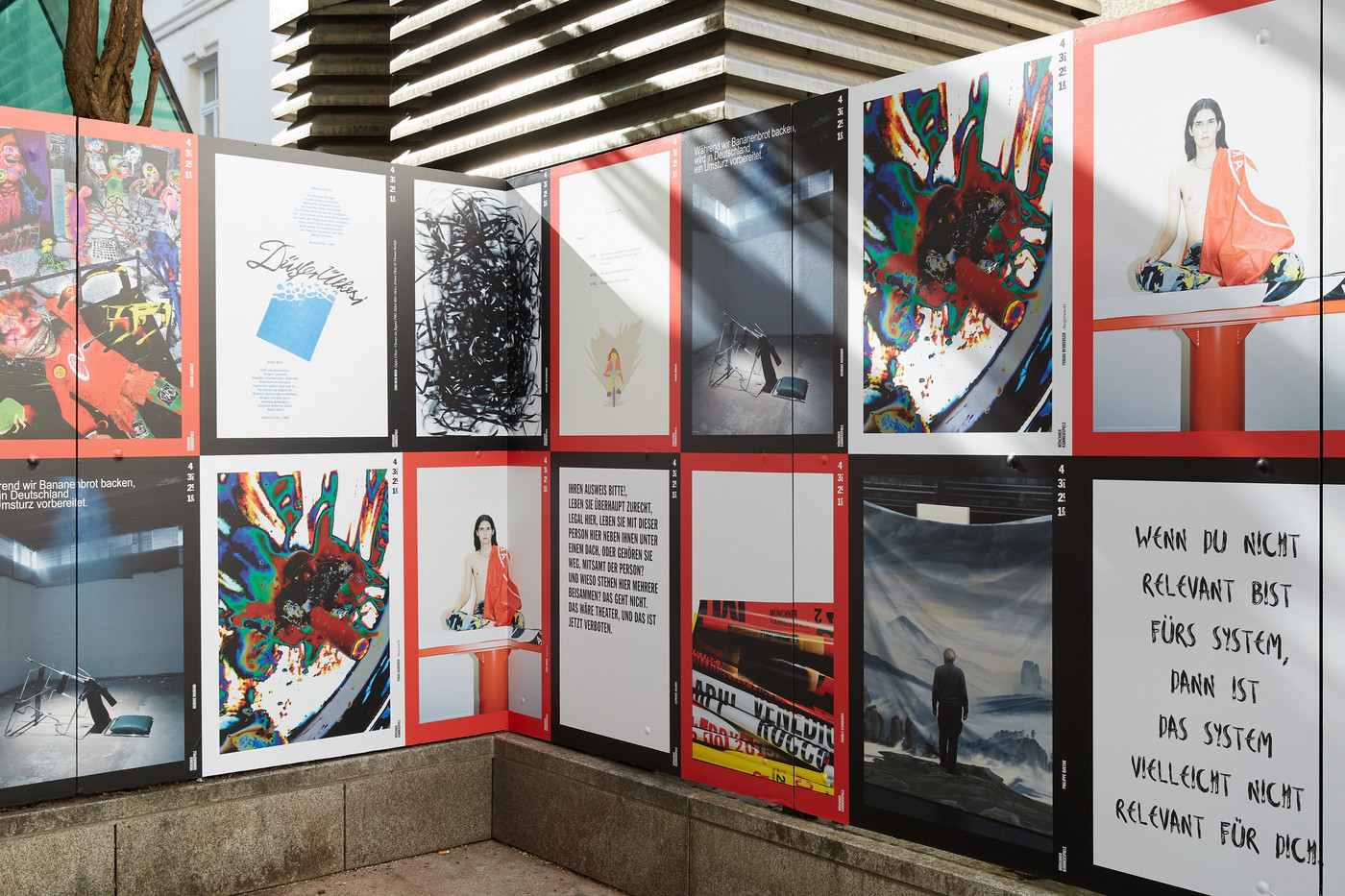
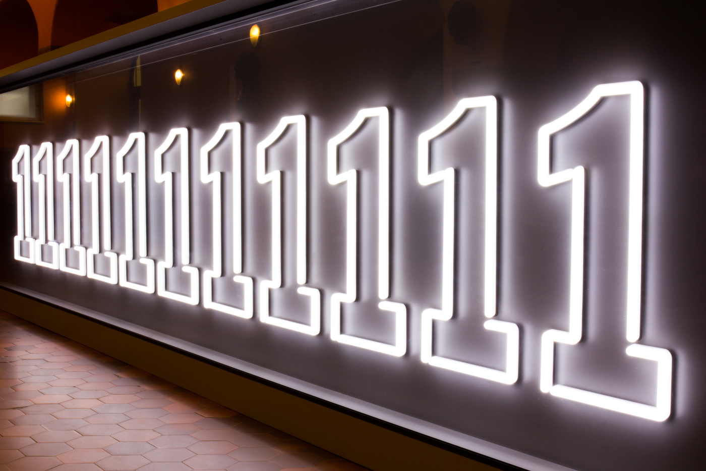
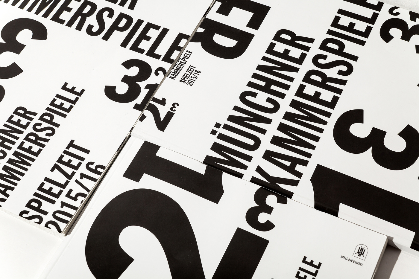
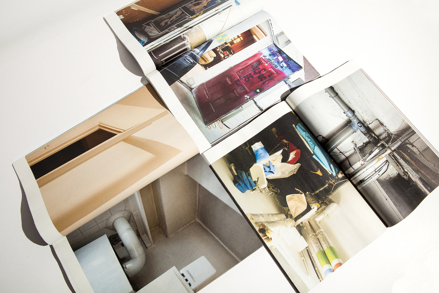
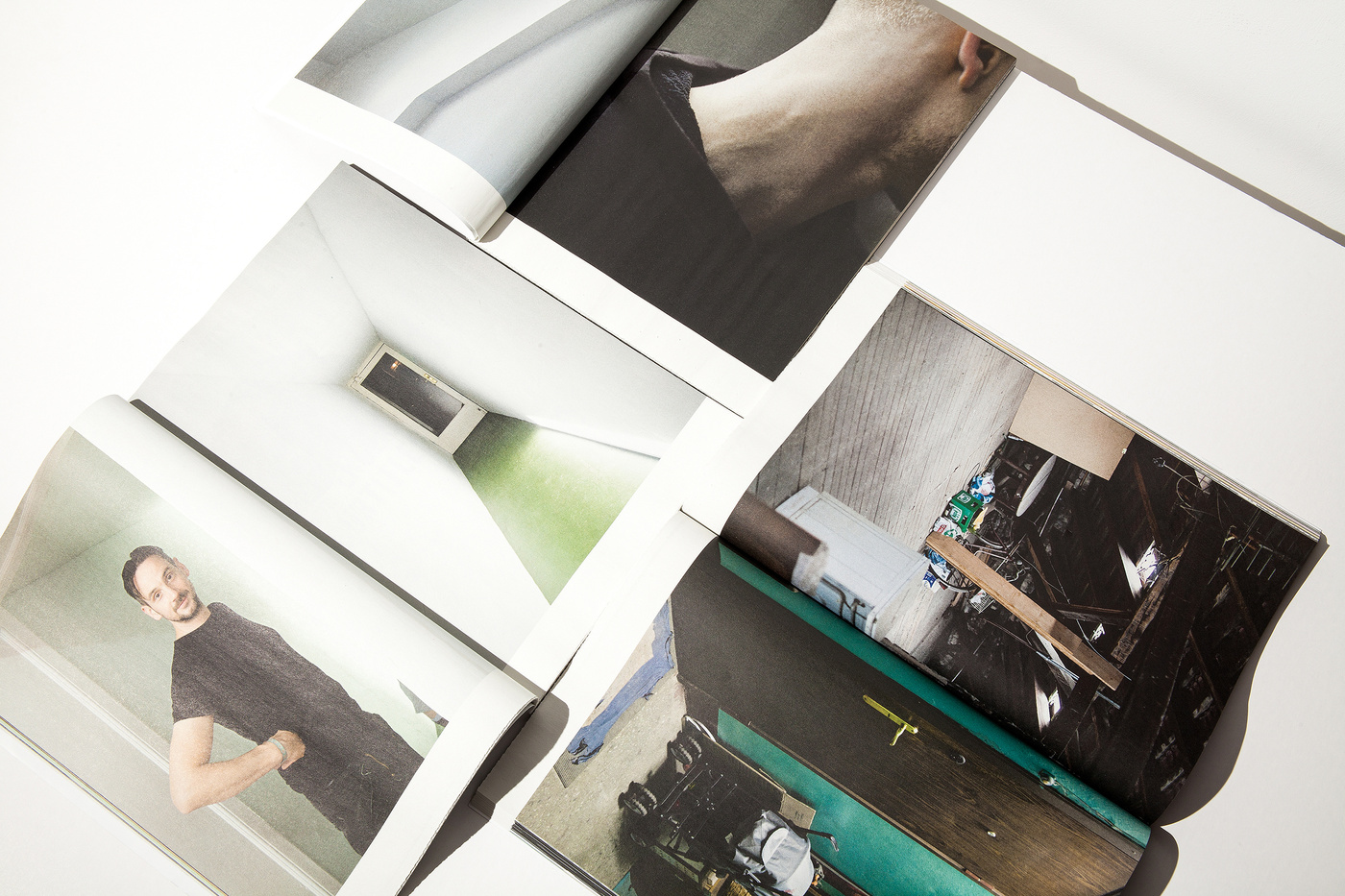
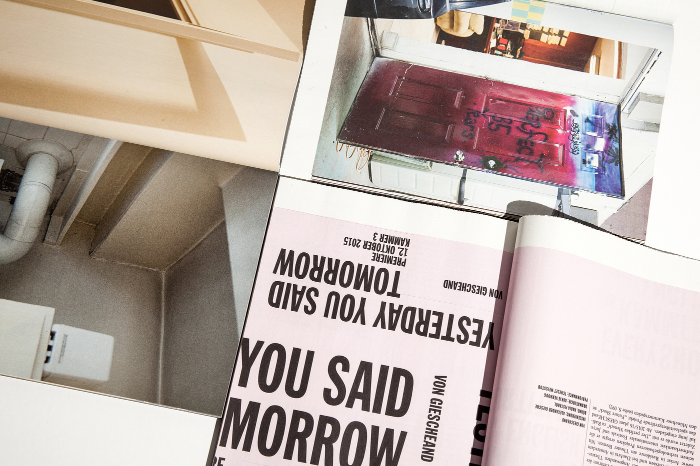
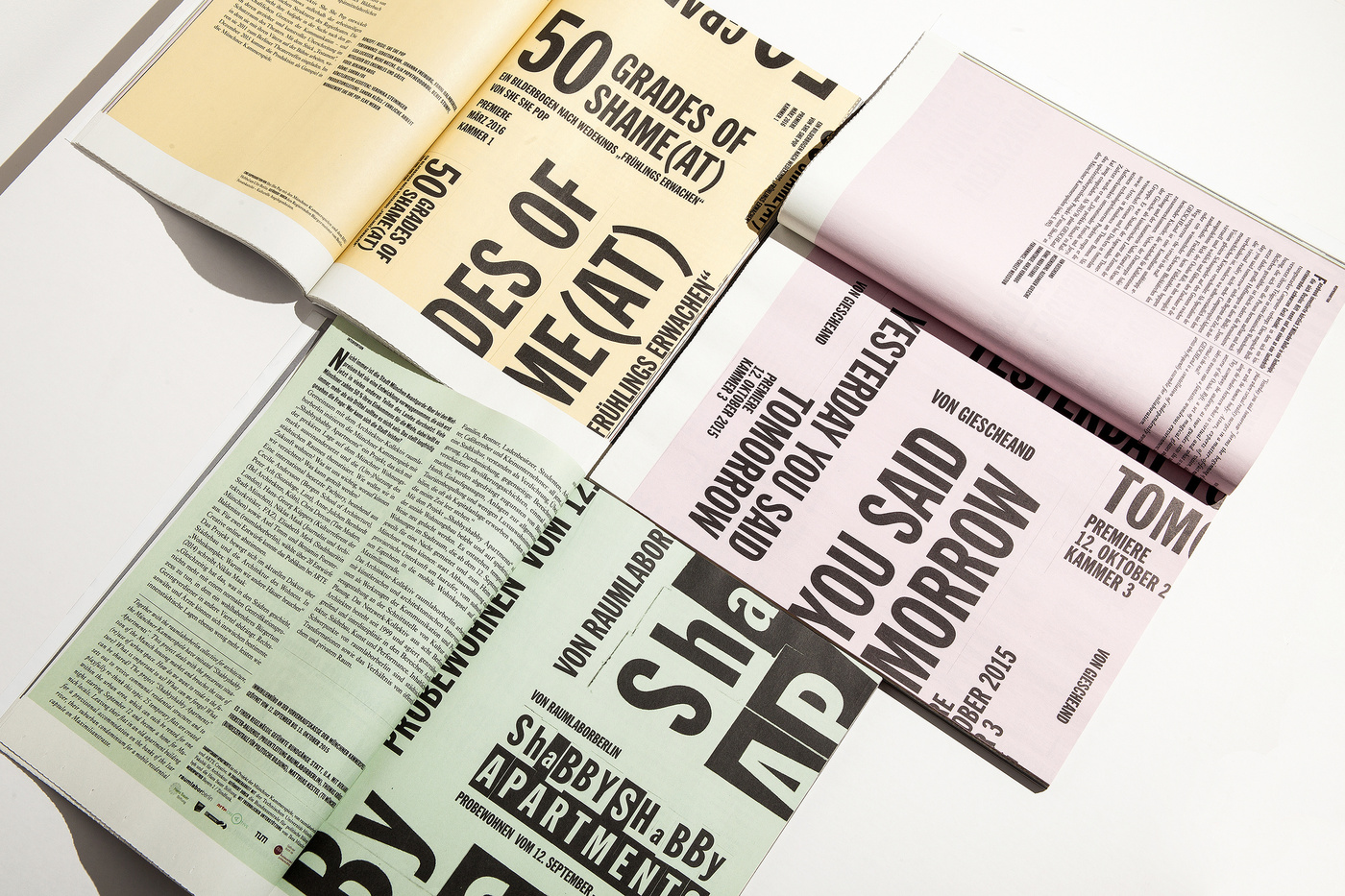
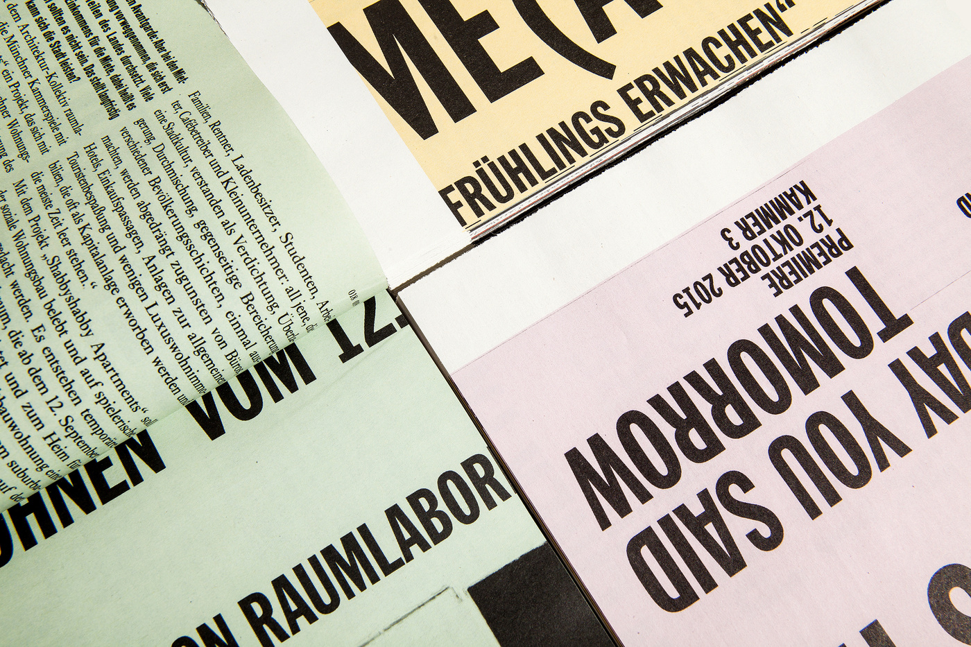
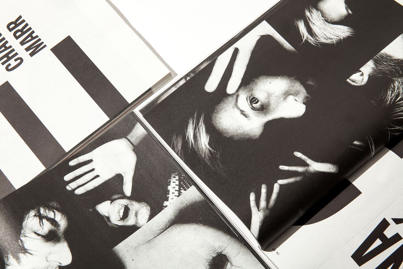
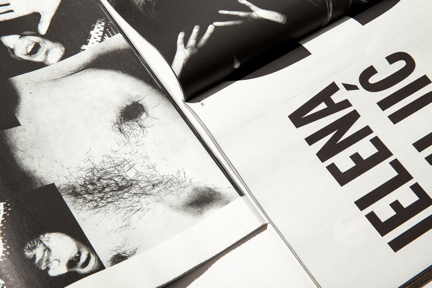
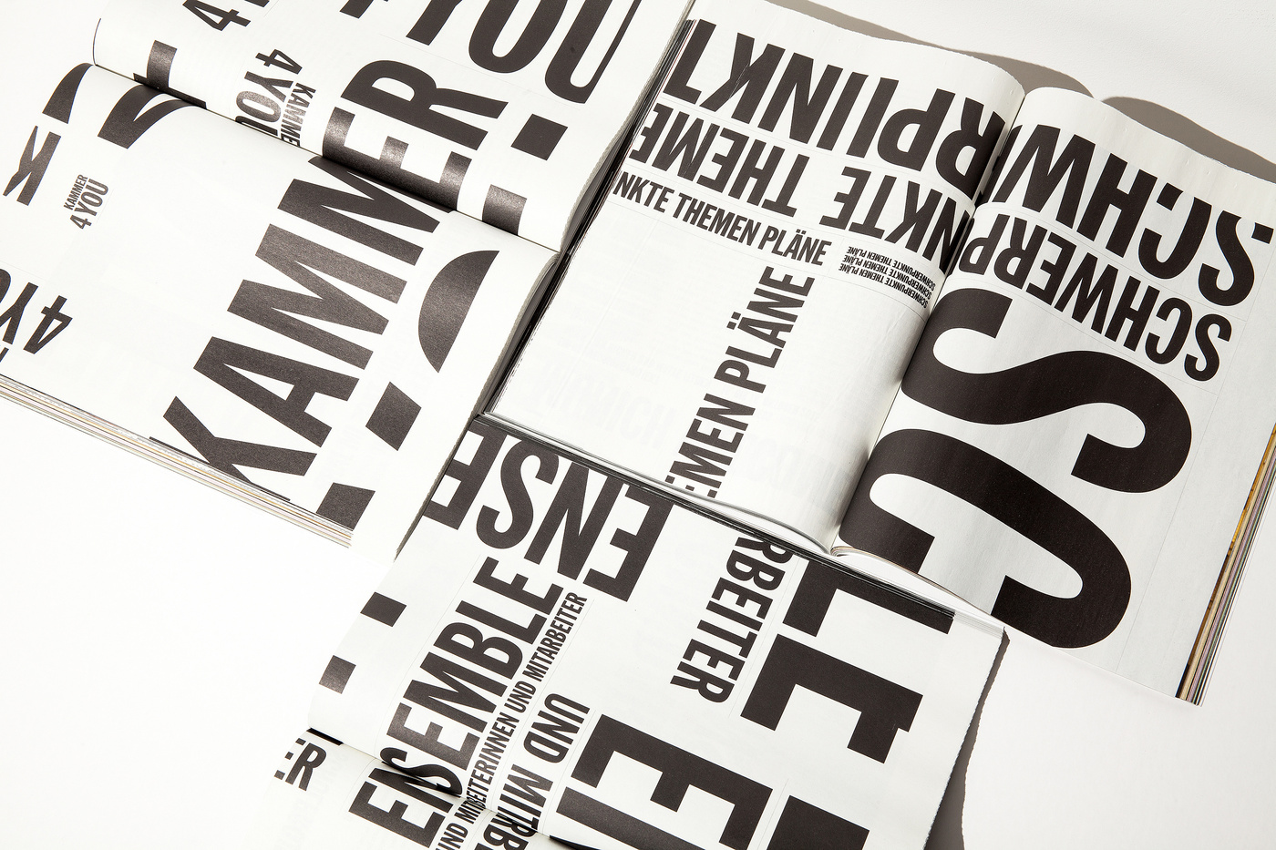
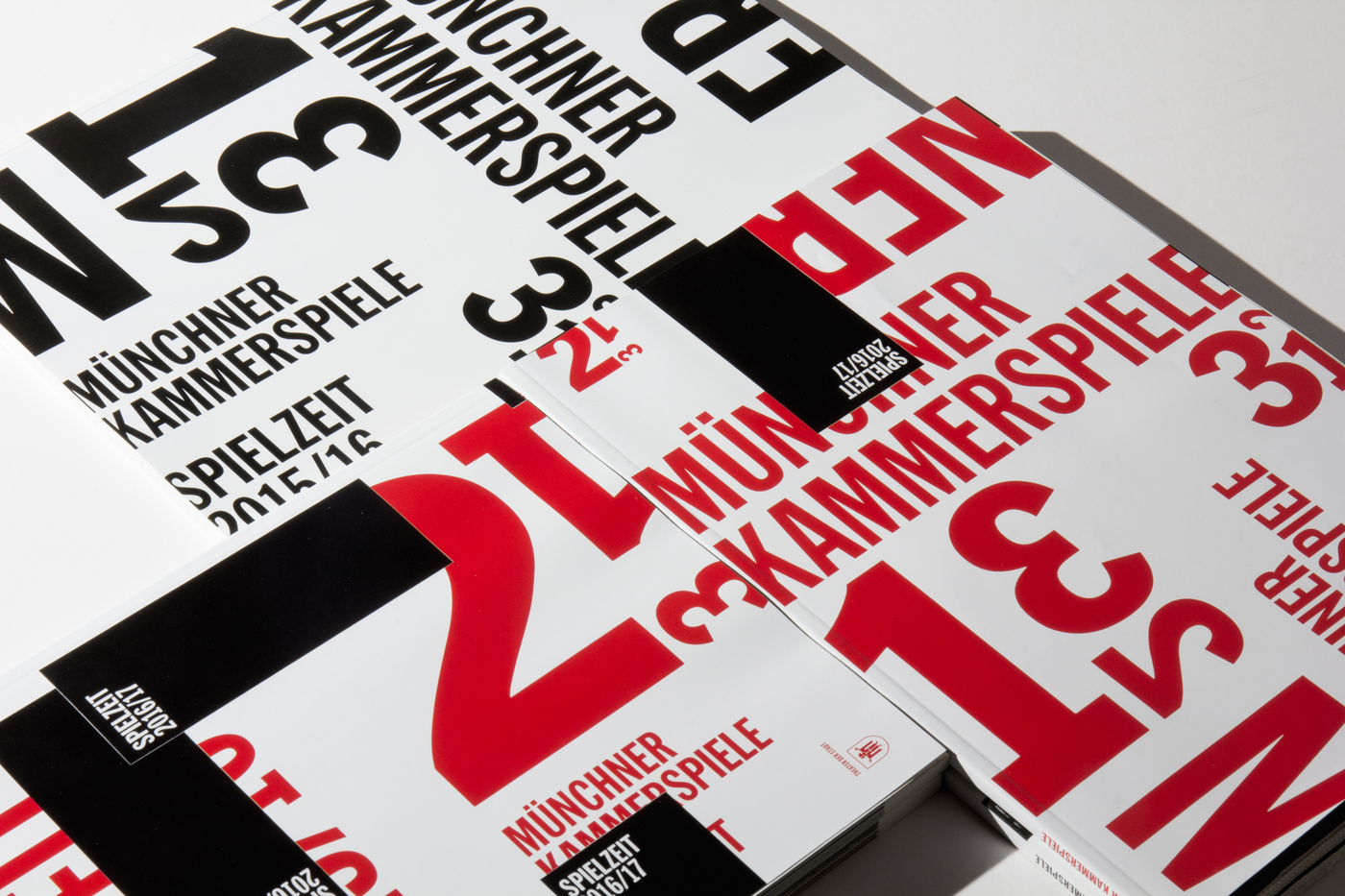
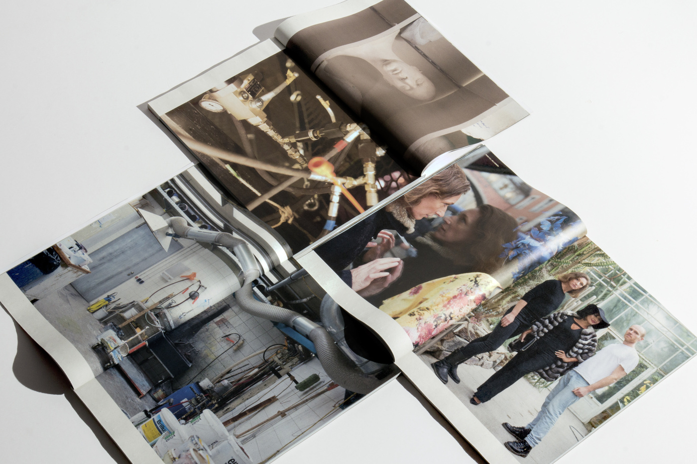
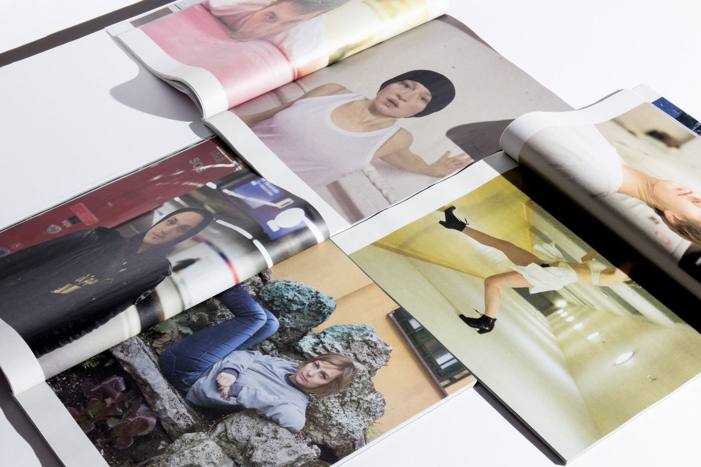
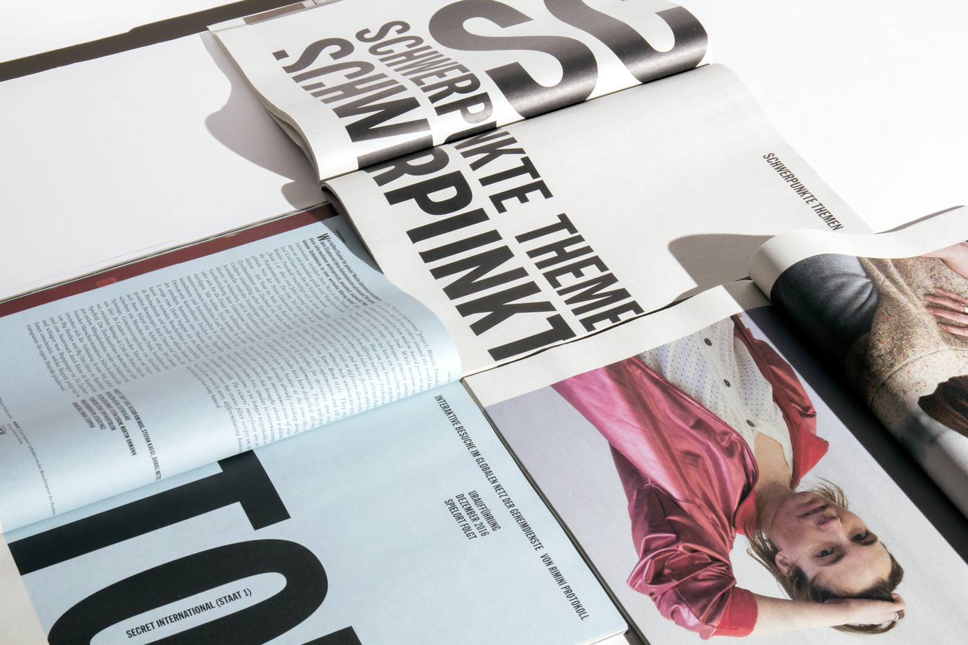
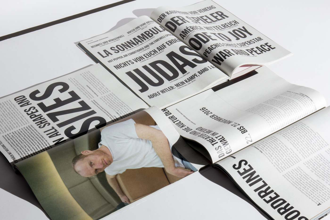
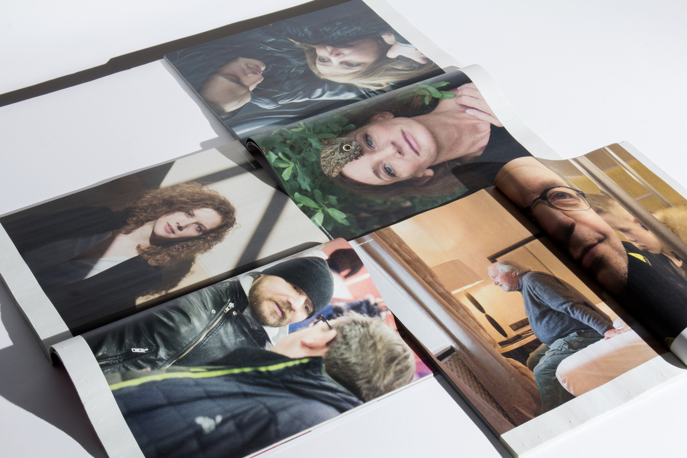
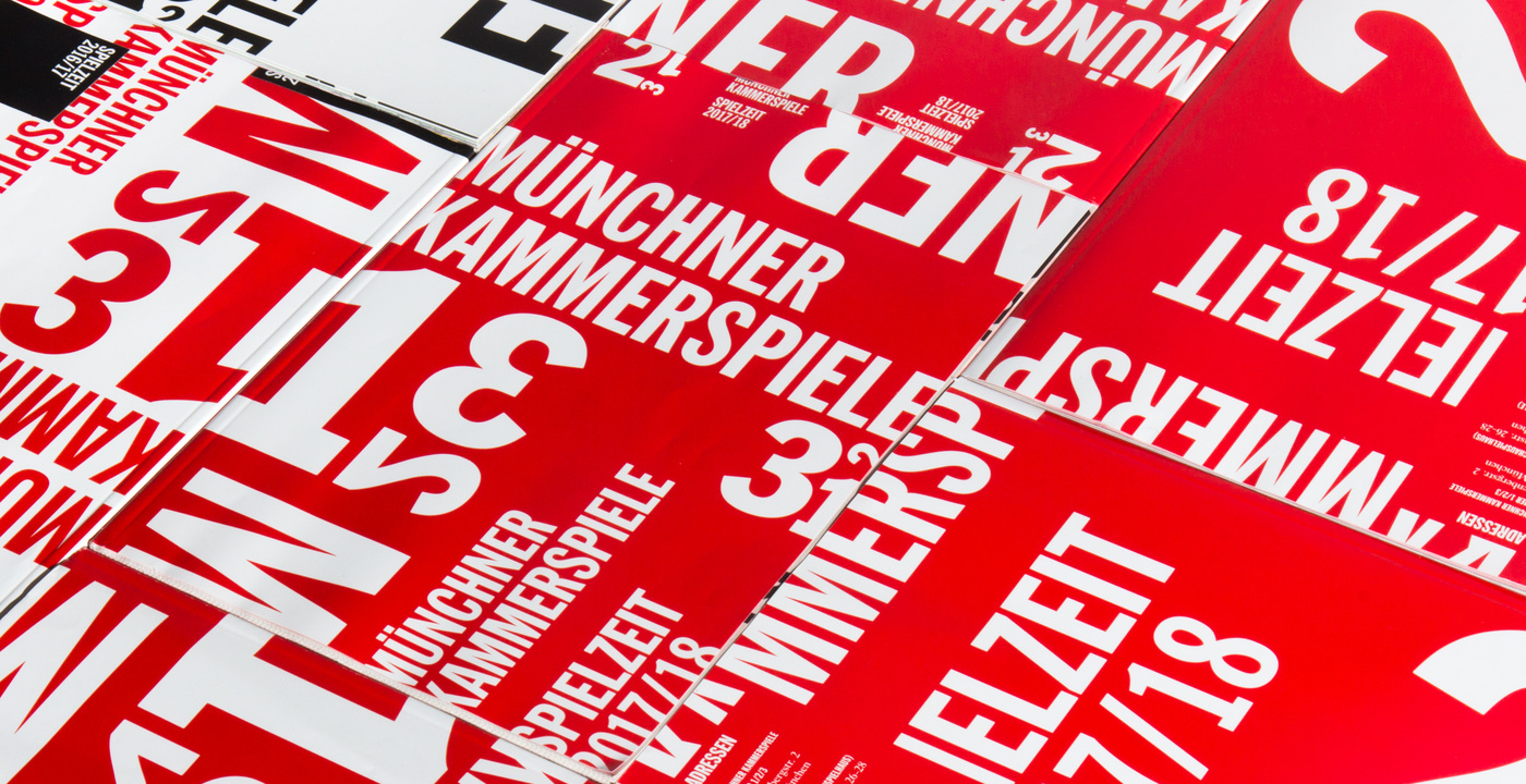
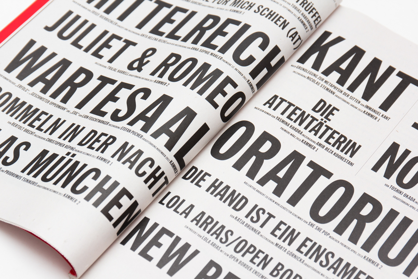
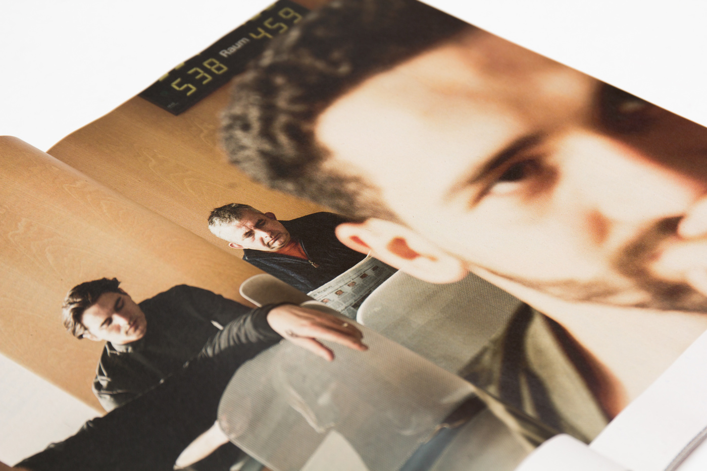
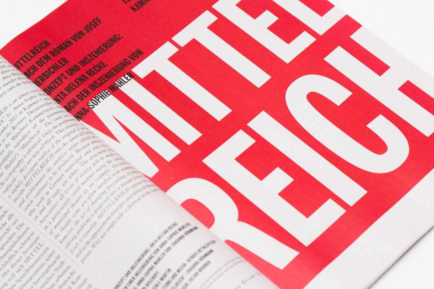
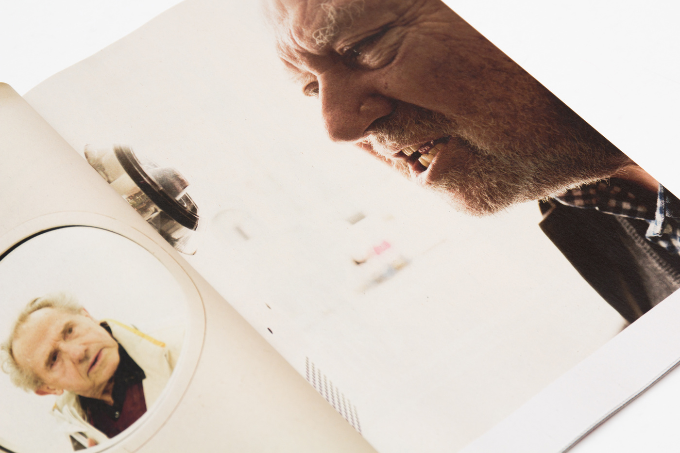
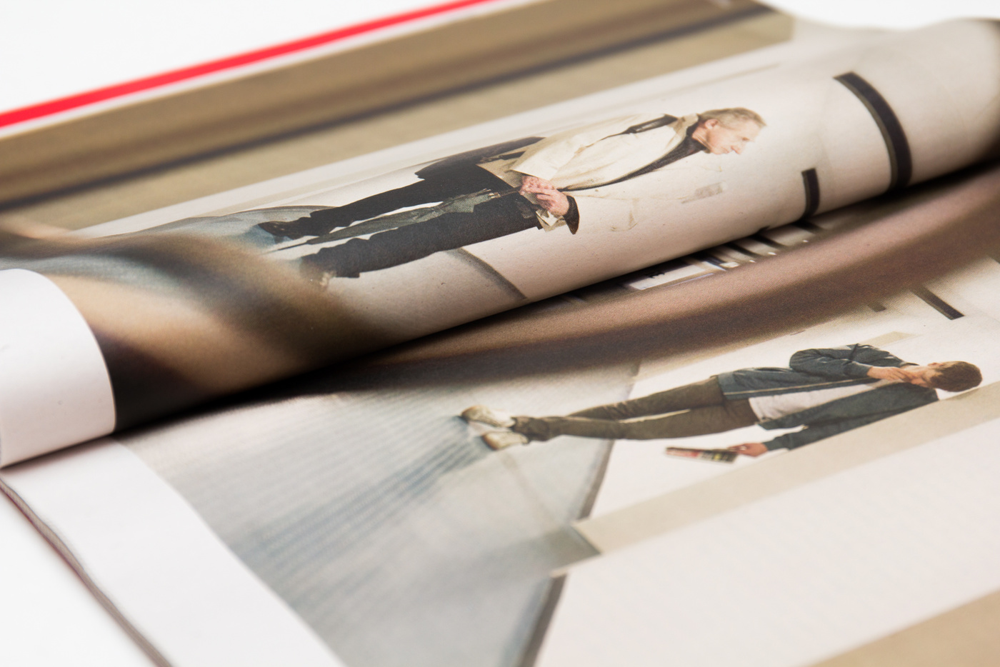
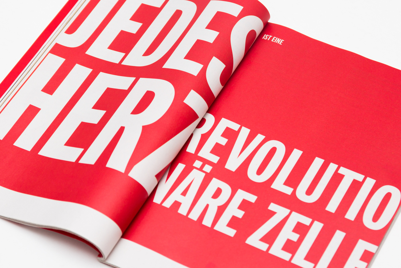
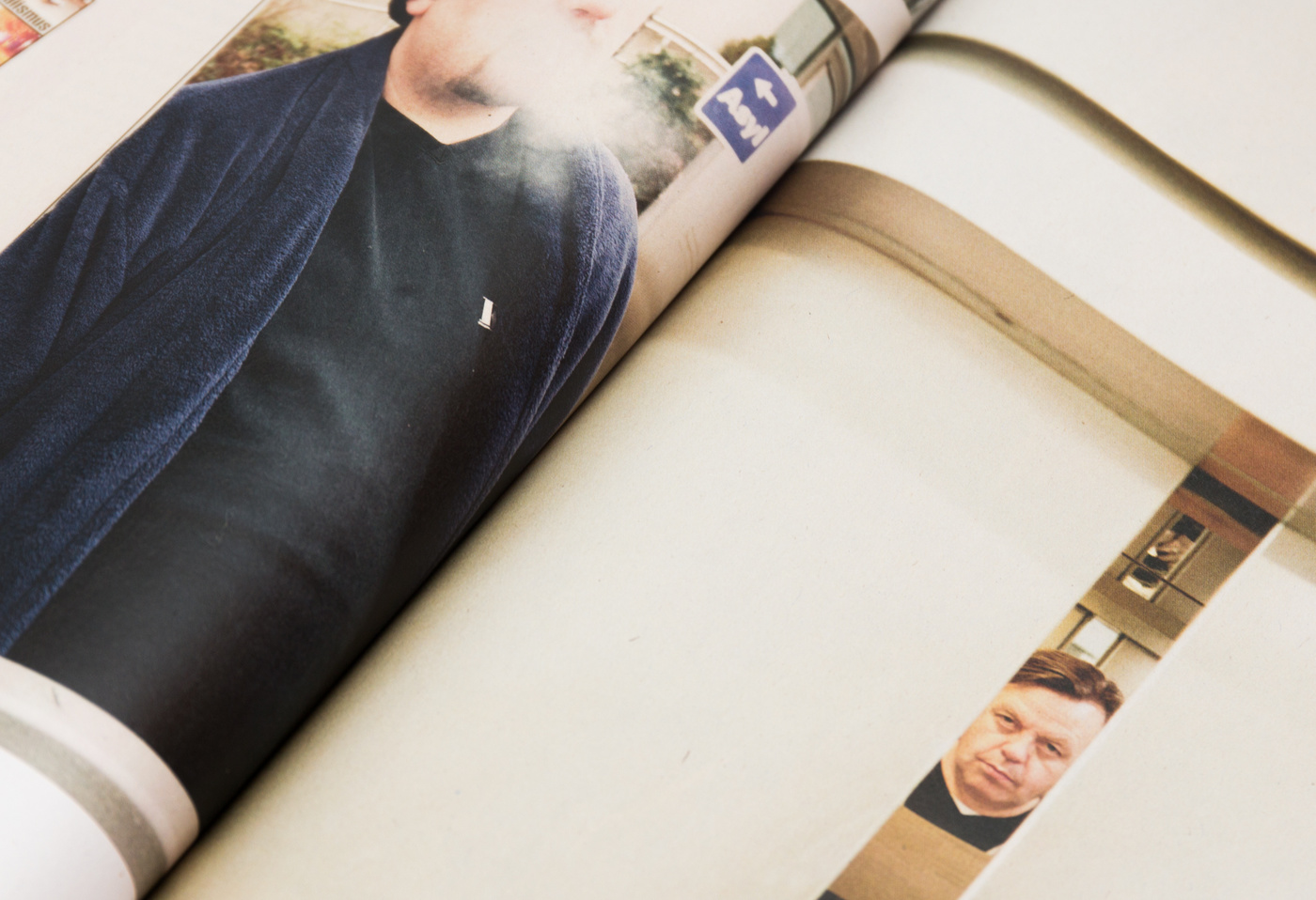
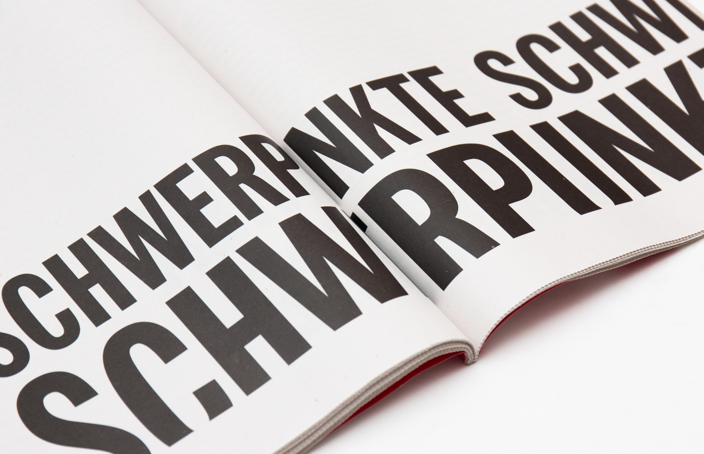
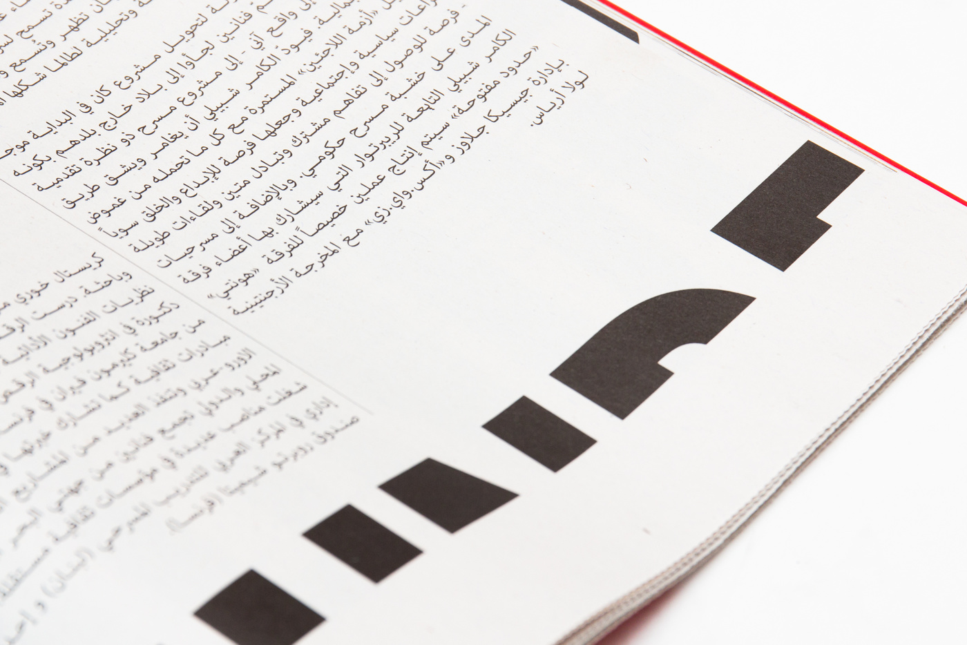
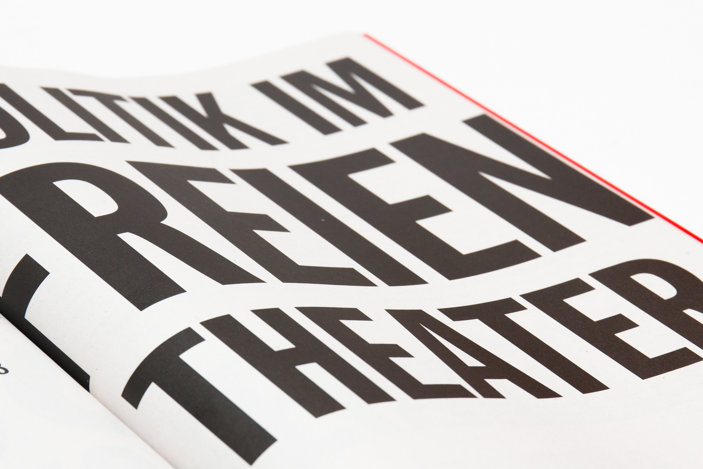
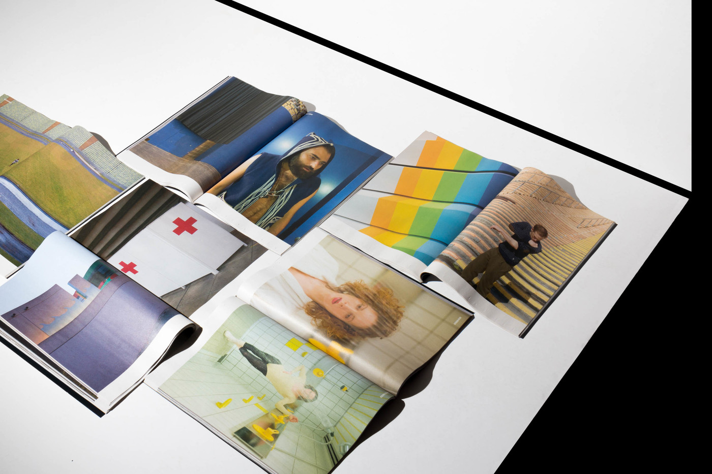
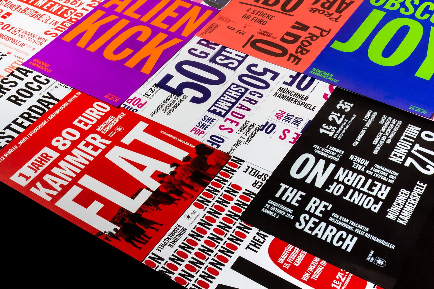
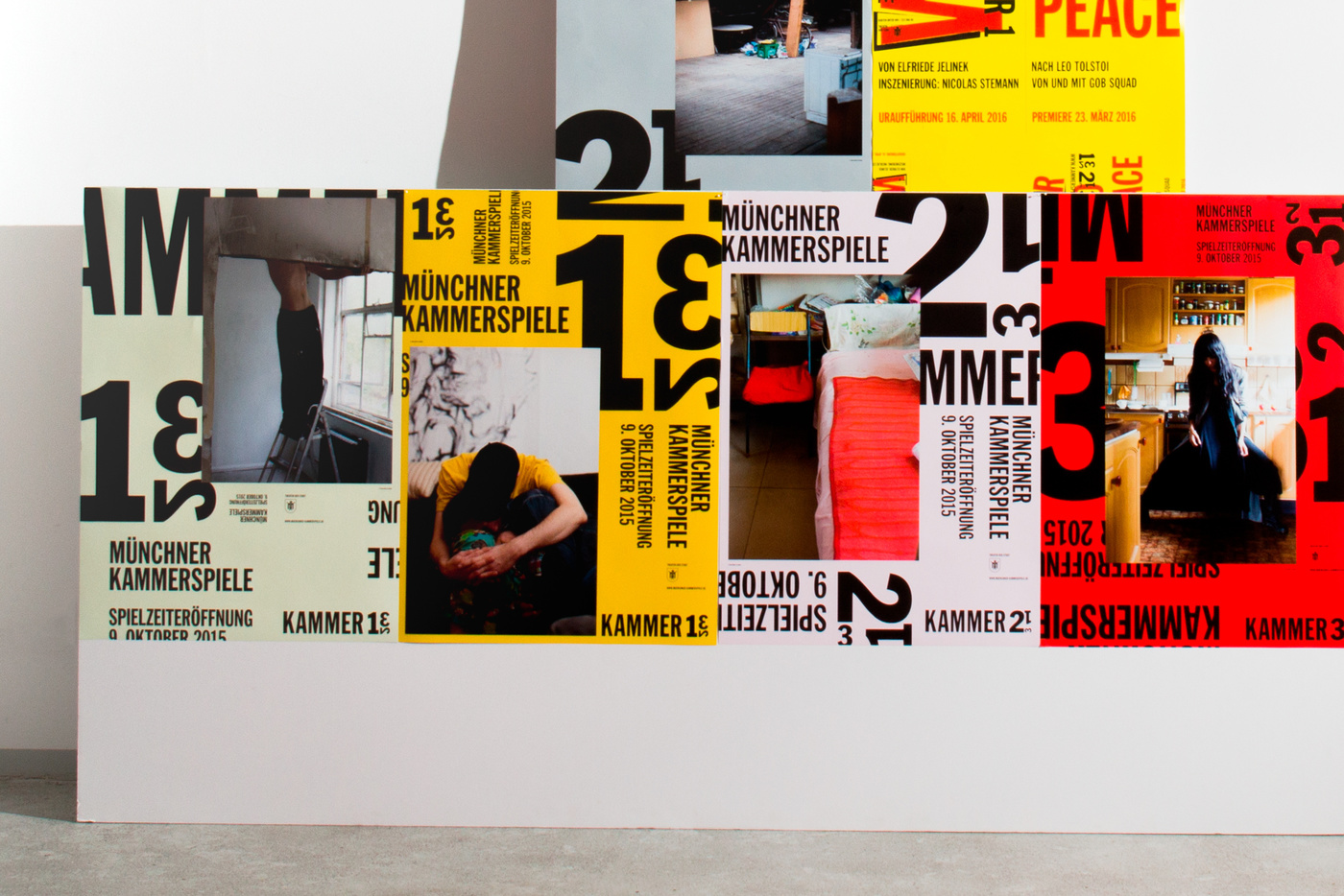
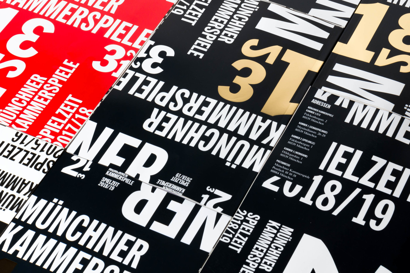
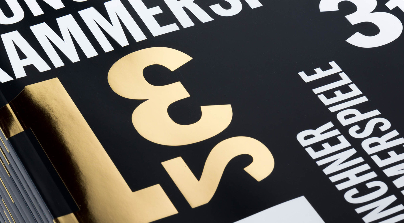
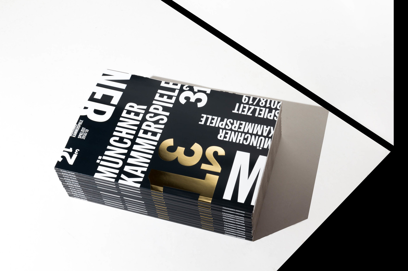
- This lead us to the idea of a very free interpretation of compartment. Some of them, according to whom they belong, would always look different. Some are very messy, others are filled with neatly stacked boxes, and for some the owner lost the keys for. This is what we took as an starting point for the logo Kammer 1, Kammer 2 and Kammer 3, it’s over and over the same digits but combined in multiple ways. With it came a new font, and many many variations for every handcrafted poster, since acting is a real craft. For us it was then necessary to involve one of the most respected art photographers in the world. We asked the Turner Prize winner Wolfgang Tillmans to go through his archives and dig out images he would identify or interprete as compatment images. And what a load of brilliant images he sent through.
Result
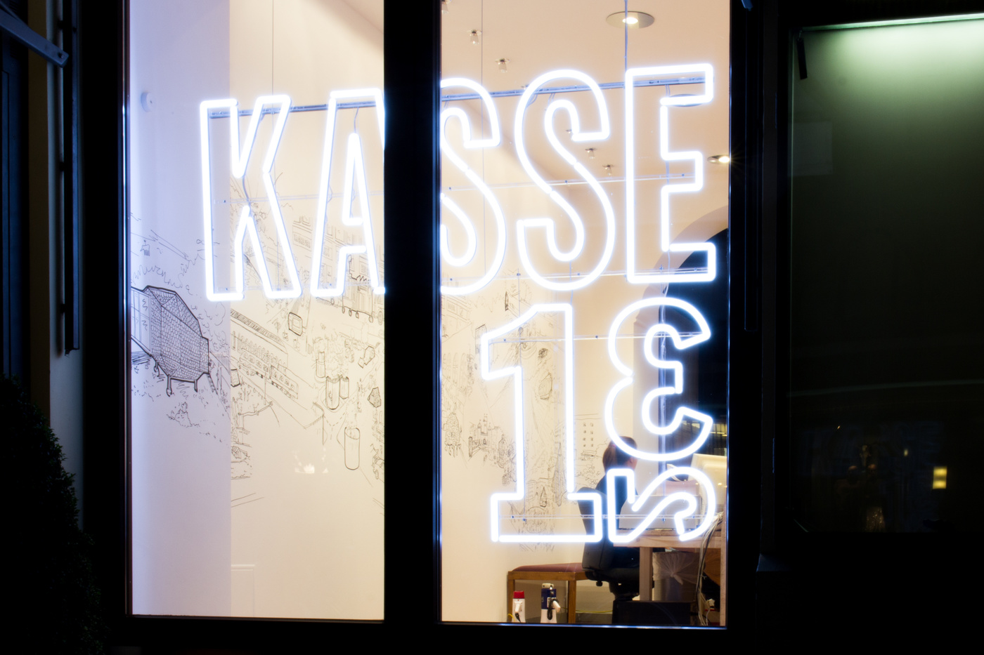
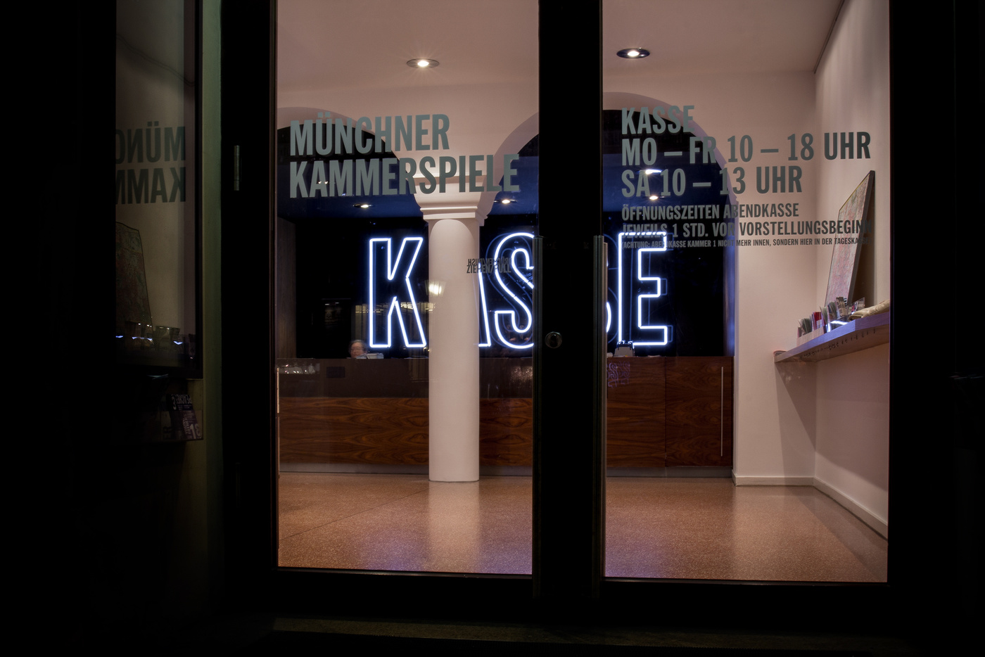
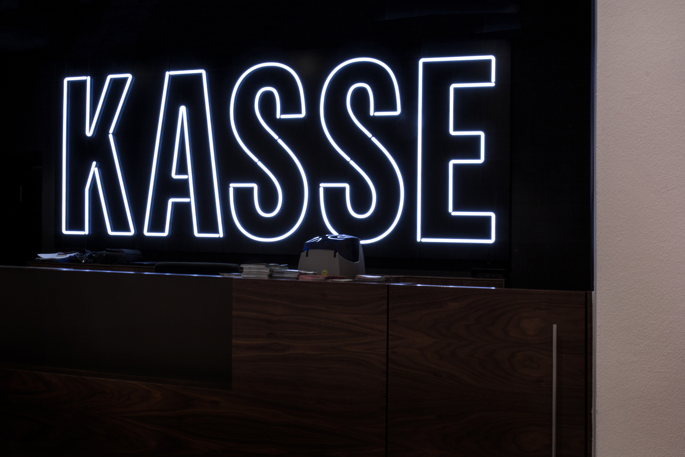
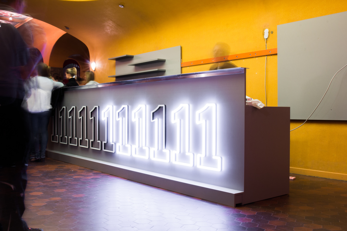
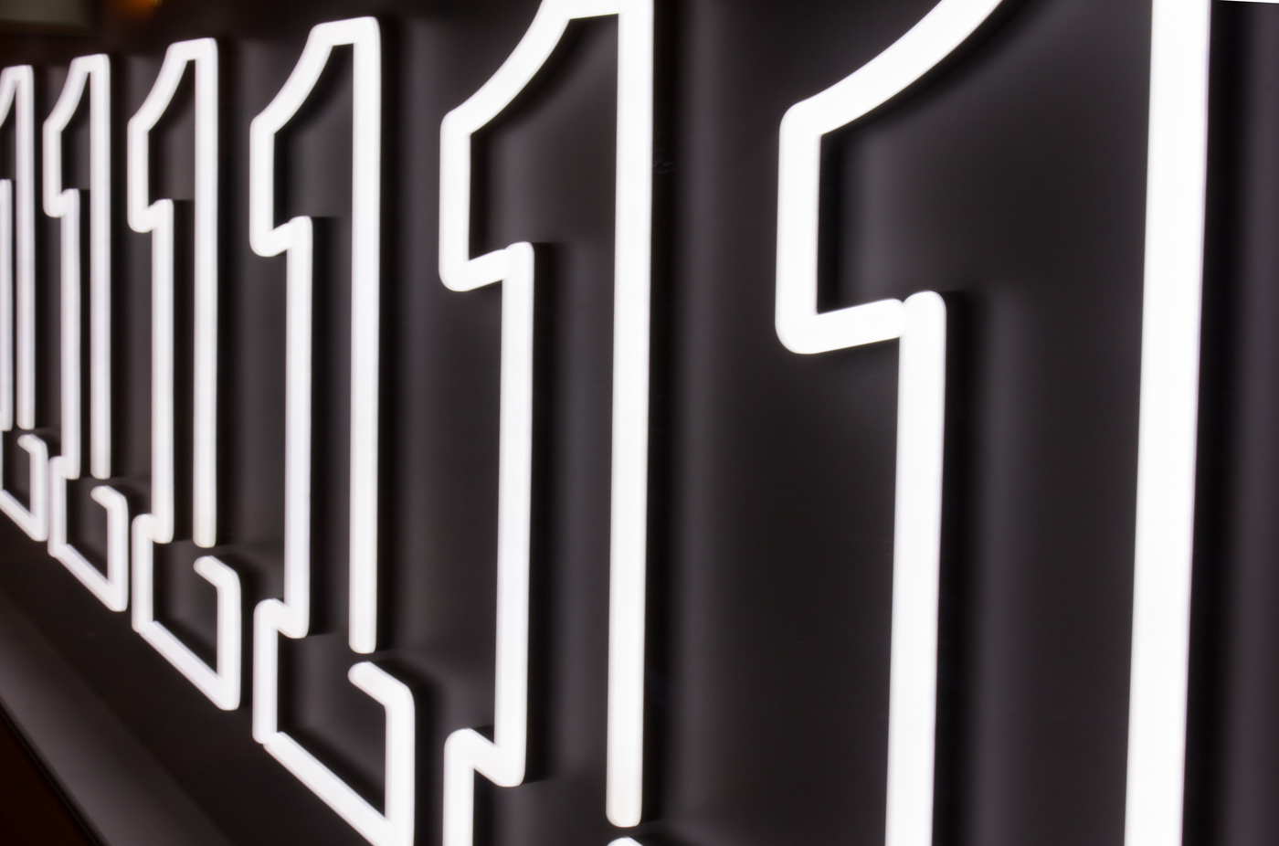
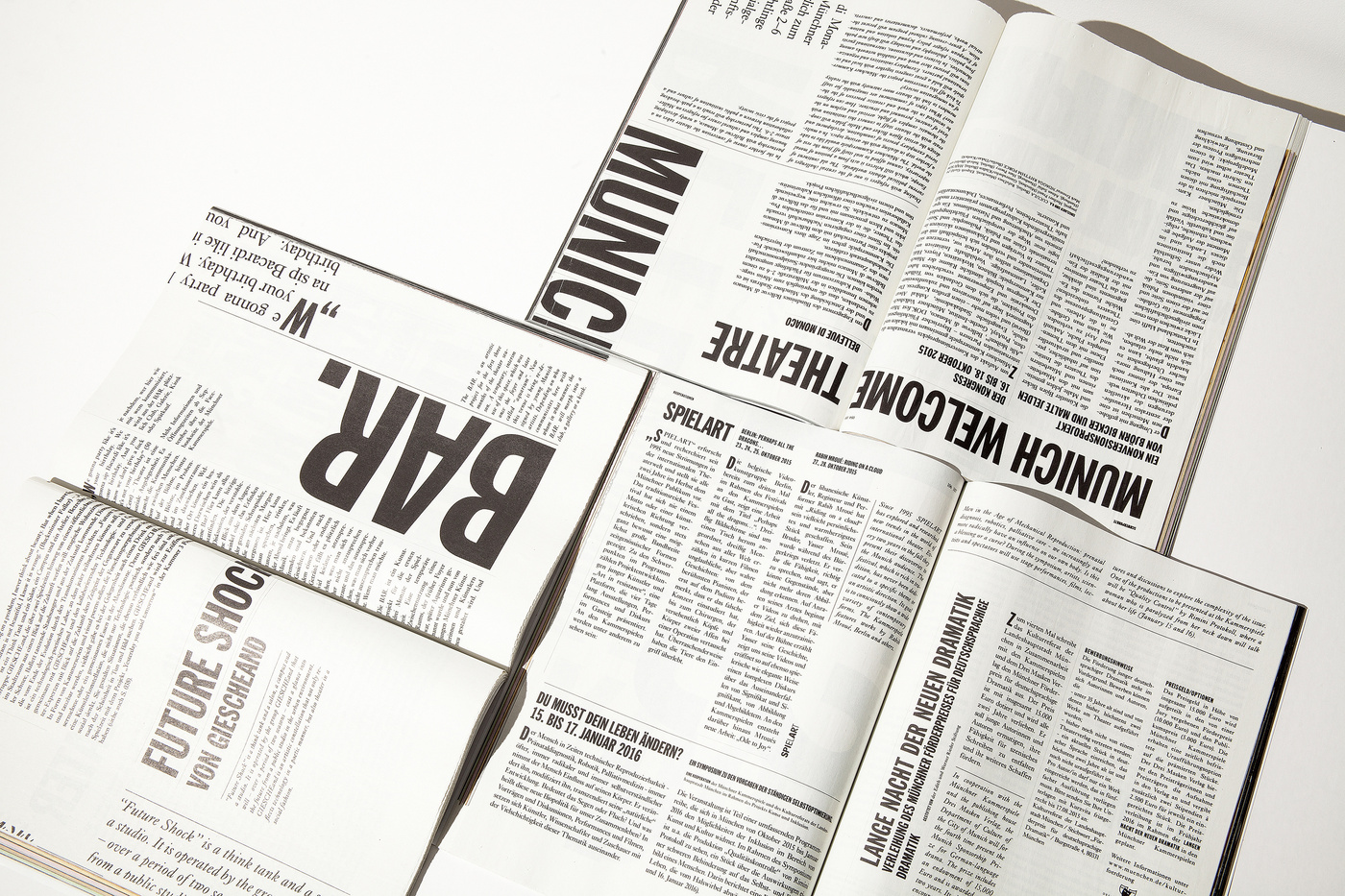
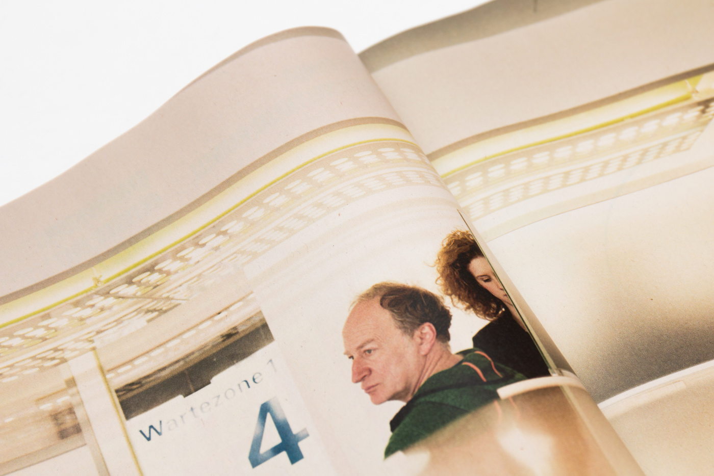
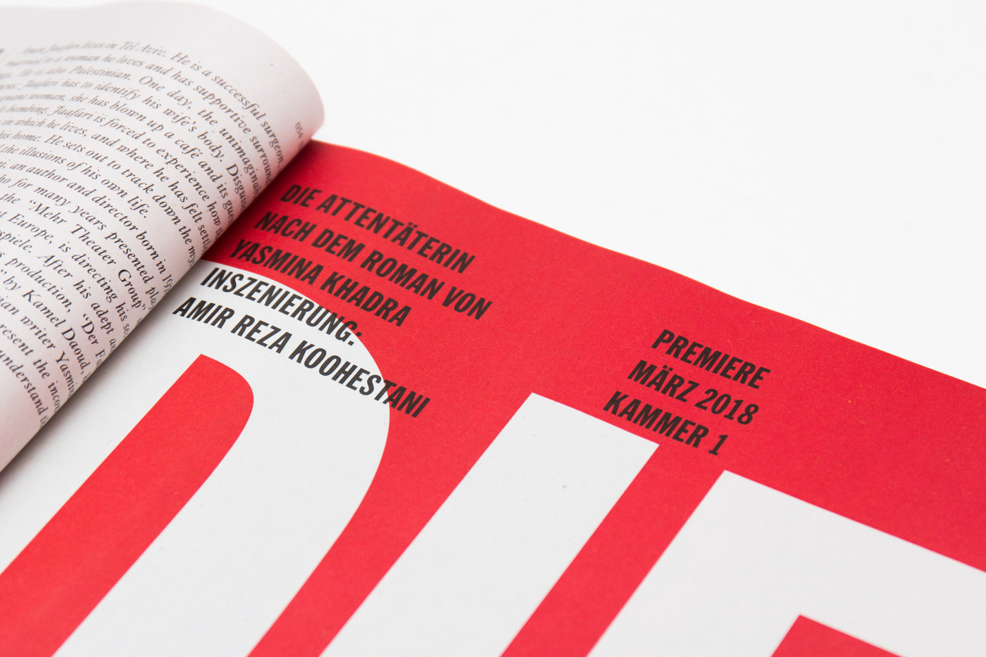
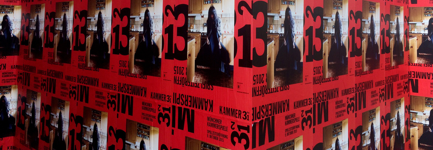
- An ever changing and yet similar, sometimes confusing and sometimes right in your face corporate was what we were aiming for. And we have reached our goal. A very significant change in the poster culture of Munich. Very easy to connect the dots for the visitors, signalling every single time THIS IS NEW. We did the same to the online presence of the Muenchner Kammerspiele, the season magazines, the banners, and everything else that needed to be renewed - down to the guidance system and bar in the foyer of the KAMMER 1.
3 2 1 – Munich, here we come
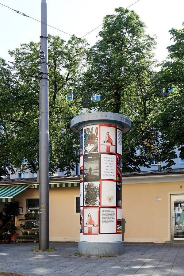
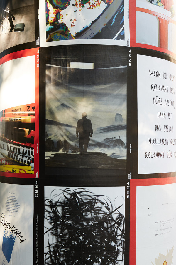
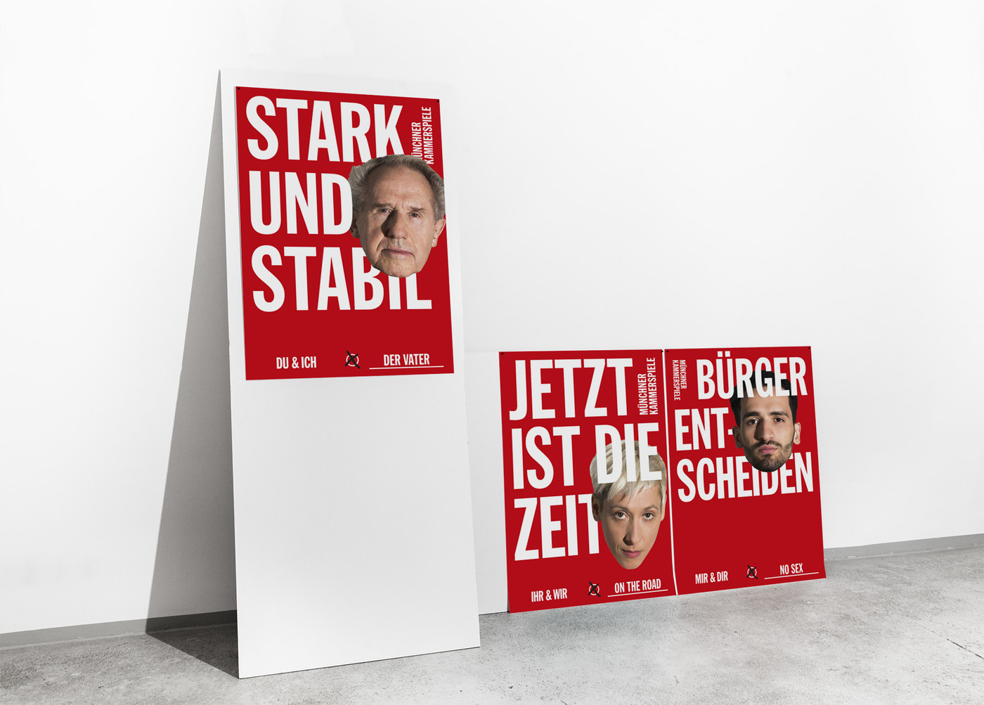
Muenchner KammerspieleThe first posters of the campaign for the all new Münchner Kammerspiele are up on the walls around Munich. We’re so happy, Wolfgang Tillmans liked our new coporate for the theatre and we could collaborate with him to develop this campaign. There are a lot more posters coming up with his interpretation of kammer (chamber) ... watch out ...
3 2 1 – Munich, here we come
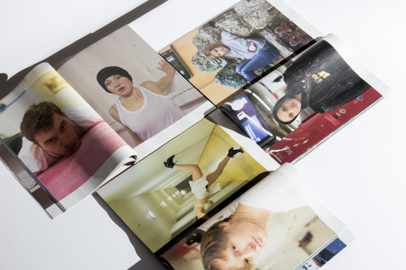
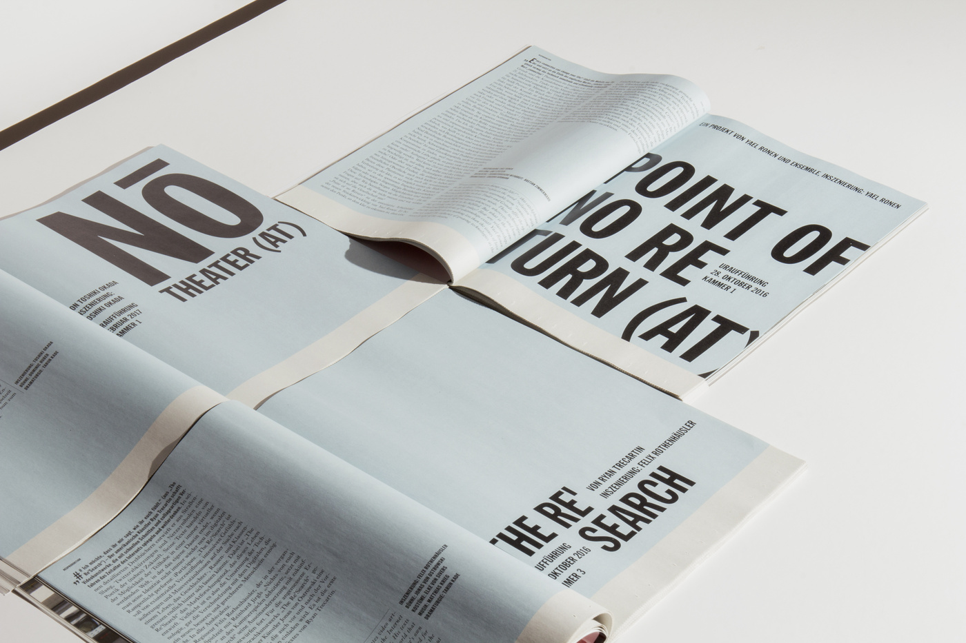
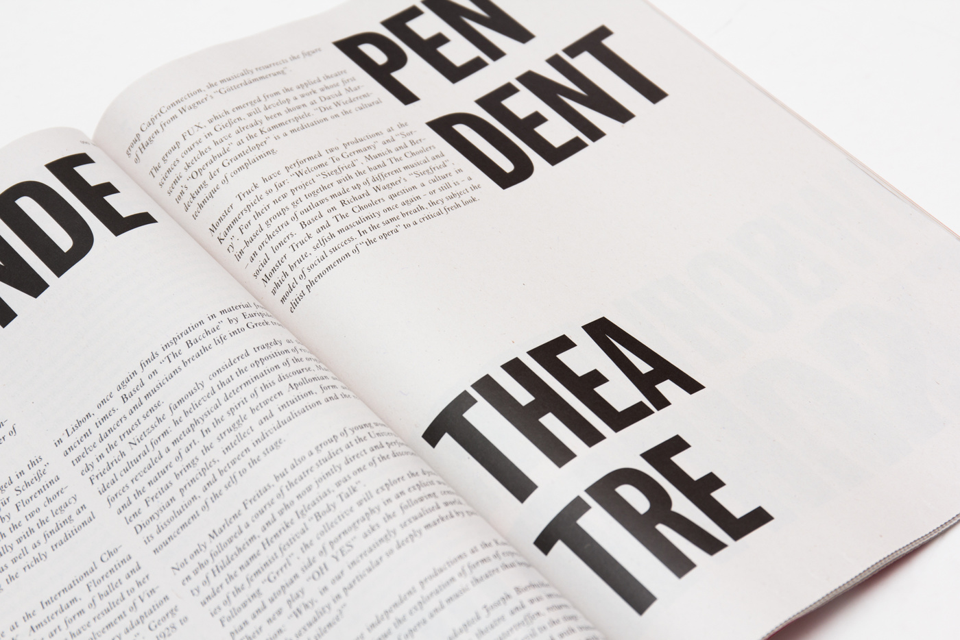
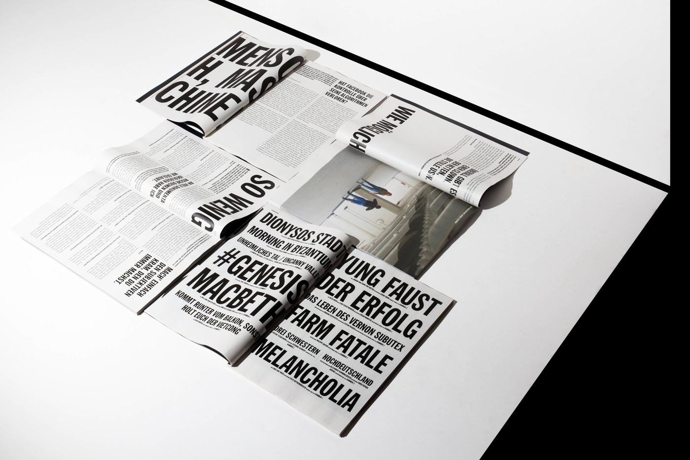
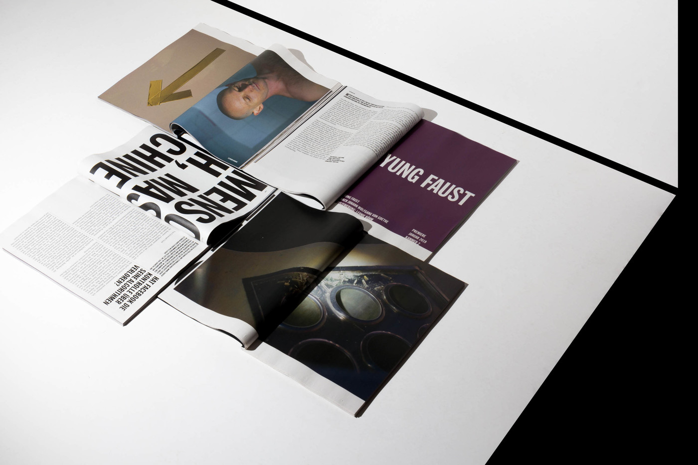
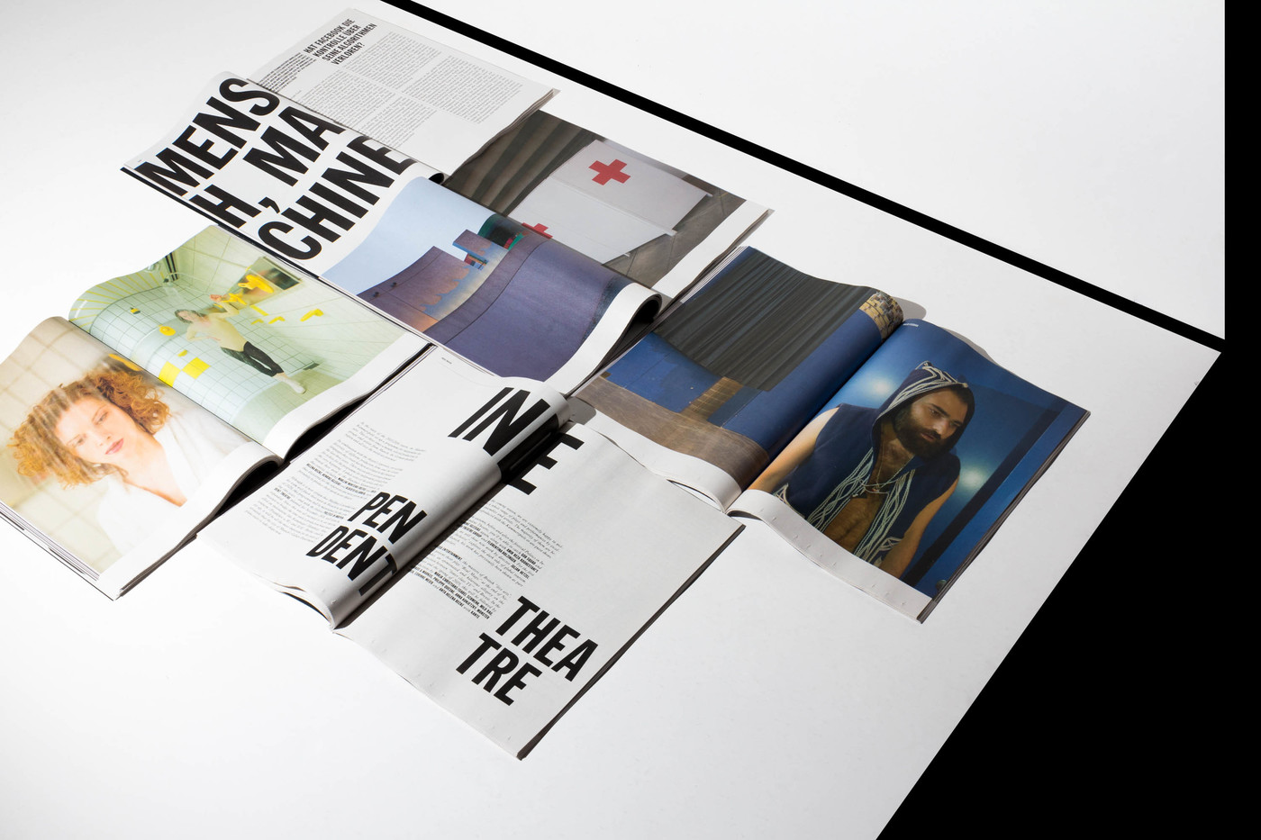
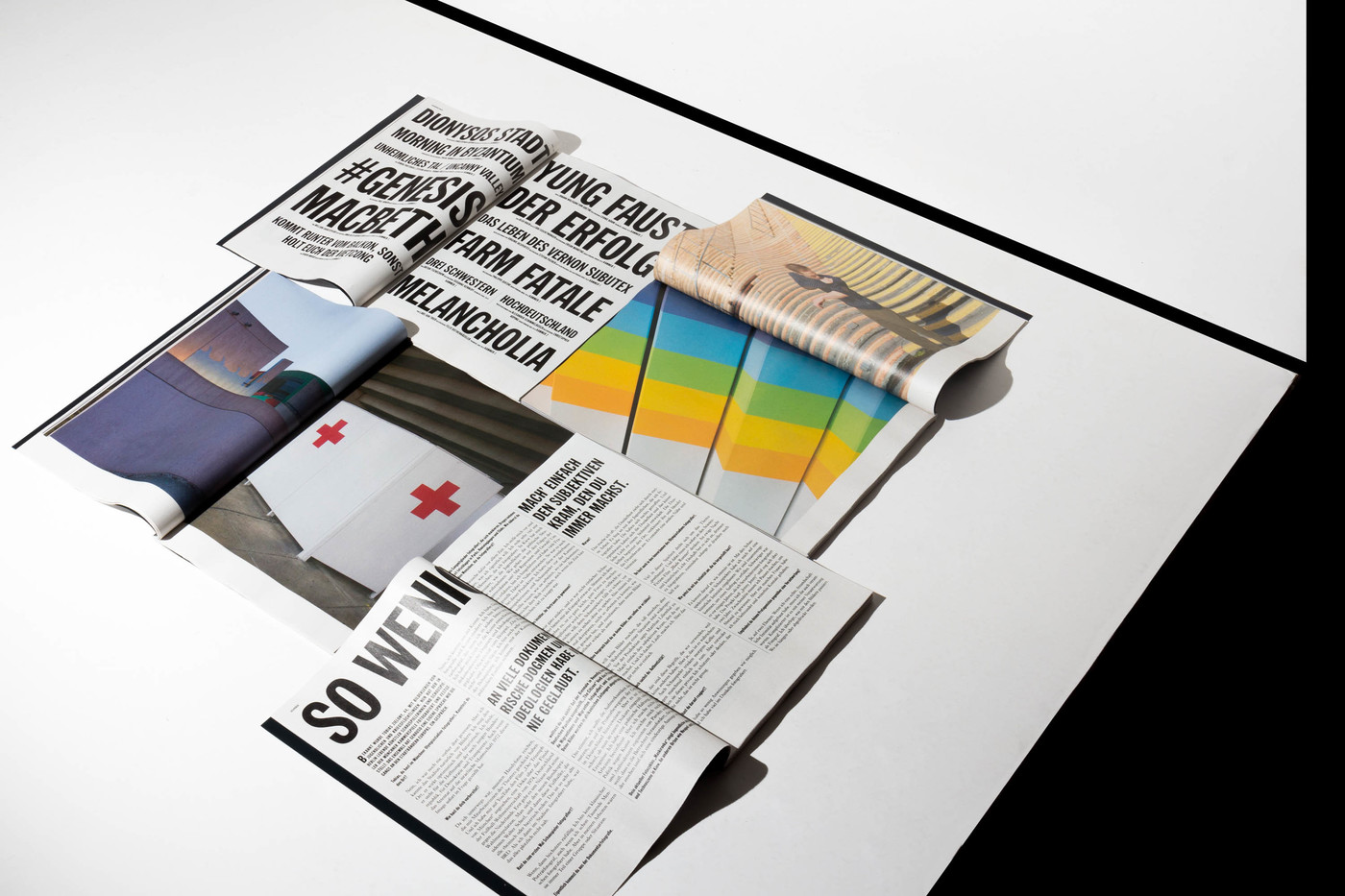
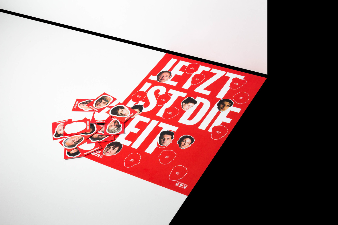
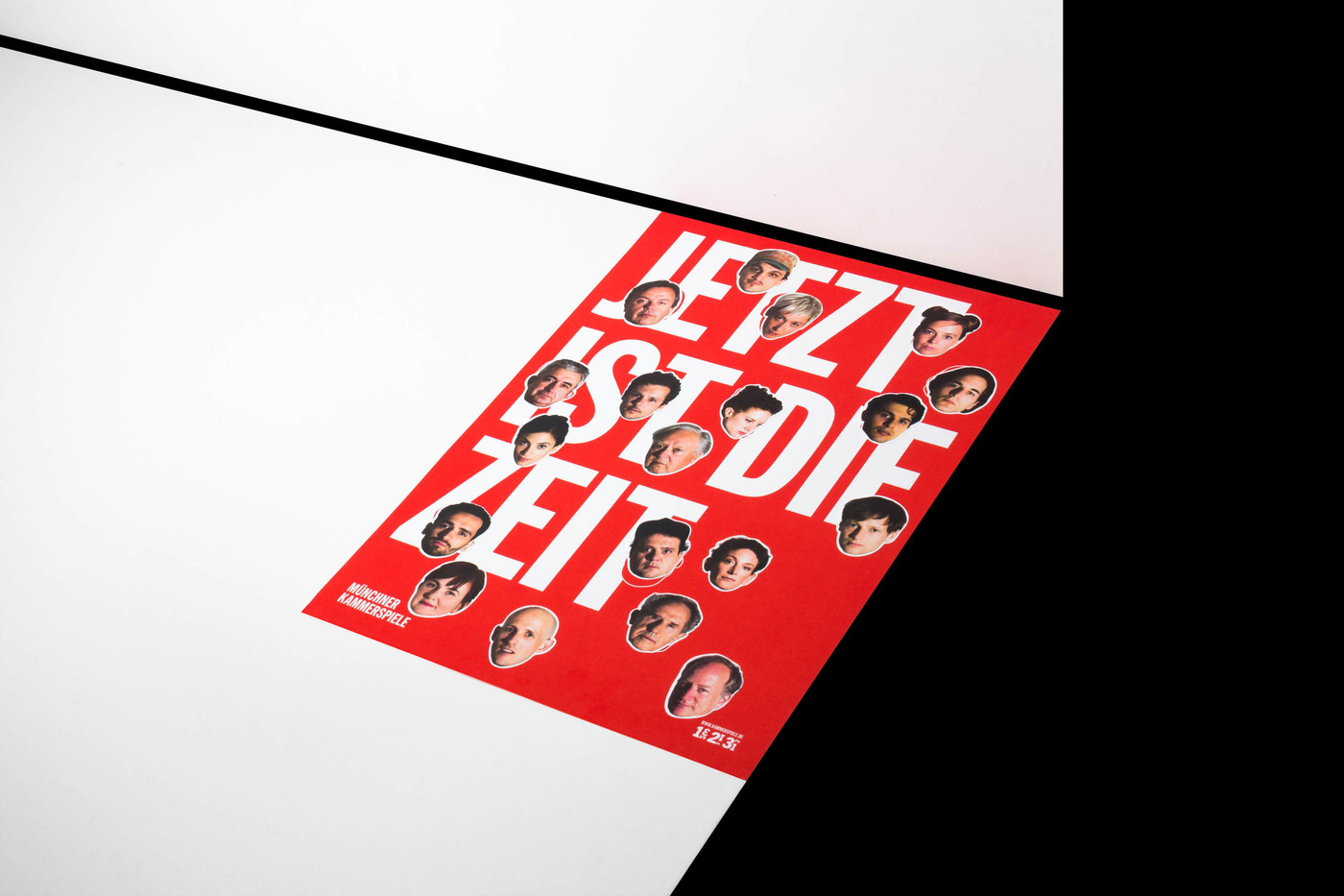
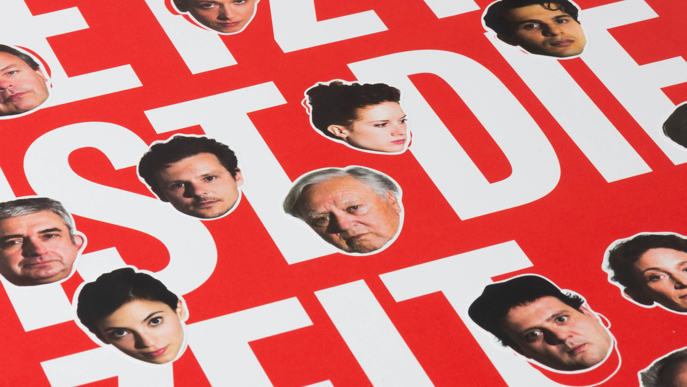
Muenchner KammerspieleThere are so many levels we are working on for the Muenchner Kammerspiele it is really difficult to decide where to start, it’s a new logo, a new general design direction, campaign, season magazin with images taken by Wolfgang Tillmans, there’ll be a new guidance system, a redesigned entrance to the theatre, and so forth … but, first things first… From the coming theatre season (2015/2016) on Matthias Lilienthal, the fearless and most brutally honest theatre director we’ve ever met, is taking over the Muenchner Kammerspiele and will change the perception of the genre in Munich. Well, that’s what the audience is expecting getting him to move to Munich. And we’re proud to take part in this endeavor. An overhaul of the design was necessary which we carefully took on. First we thought of compartments in general. Is it a hiding place, is it a well sorted archive, is it a chaotic place one just throws in the things not needed anymore. This is what led us to the many design combinations this idea has to offer for the next couple of years. We are very excited what’s awaiting us and the audience next season and the season after that and the season after that ... For now we had the pleasure to work with Wolfgang Tillmans and his interpretation of KAMMER (compartment). His intriguing images of the non-intriguing, the incidental – they are just what we were looking for – are going into the season 2015/2016 magazine and are playing a major role for the campaign coming up in August. Plus we had the whole ensemble xeroxed as a counterpart to the high gloss Wolfgang Tillmans images. It is the actresses and actors doing their selfie the way we did it, and got almost fired for it, back in the days when working at ad agencies. Hello MUNICH – we can’t wait to meet you all. Muenchner Kammerspiele Season 2015/2016
Show me your compartment
– I will show you mine
3 2 1 – Munich, here we come
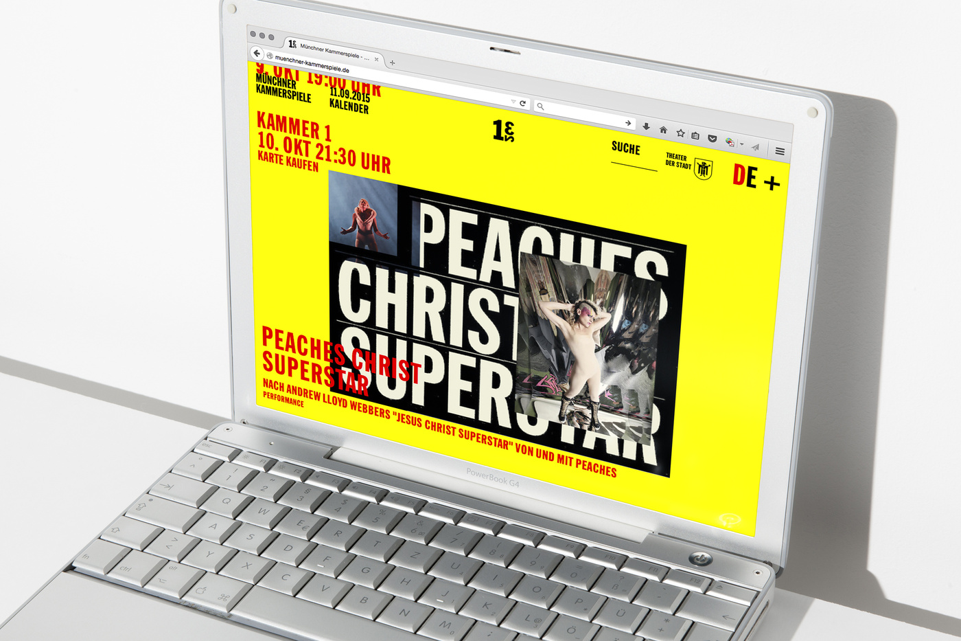
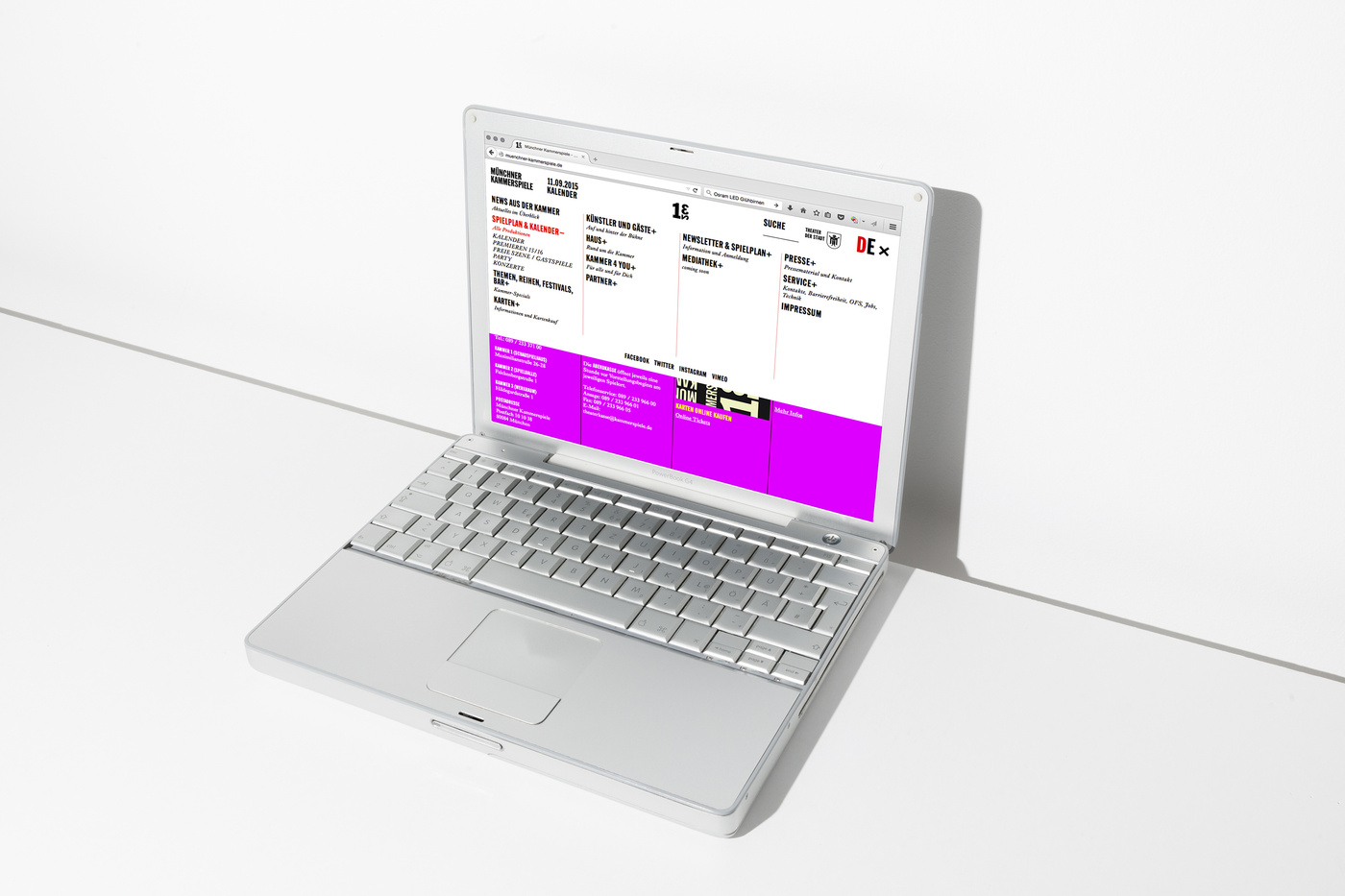
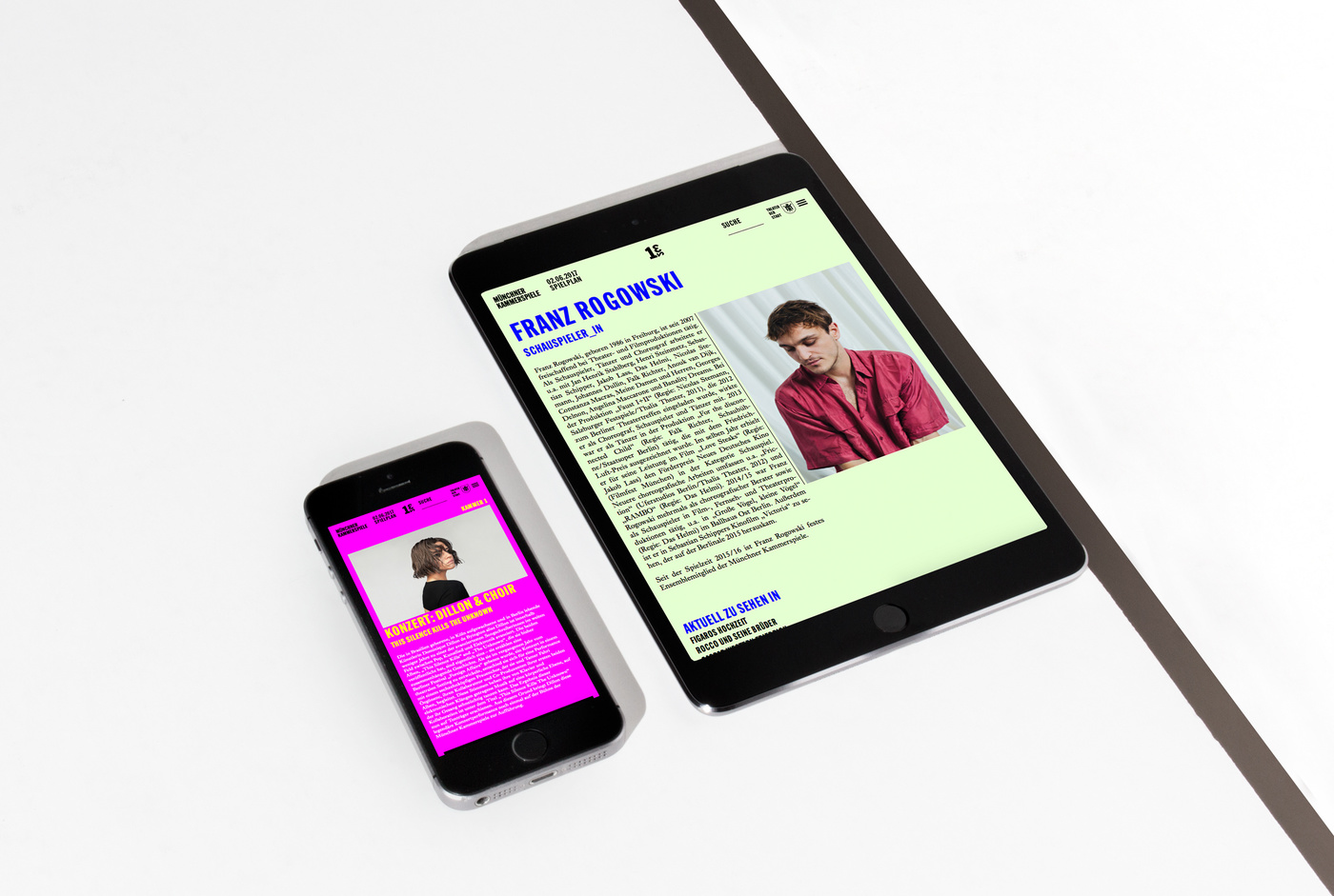
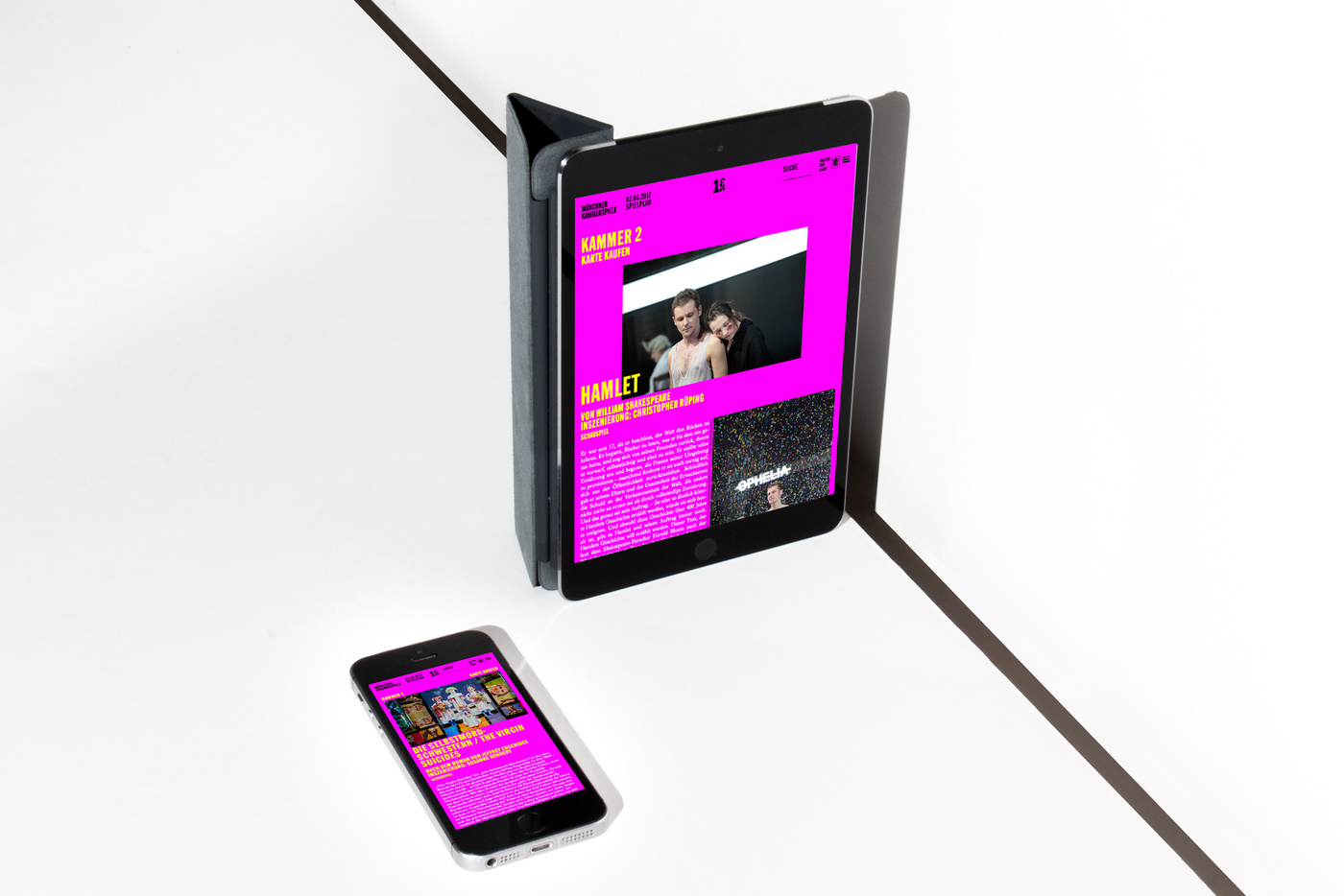
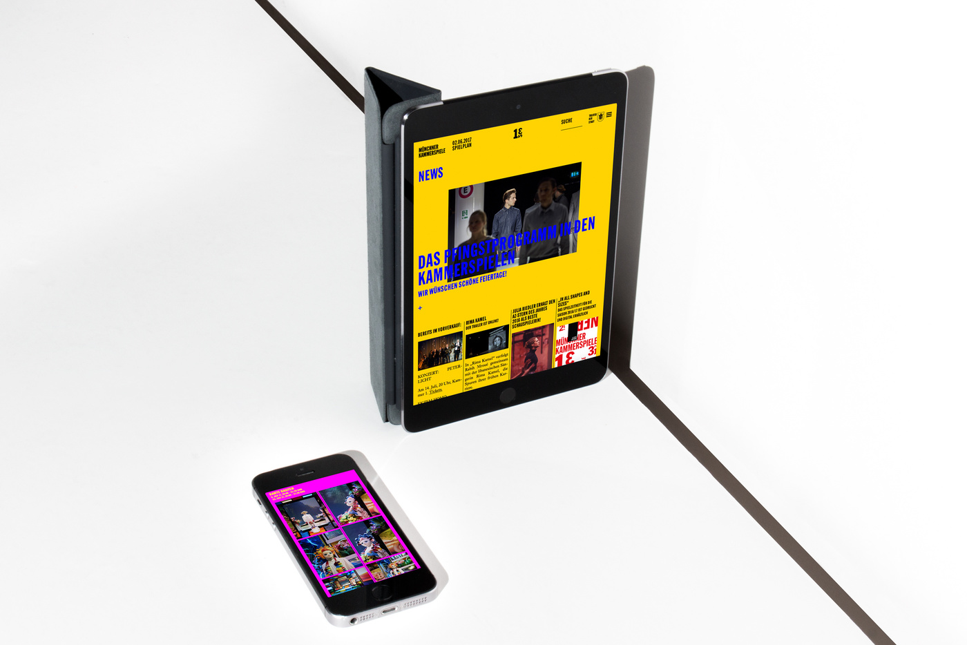
Muenchner KammerspieleCertainly, adding to all the printed matters, we have created the Muenchner Kammerspiele website. It’s all new, made to measure and very exciting since the coming season is going to be ramm-packed full of memorable stage plays and concerts... buy your tickets now HERE.
3 … 2… 1… KAMMER-ONLINE
3 2 1 – Munich, here we come
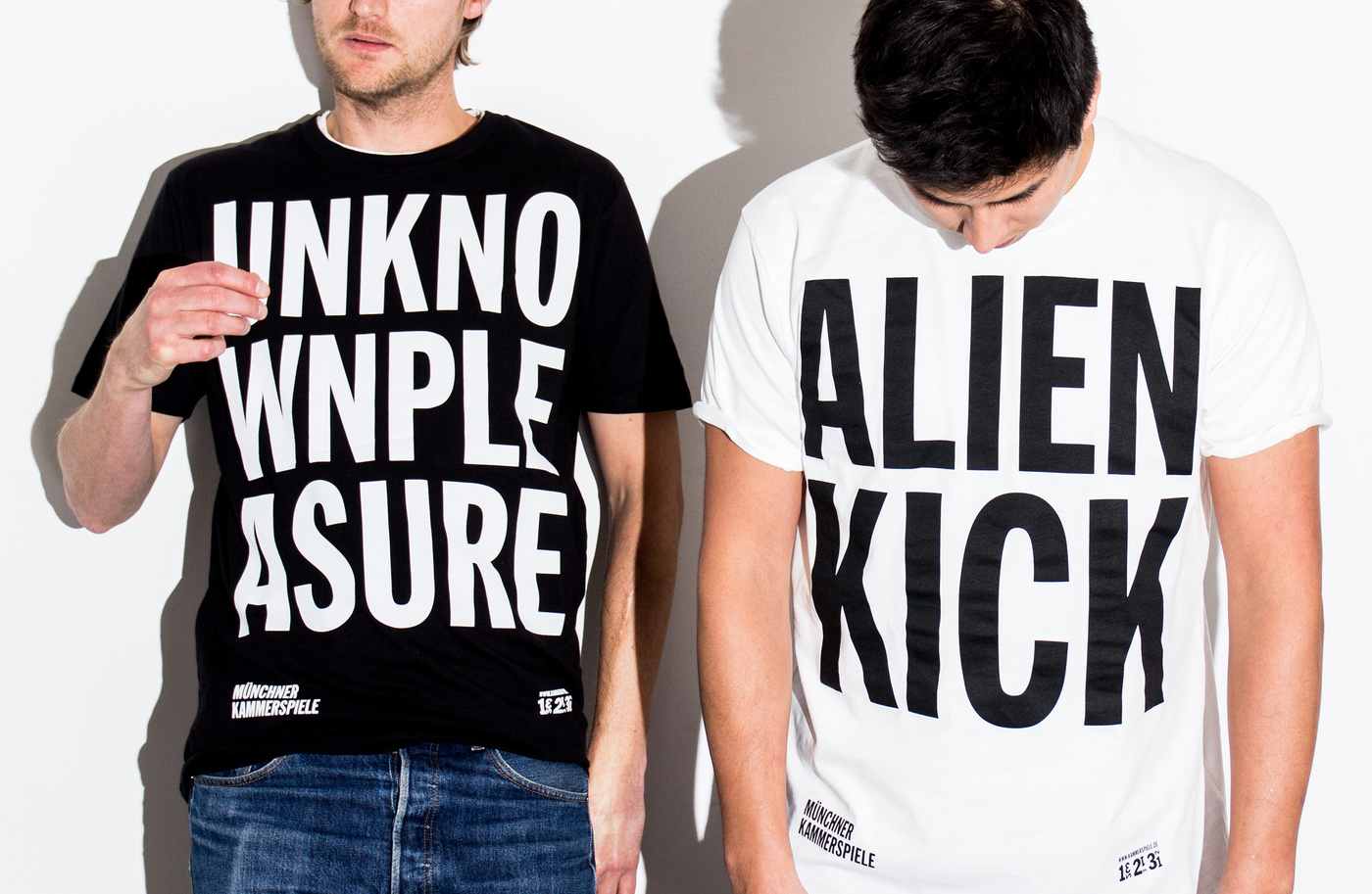
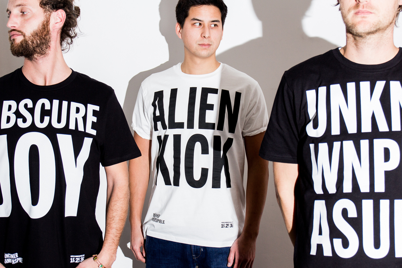
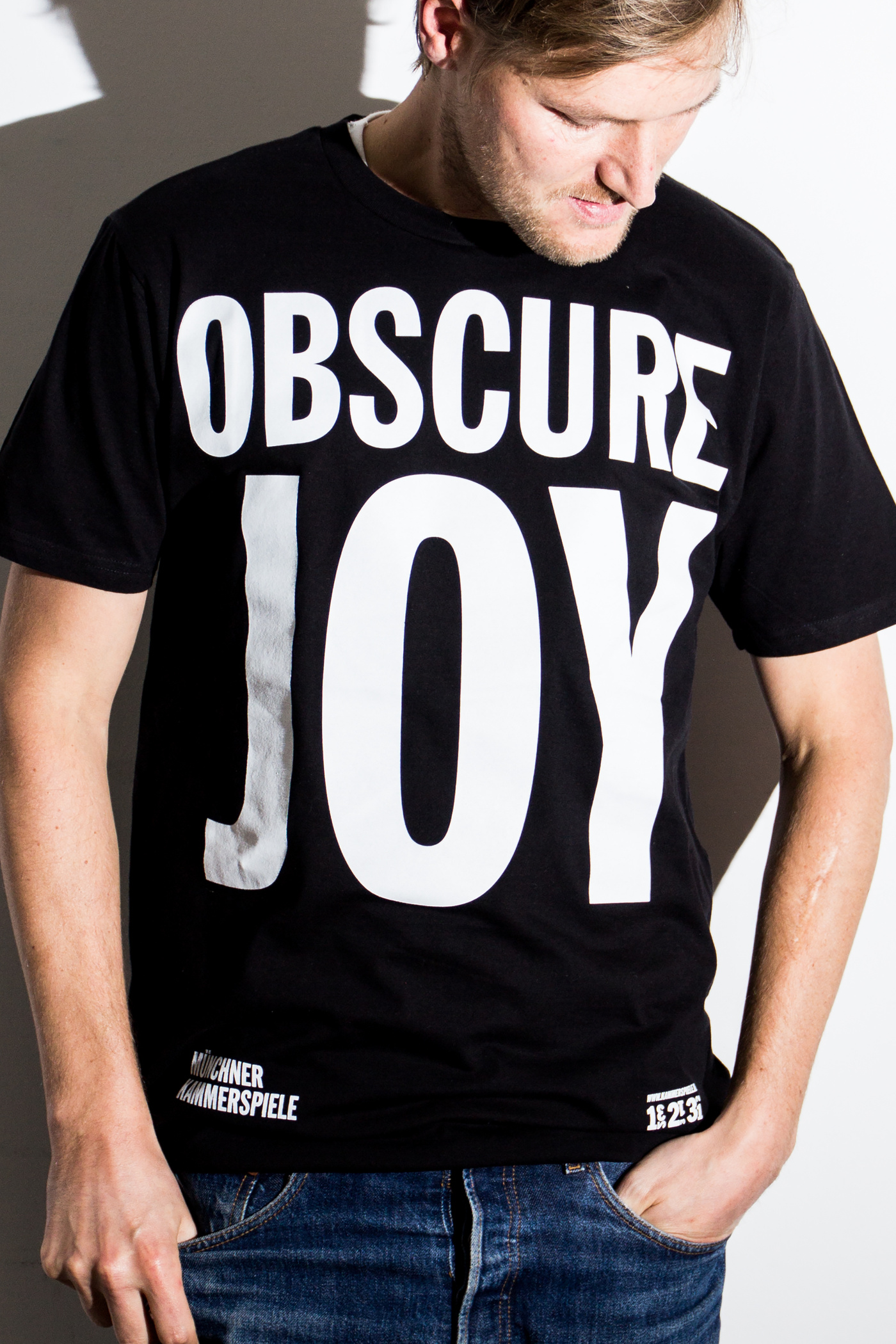
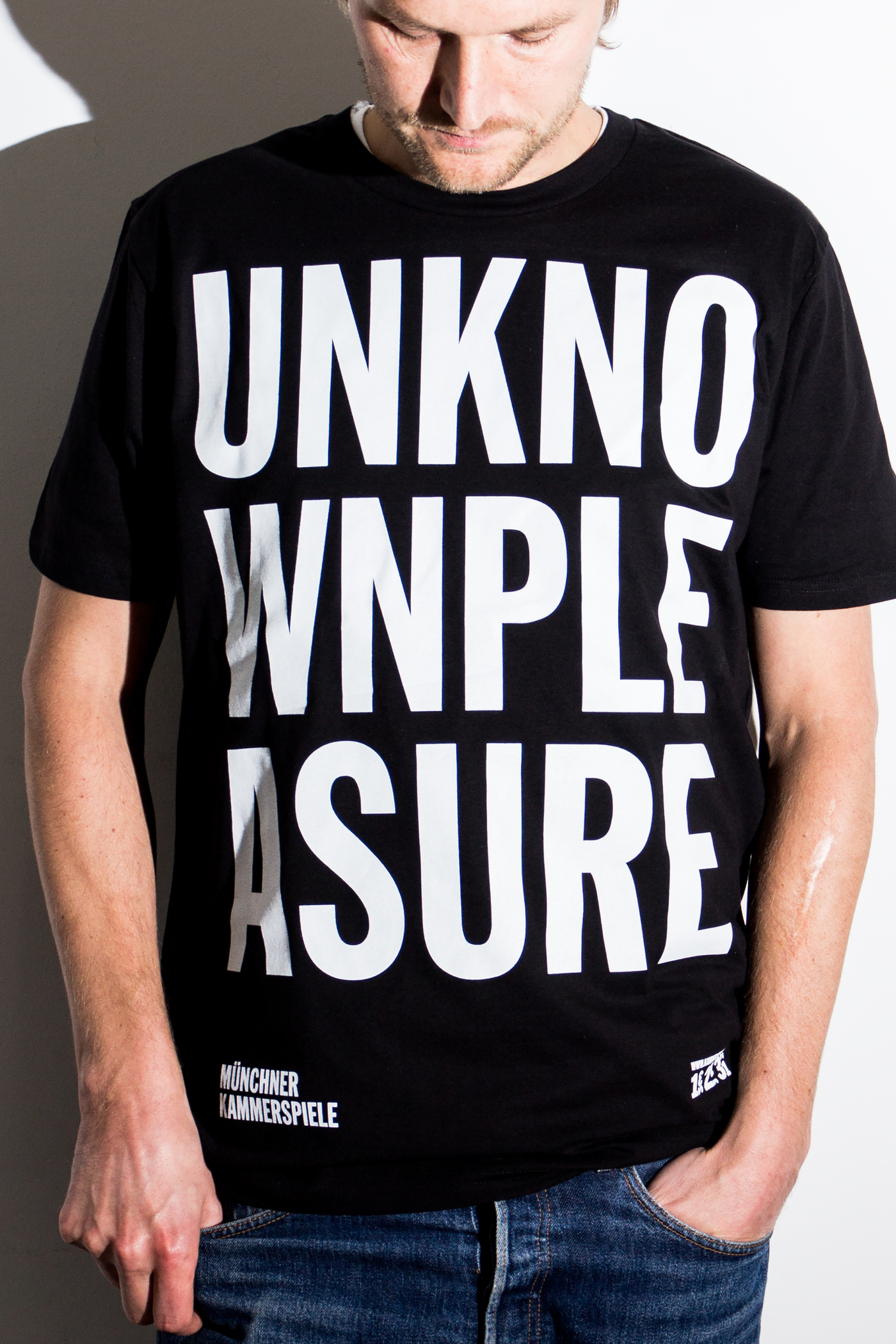
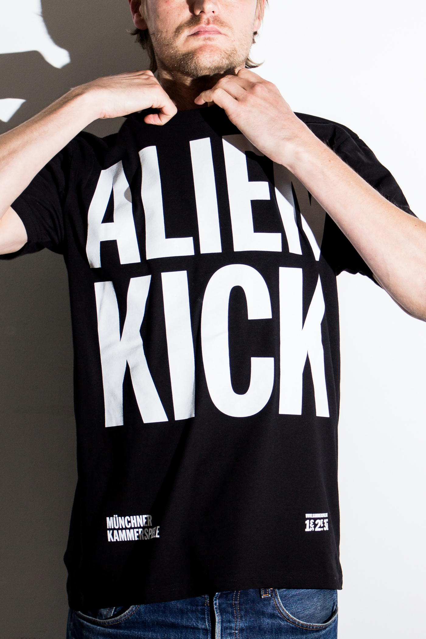
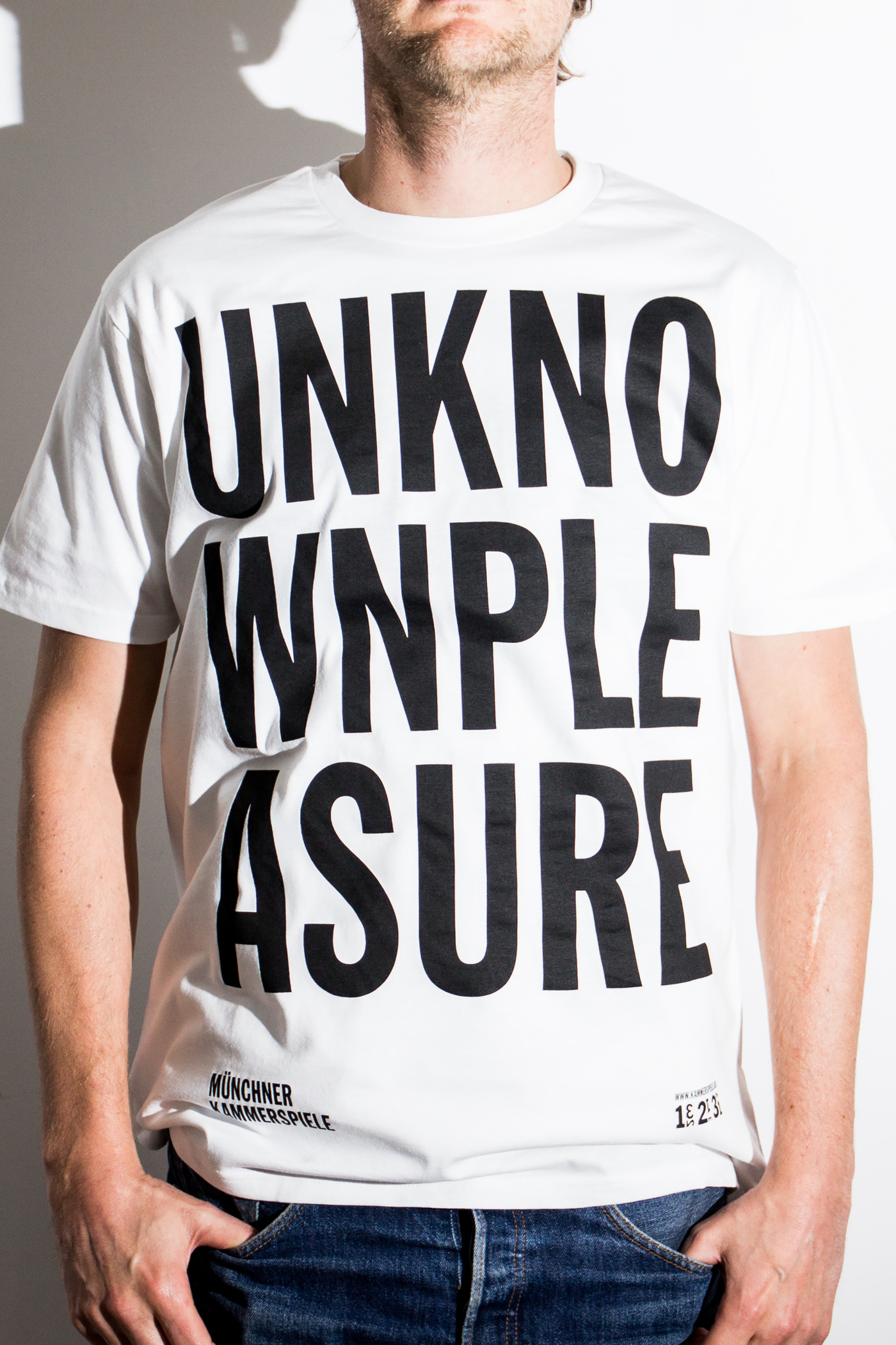
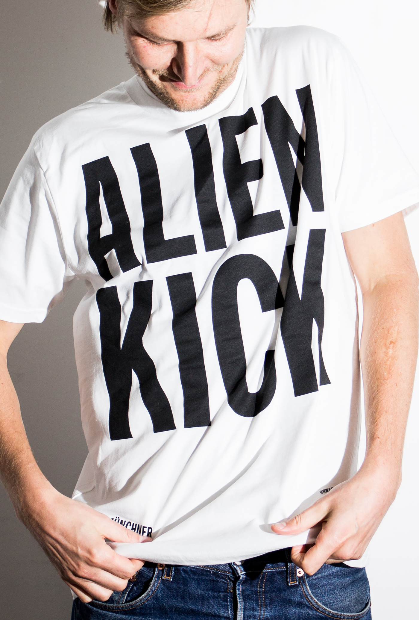
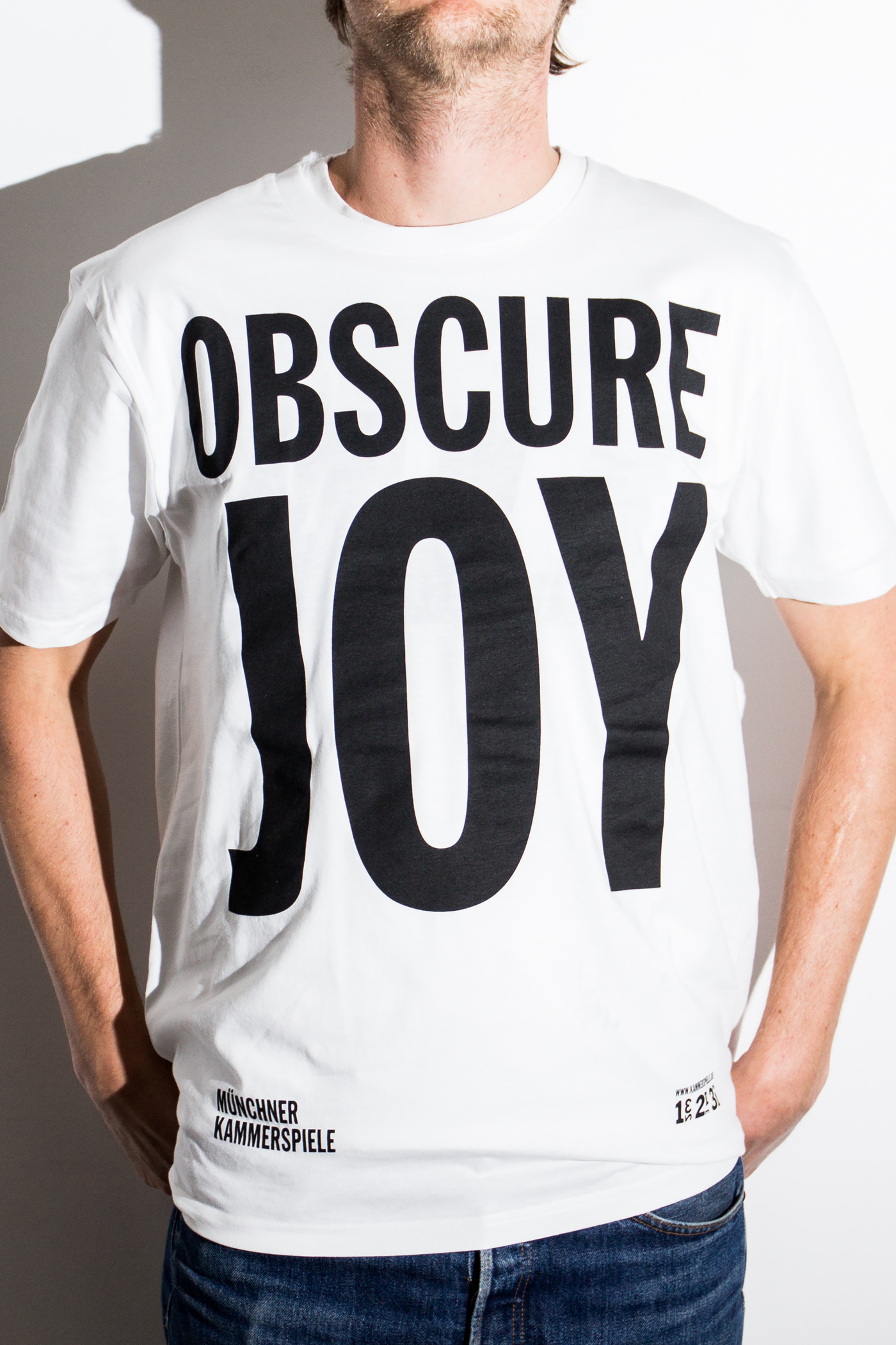
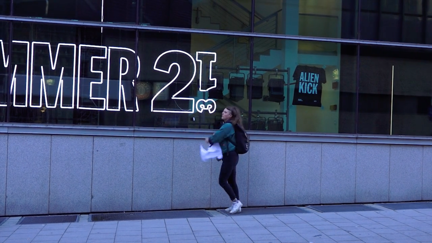
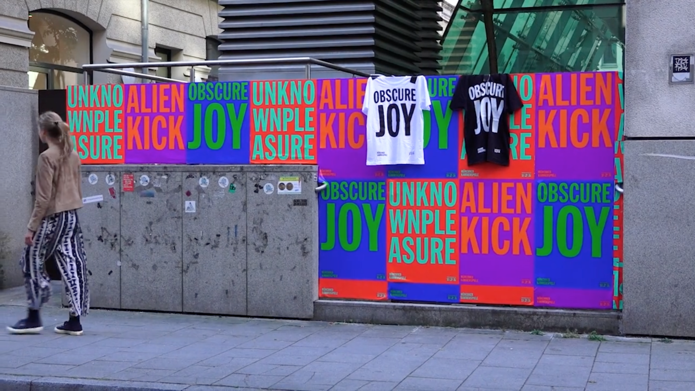
Muenchner KammerspieleThe new campaign for the MÜNCHNER KAMMERSPIELE is playing with the ideas of the unknown --- experience something for the first time. For this reason we are provoking the public to nick a shirt that is loosely attached to the posters with the slogans UNKNOWN PLEASURE, ALIEN KICK or OBSCURE JOY ... I know this obscure joy will last longer that the fabric of the shirts ... ENJOY.
The shirts to nick
if you were quick
3 2 1 – Munich, here we come
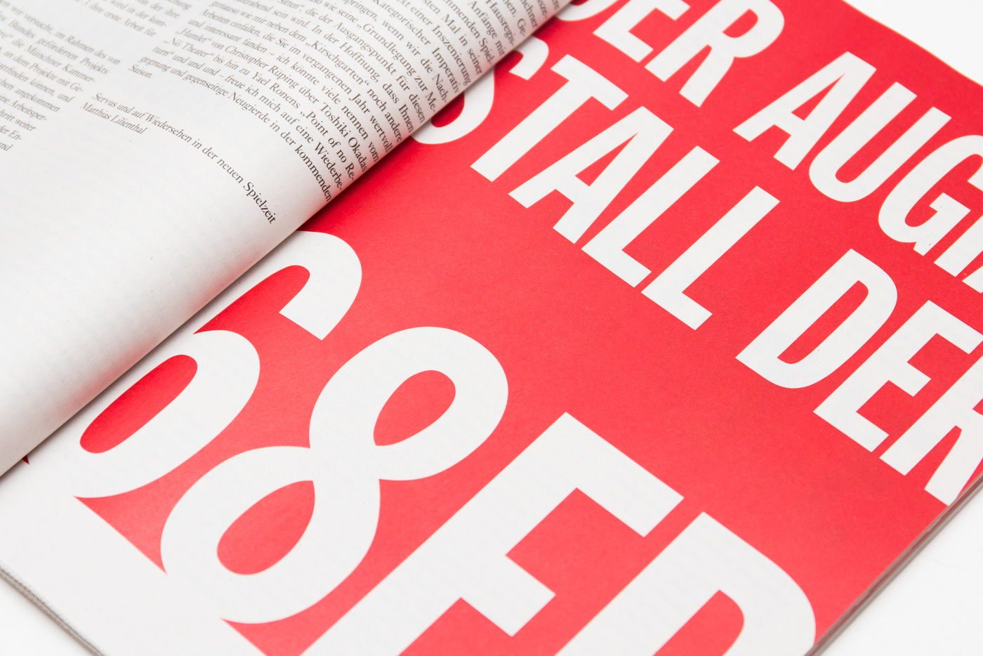
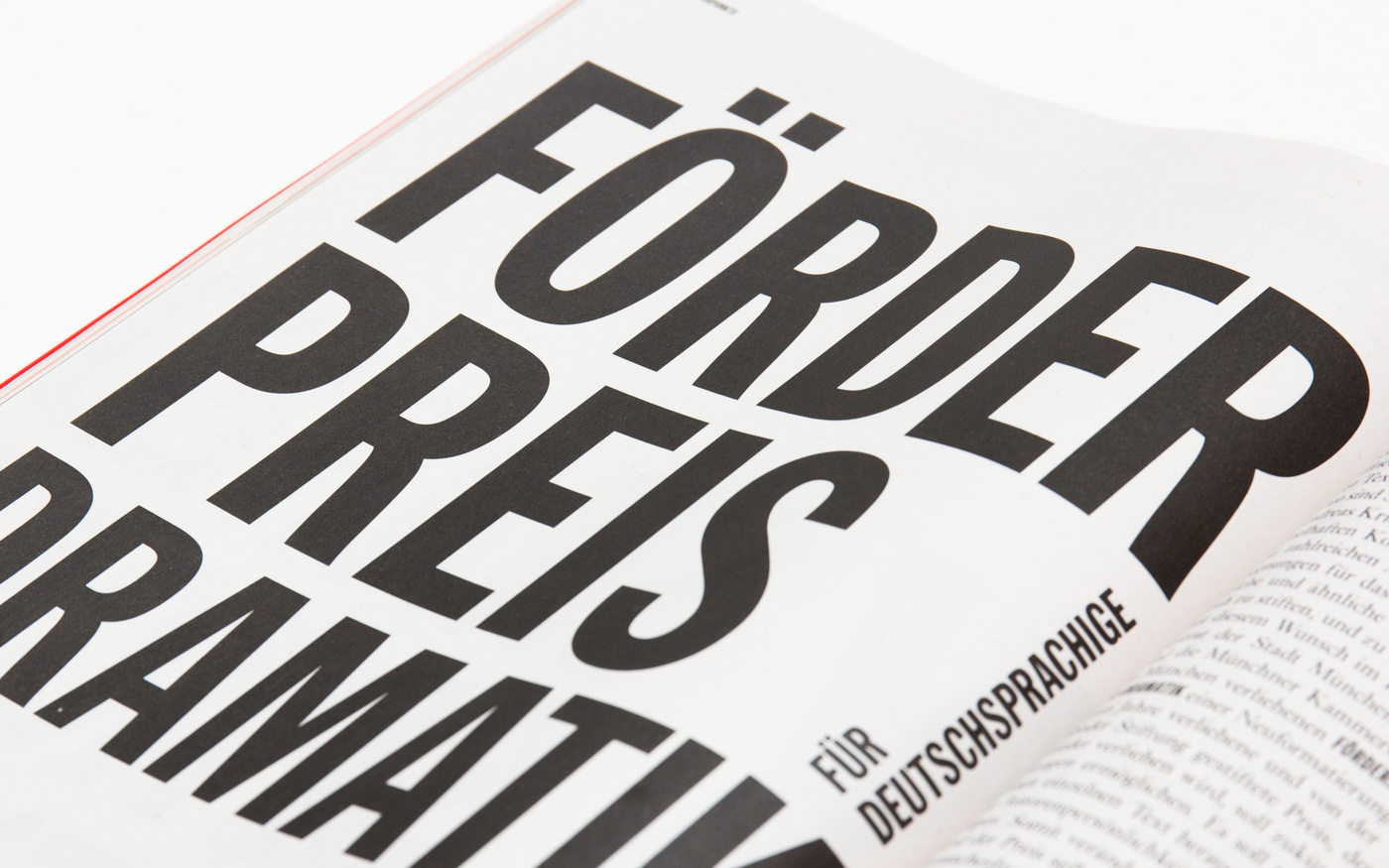
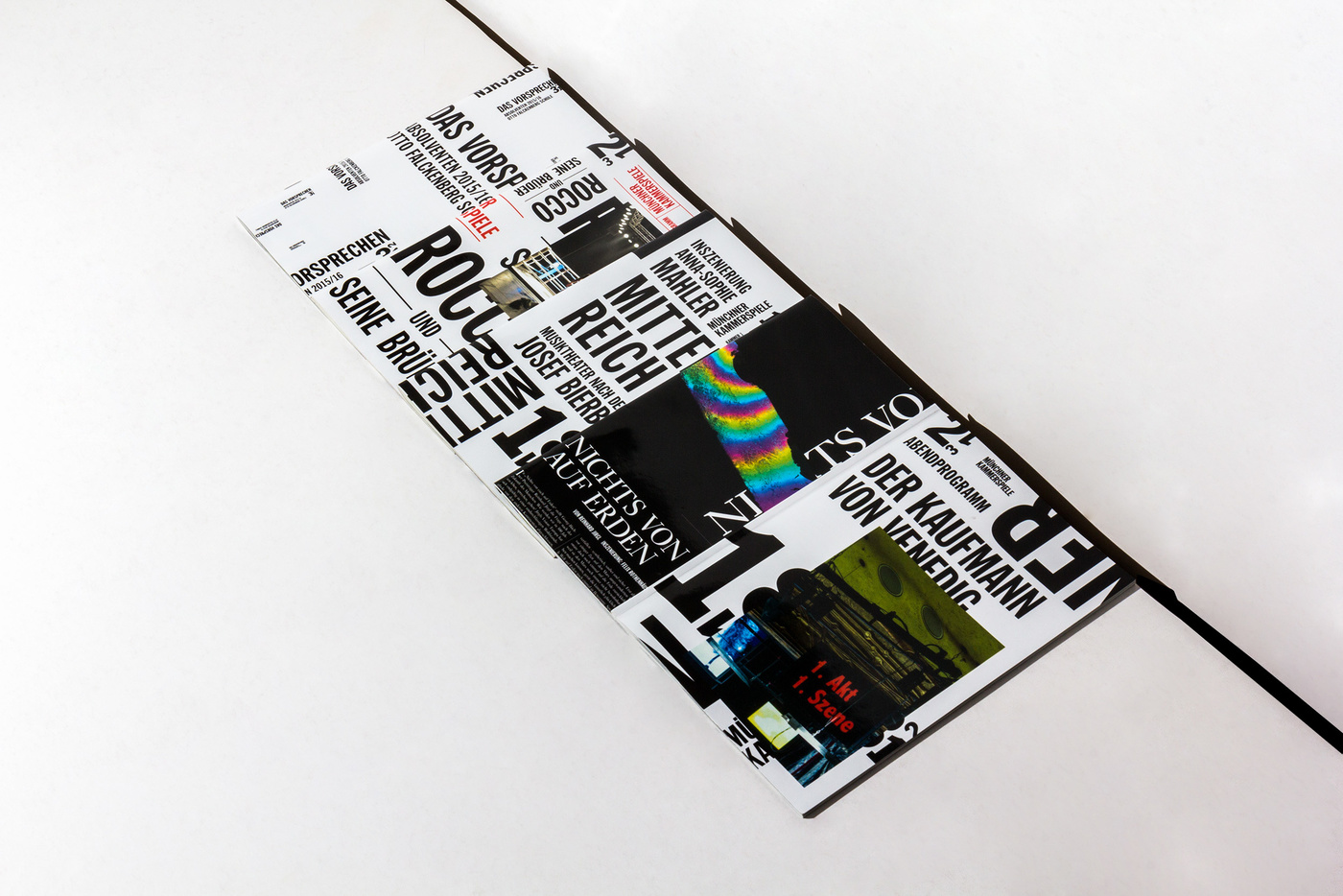
Muenchner KammerspieleThe new season 2016/2017 at the Muenchner Kammerspiele will be sprinkled with many discussions on how we see the world, how we treat it and how we want to be treated, are we even play a part in any of this, or are we left out in the cold when it comes to it. Browse through the magazine and order it here directly from the theatre. Photography by the marvelous Wolfgang Tillmans. You will see when flicking through the magazine what photography can add to the ideas and strategy behind the plays to come.
SEASONING THE SEASON 2016/2018
WELCOME TO MUNICH
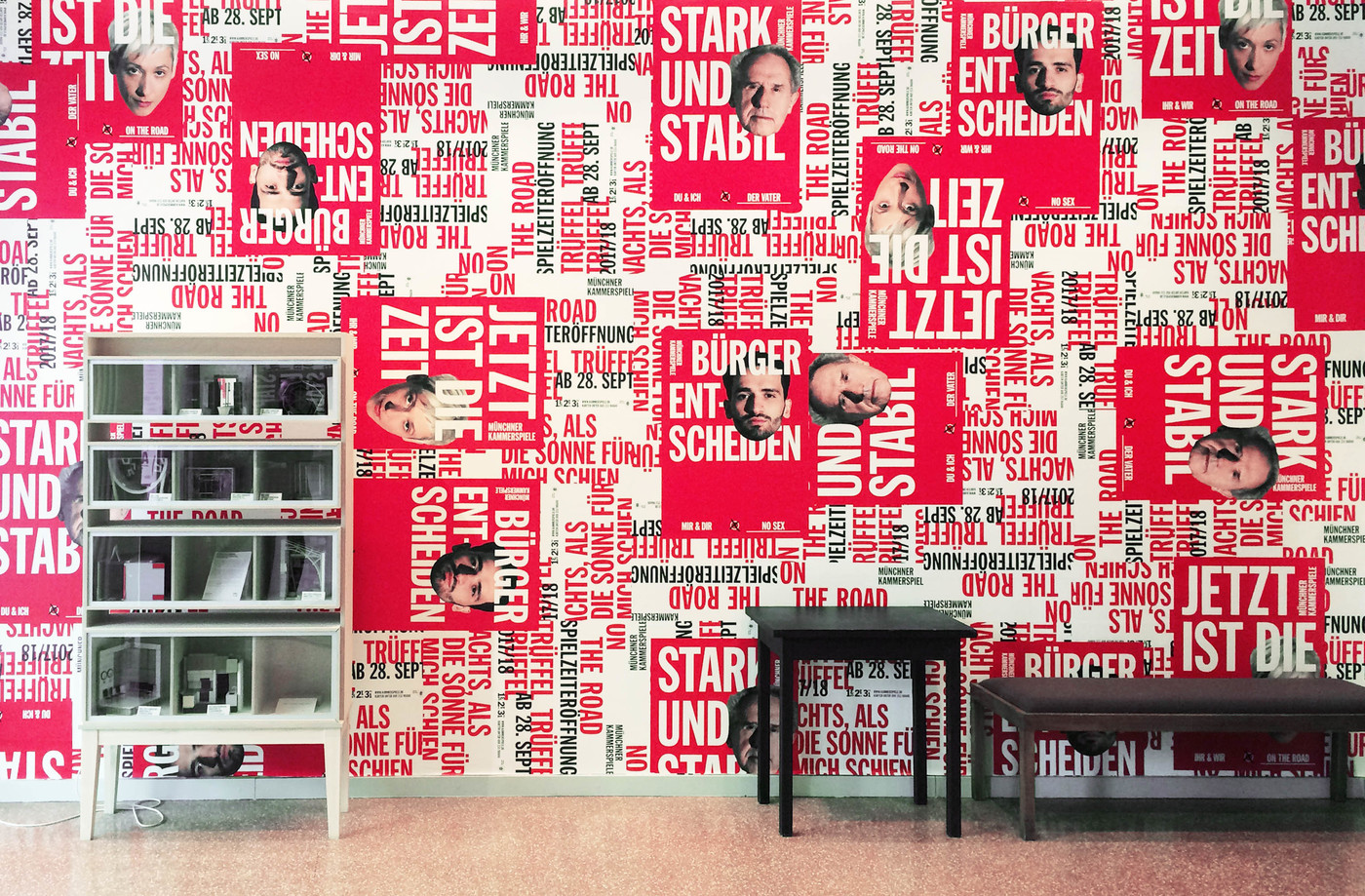
ARRIVAL CITY 2017/2018
JETZT IST DIE ZEIT
WELT OHNE KUNST
After 5 years it is time to say Goodbye!
This has always been more than just another job to us and the Münchner Kammerspiele were much more than just clients.
We wish all the best to Matthias Lilienthal and everybody, who we have had the pleasure to work with!
But goodbyes are not forever.
We can't wait to see what is coming next … let's continue together and go back to the future!
Photos © Judith Buss
