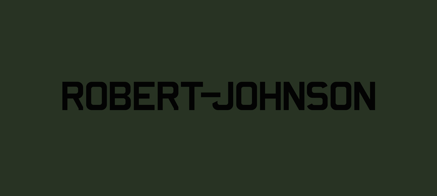
It was in 1999 when Ata Macias called me if I wanted to create a logo for the club he was planning to open in Offenbach going with the name Robert Johnson. I happily agreed to do it but was left quite confused about the fact that Robert Johnson was the inventor of the blues genre and on top of that was poisoned by his wife at the age of 27 in 1938, why, why, why would anyone like to open a techno house club with this particular name?? I knew of course what kind of a twisted and fun-loving mind Ata was (and still is), but this, this I did not see coming. So, job done, the first Robert Johnson logo was born, created of a calculated and interpreted average of British numberplate typefaces I took pictures of during my extensive walks through London (there is no such thing as a mandatory typeface for number plates in the U.K.).
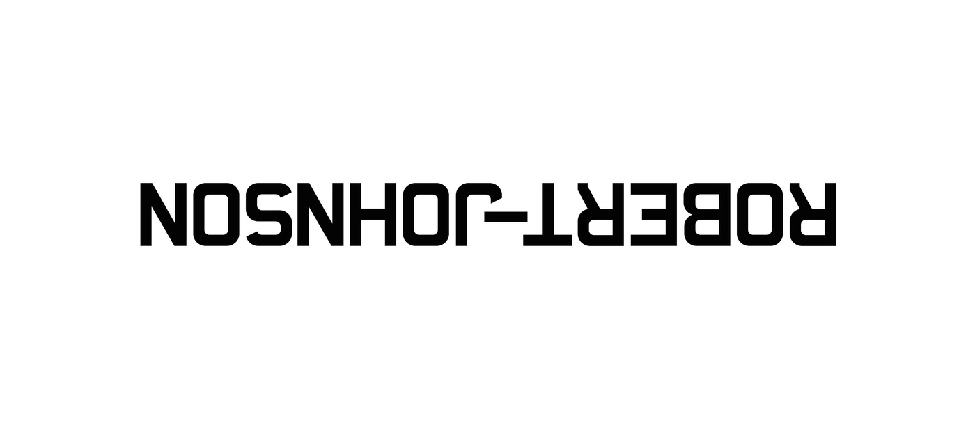
A while after that, in 2004 to be precise, the artist Michael Riedel found out about who did the original Robert Johnson logo and asked me if we could provide him with the very original file for his upcoming show at Galerie Neff in Frankfurt, called Johnson–Robert. He there turned the club upside down, literarily, and did play the music he has taped one night at the club backwards. What a really brilliant piece to be involved in. So then, ending up with having designed one logo for two purposes.
However, so many years went by …. and with every visit of the Johnson I realize more and more how much fun this club is and how it feels like when all the pieces fall into (one) place.

