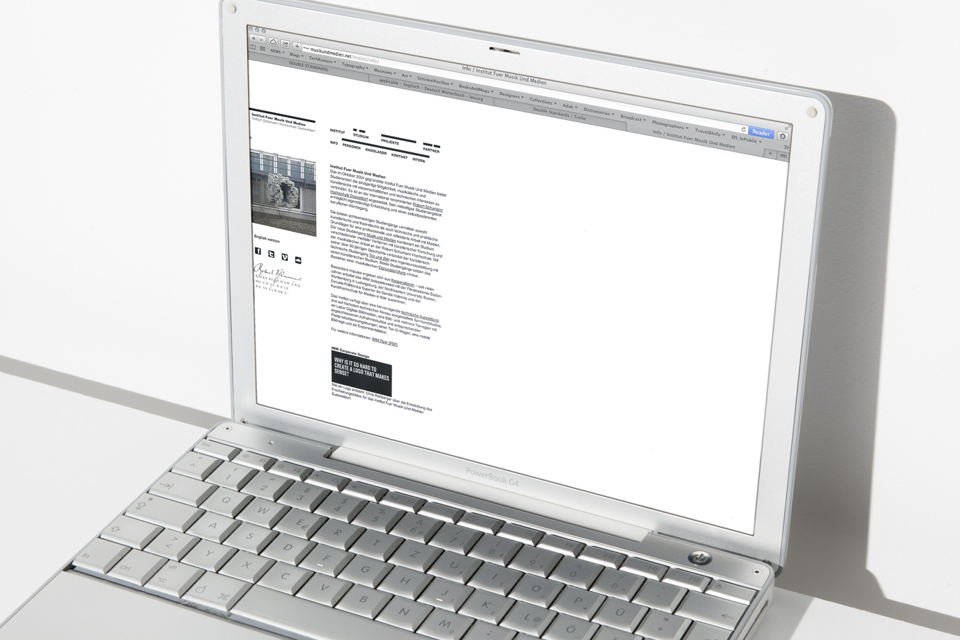
Late 2004 we were asked to come up with an corporate design idea for the INSTITUTE FOR MUSIC AND MEDIA. Heike Sperling, a professor at the institute is a close friend of ours passed this pitch on to us and we were happy delivering. Fiddling around for a while with the whole name, which is a mouth full you might think, we rather went for the abbreviation of the whole thing. So, in our opinion it needed some sort of short form. Well, IMM seemed to be the correct choice at the time. But then the form of ‘imm’ also did not give too much of an hint to what this institute was about …. what does music and media have in common was the probing question really? It turned out the user interfaces, the platforms, the programs. It was hilariously funny and so obvious all of a sudden. The way sample arranging programs or film editing programs work the same way is definitely something worth thinking about when it comes to talk about similarities between the two very different fields of work. But there we were … chopping off 90something percent of the top of the ‘imm’ left us with only ‘samples’ we could work with – well, samples and film snippets as they appear in both editing programs. Therefor we ended up presenting something the could easily agree to since this is exactly what they are working with – visualisation of music and film. This is how it turned out to be correct translation from an abstract into something really solid ….. here we go listen to these visuals very attentively.
The whole corporate design is an ever growing ever changing idea …. from letterhead to t-shirt to their broadcasting van to, well name it … it is applicable on to everything ….. just name it, there is something we can do about it…. the idea proofed to be bullet proof.


