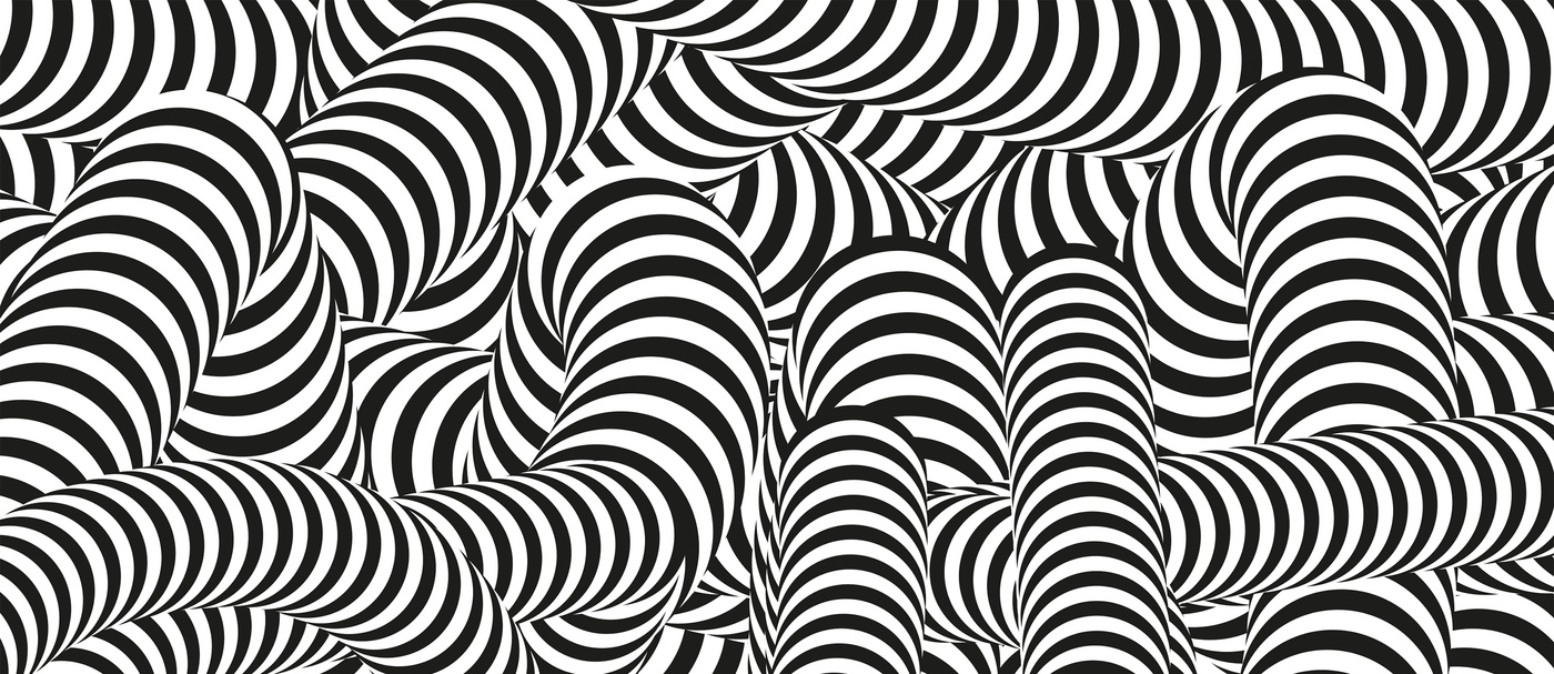
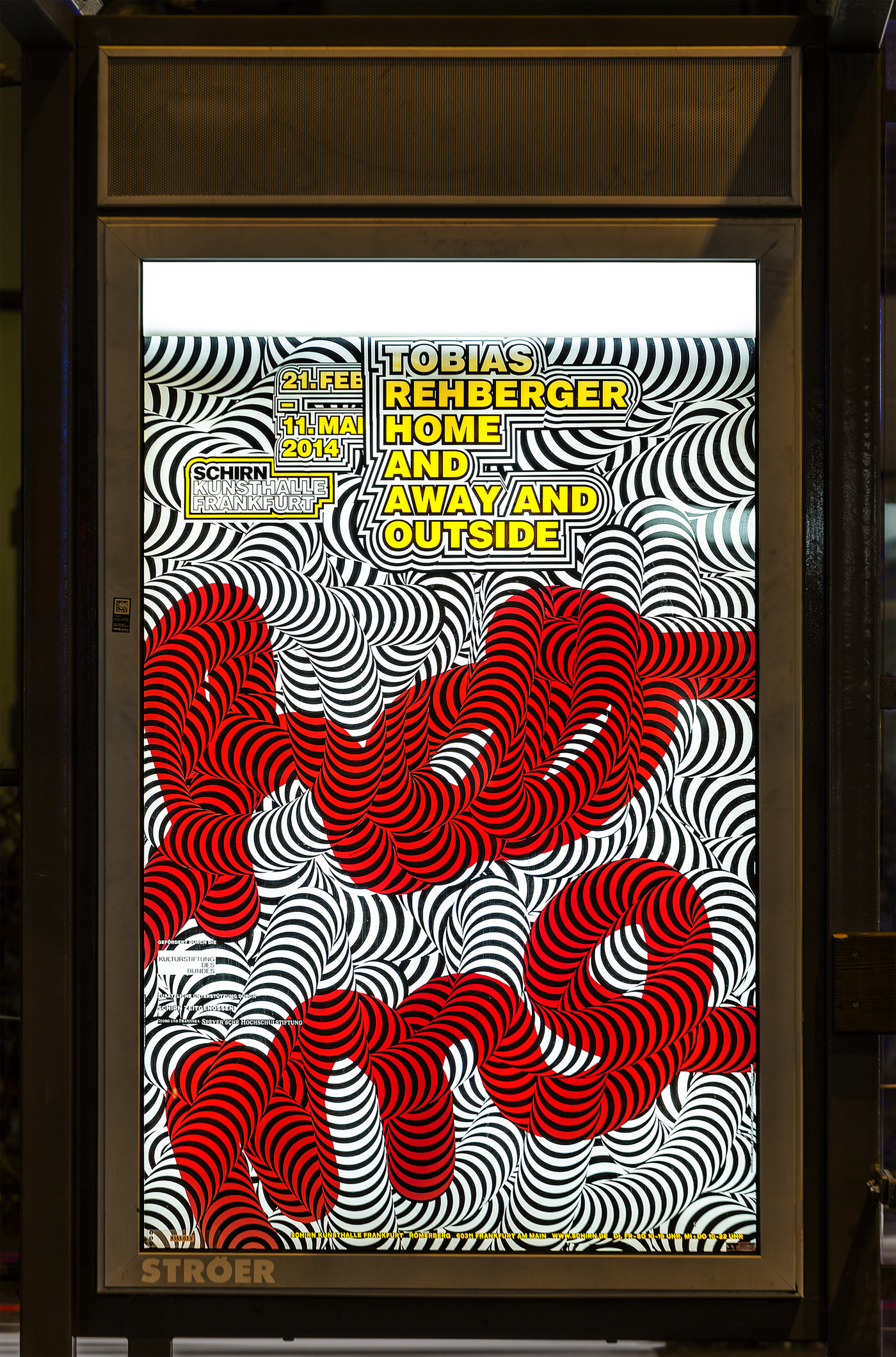
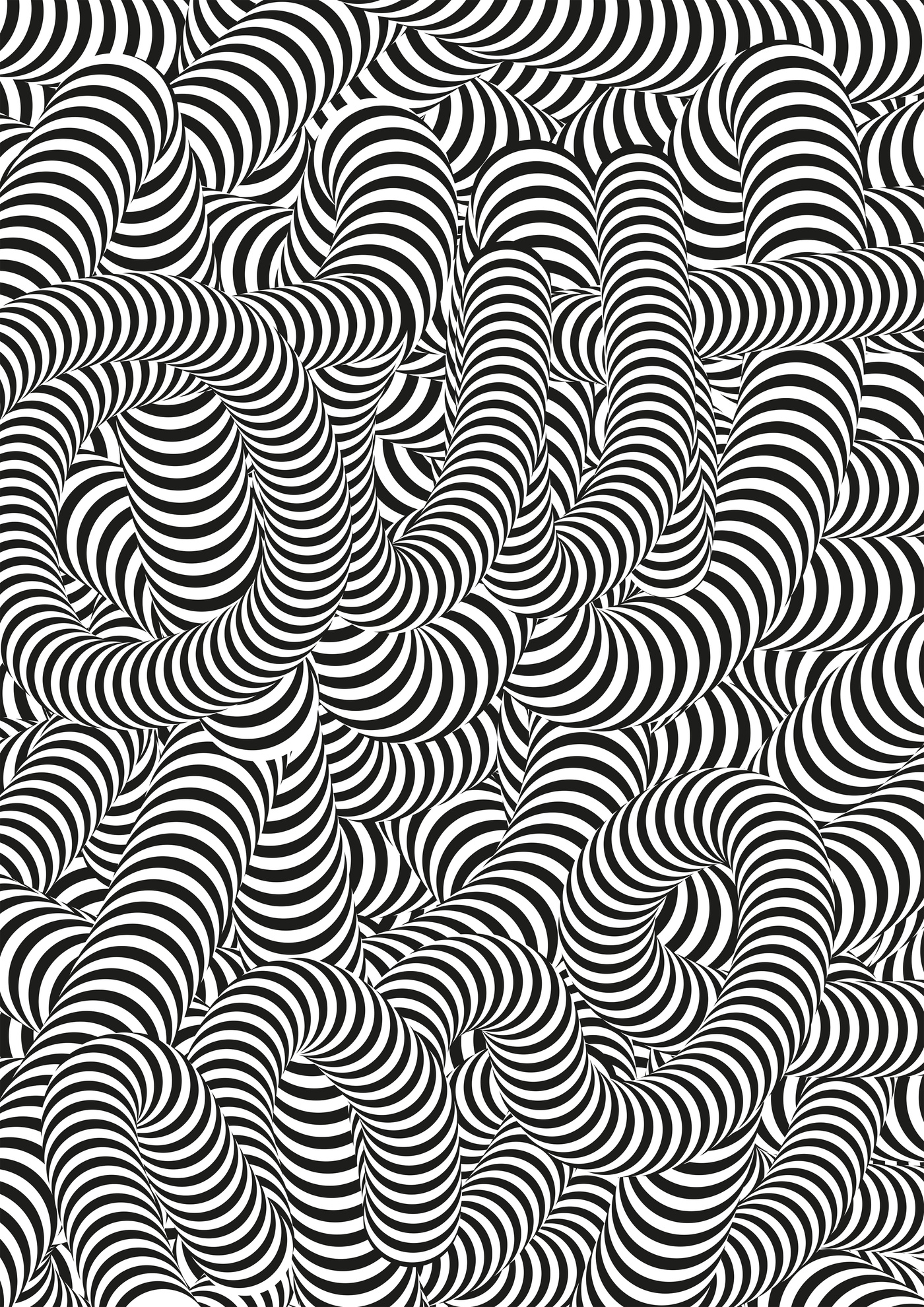
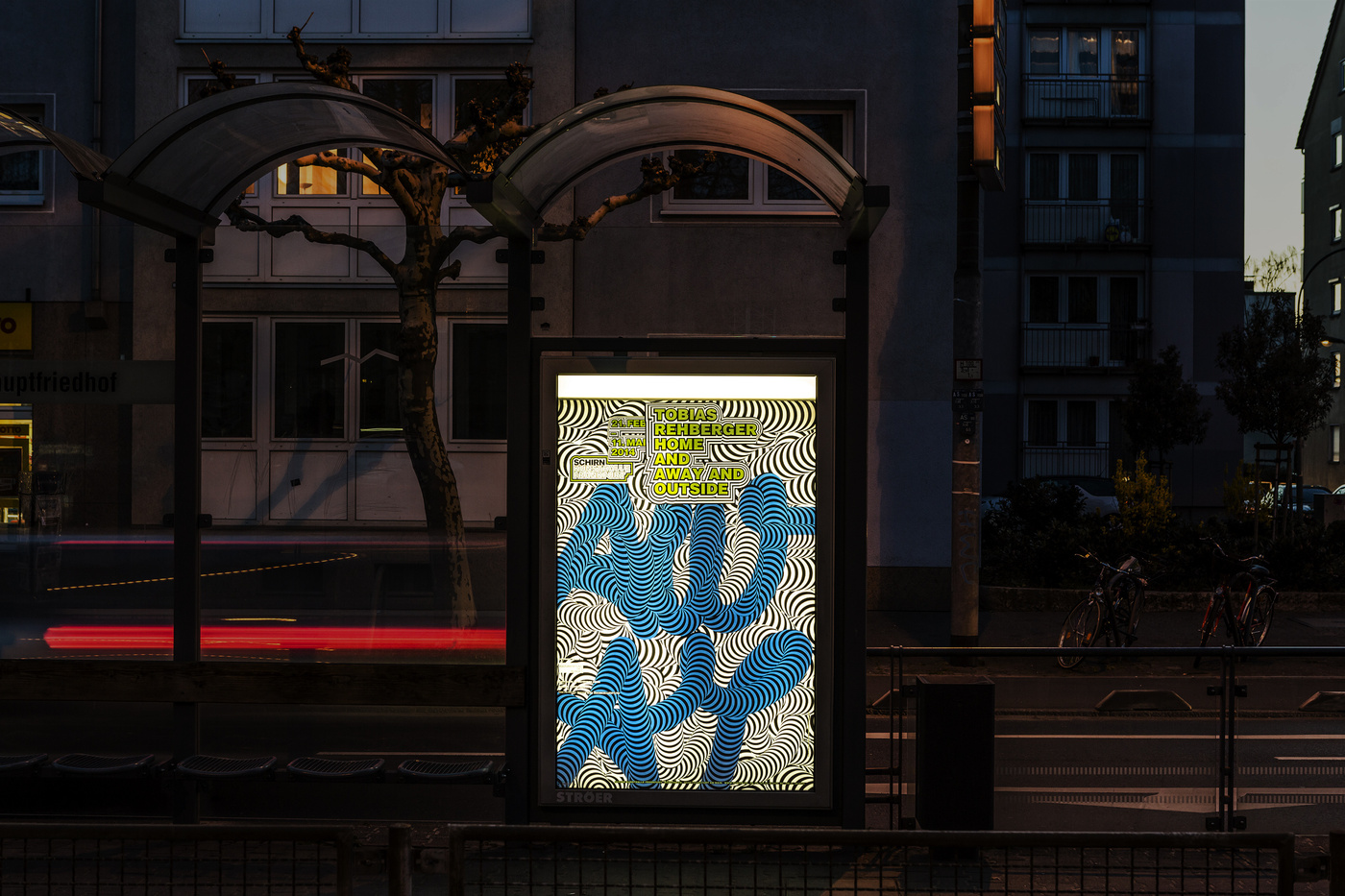
From February 21st until May 11th, Tobias Rehberger’s huge show ‘Home And Away And Outside’ at the Schirn Kunsthalle Frankfurt was a dazzling event for us in so many ways. The exhibition assembled 60 works including sculptures, installations and paintings. It opened with a new take on 'Was du liebst, bringt dich auch zum Weinen', the work that earned him the best artist Golden Lion at the 2009 Venice Biennale. Walls, floors, ceilings, sculptural objects, are all covered with the eye-boggling camouflage used by the dazzle ships in World War I. Another part of the exhibition, housed in the Schirn Rotunda, at the entrance to the Kunsthalle, there was a huge hanging light sculpture created from old neon tubes, fairground lights and advertising. A spotlight above the sculpture casted a shadow onto a round pedestal underneath and spells out a single word: Regret. These two elements, the dazzle paintings and the shadow piece are most significant, or let’s say they embody Tobias’ thinking in an quite identifiable way. It boils down to the things we look at but cannot see, or misinterpret, or misunderstand in the most appreciated way. So, how would we misunderstand it our way and create something that is not a copy of his work but communicates this strategy combined with our craft? Now you see – now you don’t see, and yet you might not exactly know what this fuzz is all about. This is what we were coming up with. We first created this texture made of layers and layers of single words of the title – Home, Away, Outside and created ridiculously confusing black and white tubes. This was the key visual (it might make a brilliant scarf someone posted) we’ve been using for the invites and posters. But we wanted to turn the posters into something else but a plain poster. So we asked the press office of the Schirn to book as many poster light boxes in the city of Frankfurt as possible to present an actual picture puzzle. During the day the black and white dazzle poster was showing - but as soon as the lights went on in the light boxes, the posters were showing the title fragments and turned colorful by printing these elements only on the back.
Here we were - showing and not showing at the same time … following Tobias’ rules without trying to simulate his work.
And here a short article in the Schirn Kunsthalle Magazine on us (German only – unfortunately).


