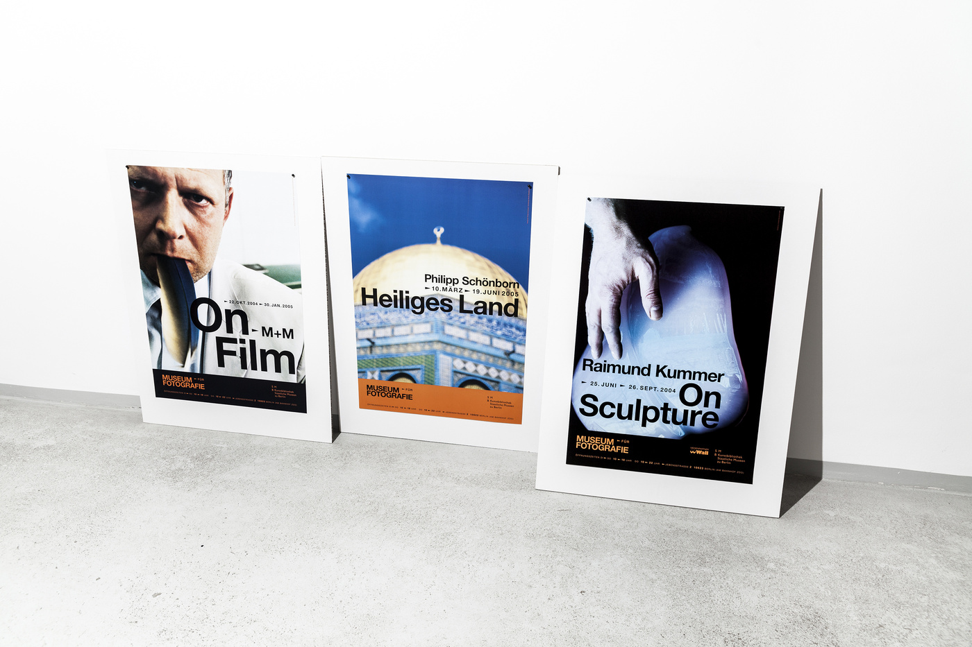
Early 2004 we were asked to pitch for the Museum für Fotografie in Berlin which at the same time domiciled the Helmut Newton Foundation (or vice versa - which ever way you want put it) in this beautiful building situated opposite of the Zoo train station. It appeared to us naturally it would be smart to have some sort of visual connection between the two institutions. The odd mechanical typography, type setting, arrows and how they were composed at the edges of filmstrips gave us a clear idea how to proceed with this assignment. Since Helmut Newton was more on the black and white side of the photography, or at least his most famous pictures are black and white, we distinguished the two concepts by the colourschemes of black and white and colour filmstrips. The Museum für Fotografie went for the bright orange / black typography, the Helmut Newton Foundation turned for obvious reasons black / white.