I have, as Tobias’ brother, learned of this project for the very first time sometime in the mid 1990ties during one night we were sitting outside a ski hut. He just said: ‘I have this idea to develop a film backwards, you know the process how a movie, a feature film is created.’, it came from nowhere, and left me wondering what that meant. Many years later, with the help of many, especially our dear friend Lisa Feinstein running the production for this crazy piece of art, it was done. We could ramble on how this project was intended and produced and what it brought together from our point of view ... but there is this wonderful text by Ina Blom ( PDF download ). Ina’s text starts on page 137 in the PDF.
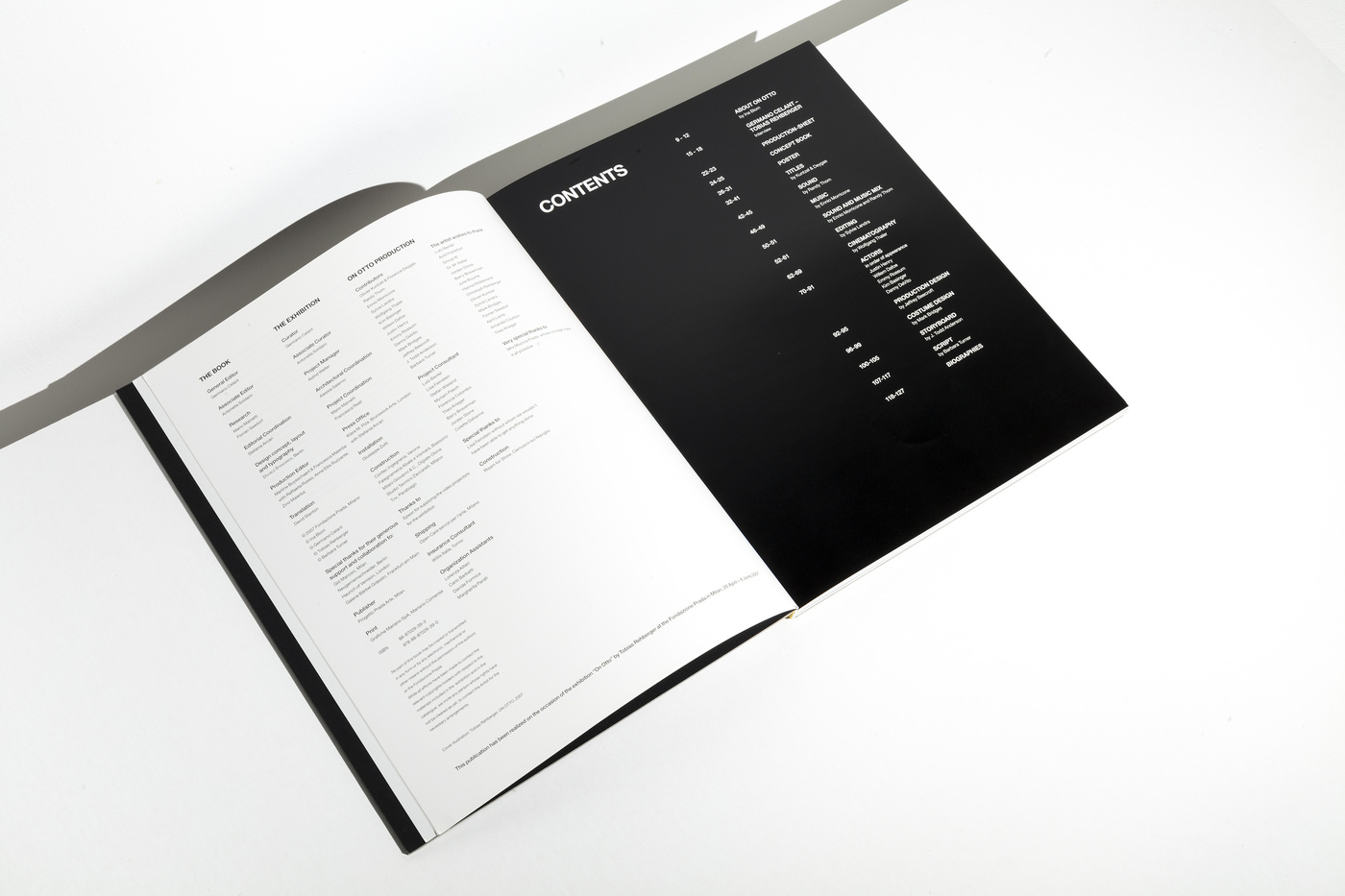
Here a quick introduction…
On ‘On Otto’: Moving Images and the New Collectivity Ina Blom
Part One: Cinema and Automatism Recontextualized
(Report on a Reversed Film Production Process)
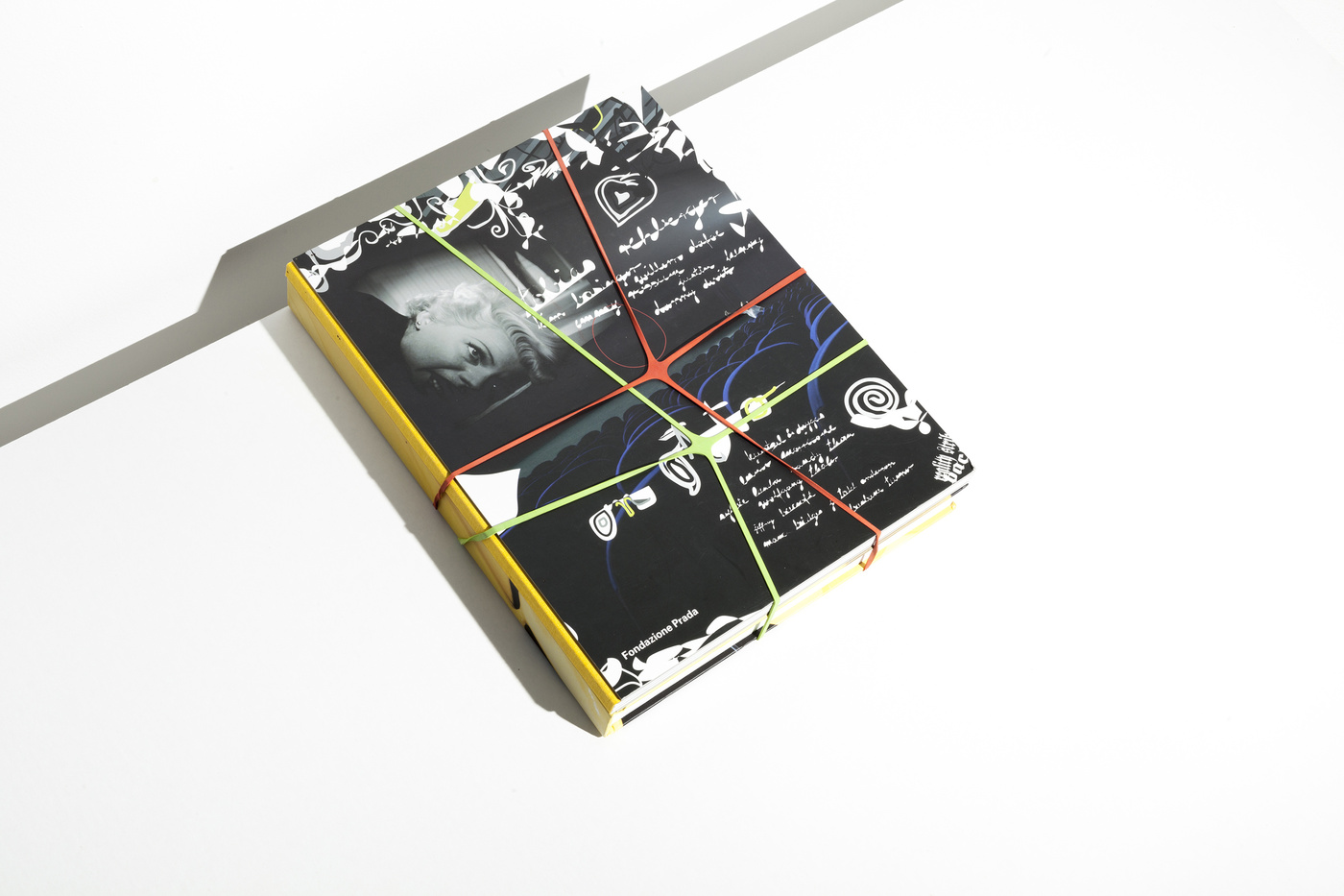
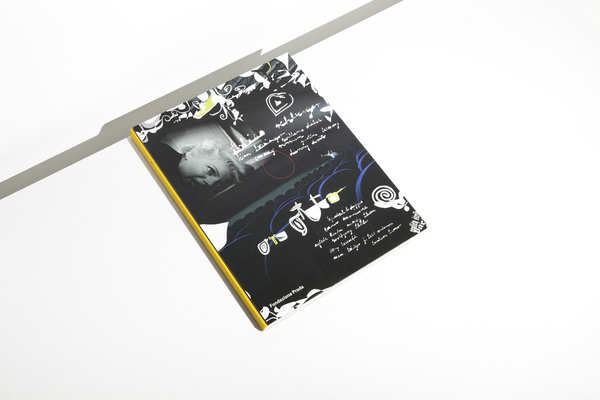
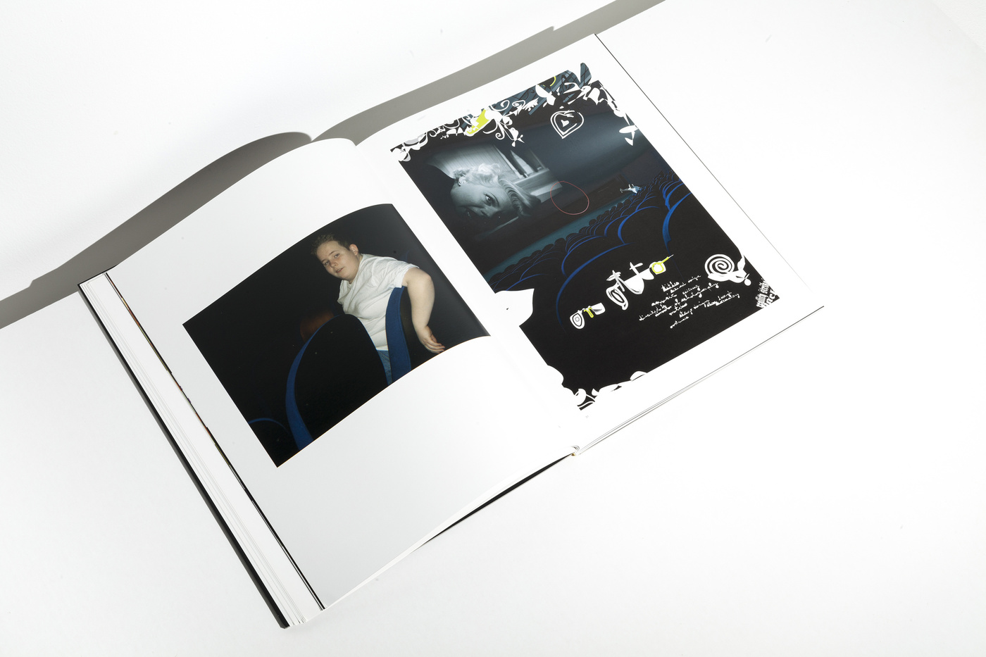
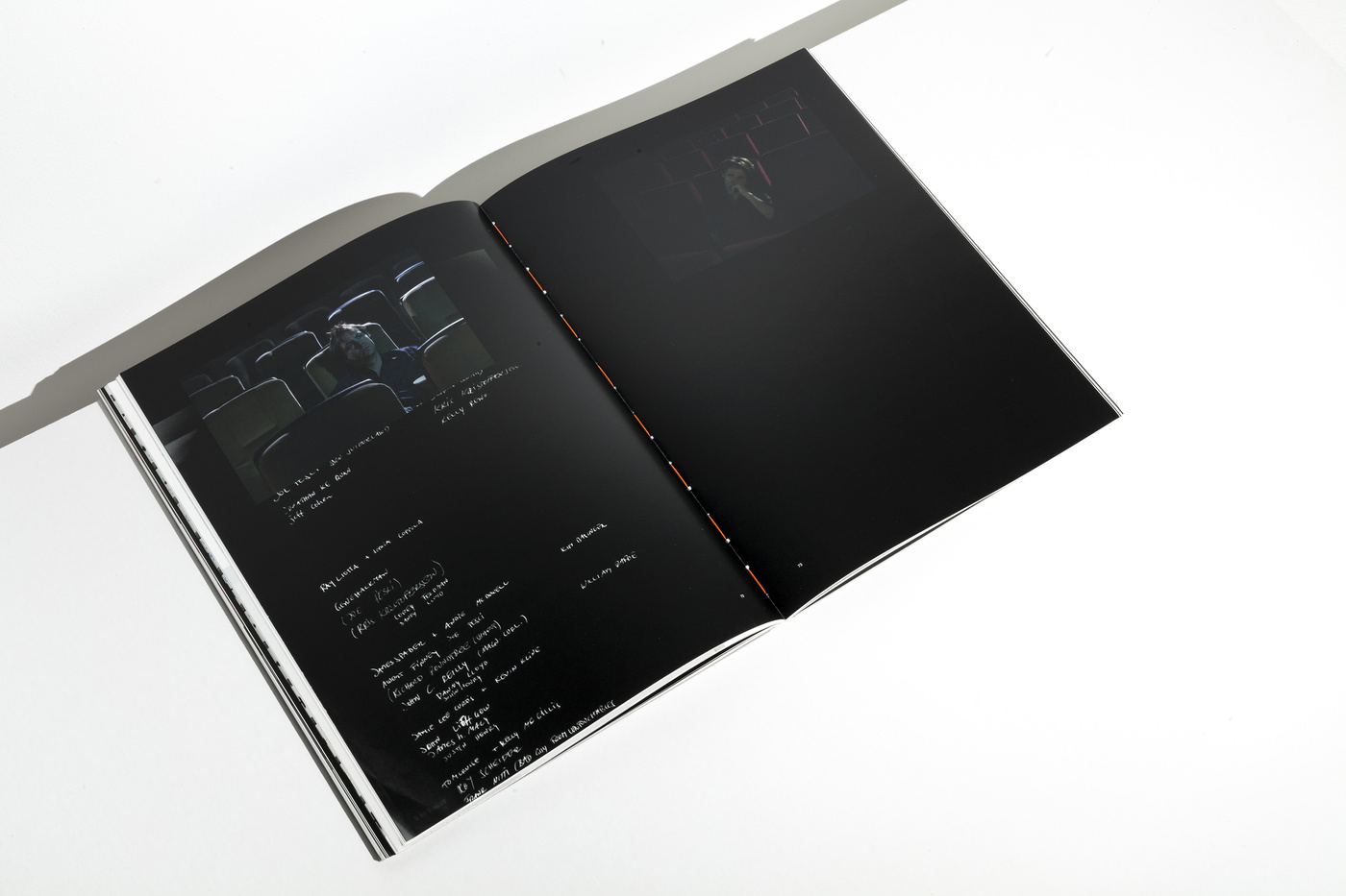
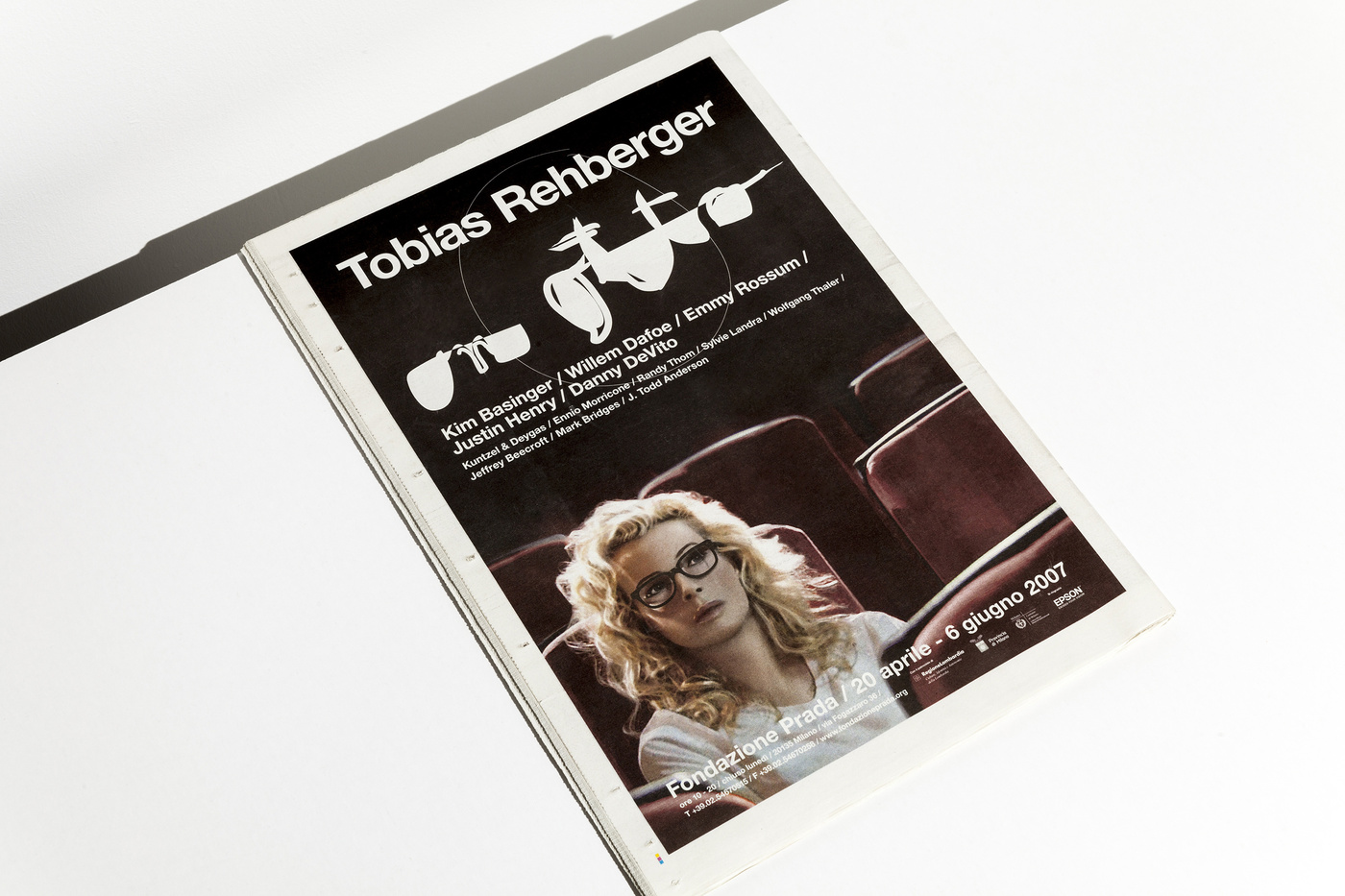
Here is how the movie project named On Otto (2007) starts: With a poster for a film that is yet to be made, a film that no one, at this stage, knows if it is even possible to make (Fig. 1). No names (of actors, directors, producers) are mentioned. But like all movie posters, it takes film itself for granted, in fact, takes the whole cinematic context or apparatus as absolutely self-evident. There is, and will be, cinema: beyond individual productions, cinema is something akin to a paradigm – a generative set of rules organizing the production of phenomena at once scientific, perceptual, aesthetic, technological, economic and existential. There will be titles, music, editing, stage design, sound. Something will be directed by, produced by, photographed by, acted by. The poster advertises this certainty and spells it out in letters that visually frame “the cinema” that they promise: A screening space, seen from the back of the row of seats so that attention is directed towards the movie screen. On this screen the enormous head of a film diva – apparently caught at the moment of death – clings to the foreground of the screen-image: Due to the play of shadow and light, a lock of her hair actually seems to have spilled over into spectator space, as if to make contact. And the quest for contact is reciprocated. A boy, a lone figure among otherwise empty seats, points a fish in the direction of the screen, directly in the angle of the blonde coils of diva hair. Between the screen and this spectator, a space of action is established: the poster, none too subtly, marks this space with a red markered circle. Demarcating an “expanded” notion of cinema, the poster for On Otto announces a cinematic production process that will reformulate the place and status of so-called “moving images”.
Here is a short introduction to the book on ArtBook.
Just a last word… We were still in the planning stages of the catalogue for (Tobias Rehberger) my brother’s show ON OTTO at the Fondazione Prada when he presented me his art works of the posters, the actual starting point in the show. He had created this odd handwriting by mouse in the design programme Illustrator which we at first thought could be used throughout the whole book as the headline typeface. So, we created a font that would mimic Tobias’ handwriting. After a couple of tests we kind of liked it a lot but agreed not to use it in the catalogue since it seemed to play all of a sudden a major role and chose a more neutral typeface instead.