
THE HOUSE WE BUILT
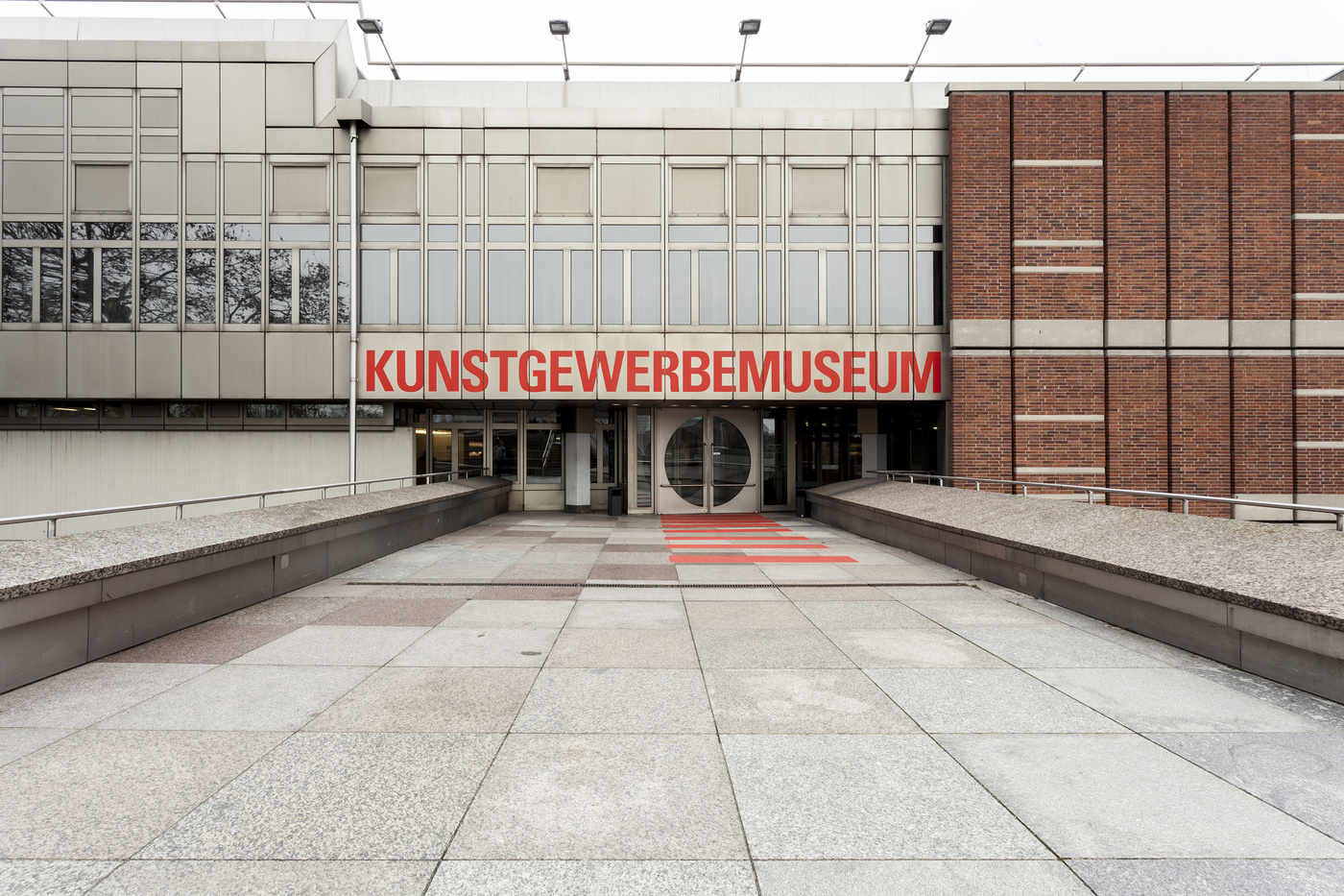
KUNSTGEWERBEMUSEUM BERLIN
CHALLENGE
- A guidance system in combination with the rework of the architecture by Kuehn Malvezzi for the Museum Of Applied Arts Berlin
Insight
- What we found, entering for the first time the Museum Of Applied Arts Berlin was a dark box that gave the visitor no orientation whatsoever. Heavy curtains covering windows, blocking out the light. Different typefaces on different material on places you would not expect them. It clearly needed Kuehn Malvezzi and Double Standards to shape it the way people would understand how to approach the objects, even how to get to the next floor.
SOLUTION
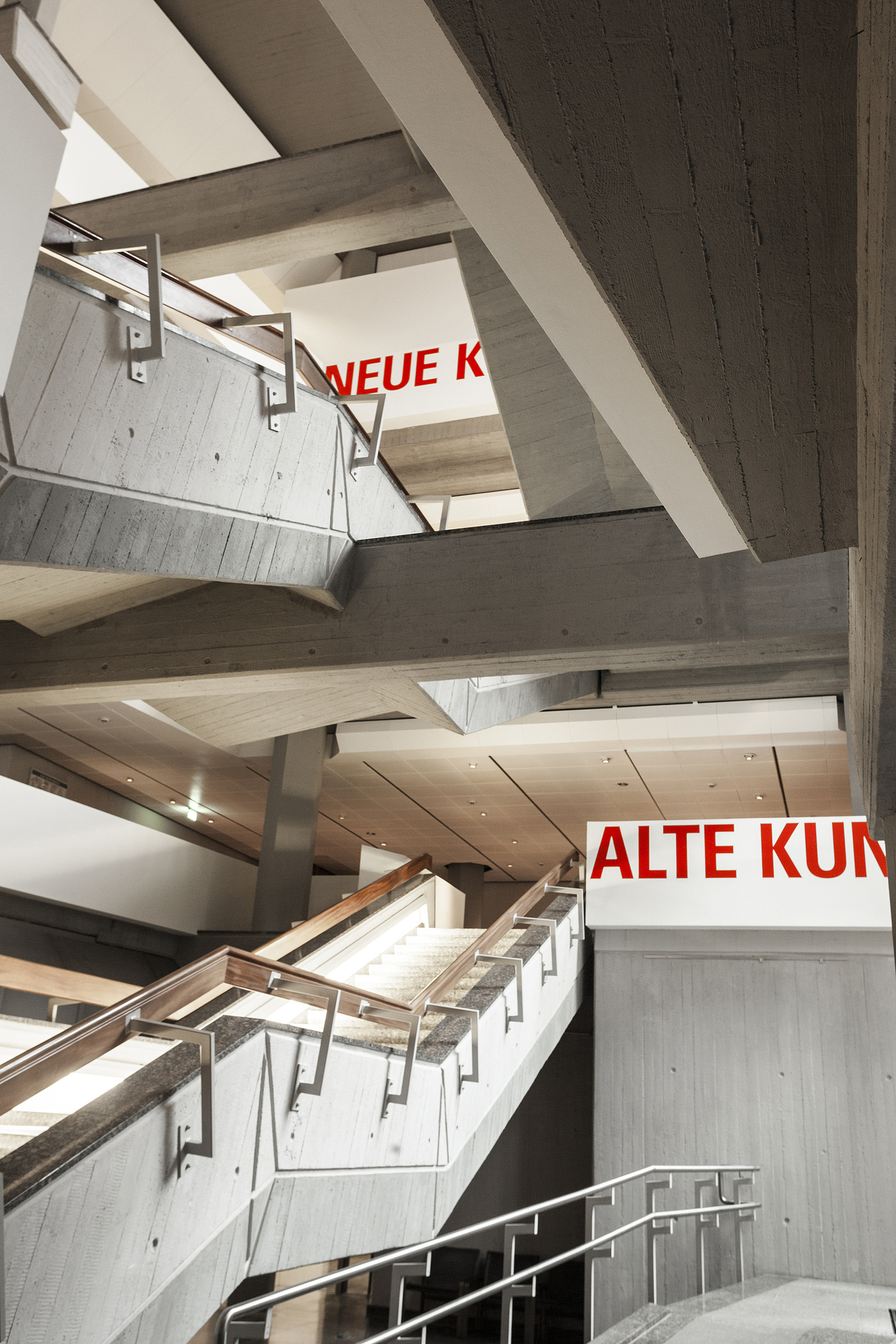
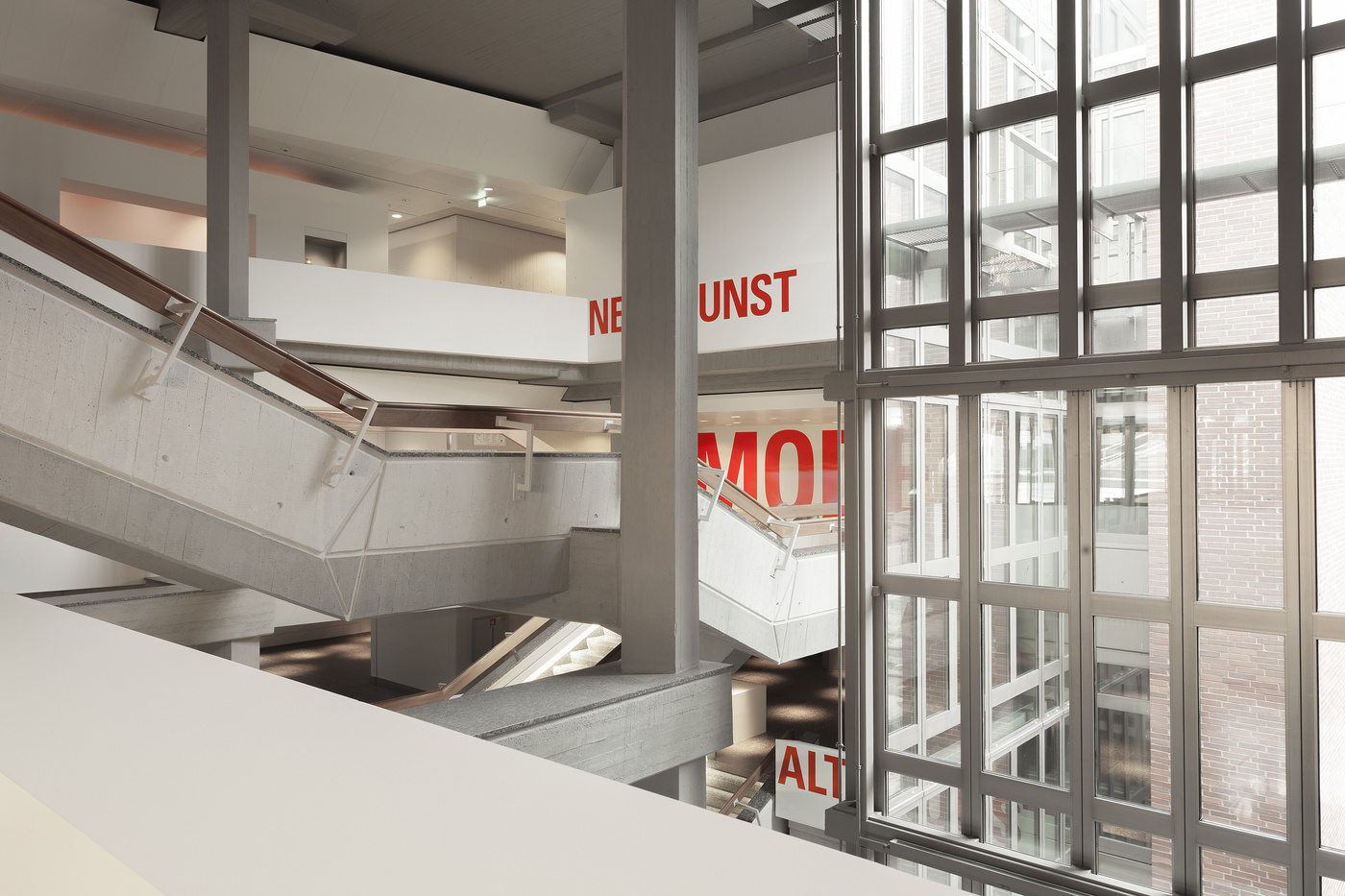
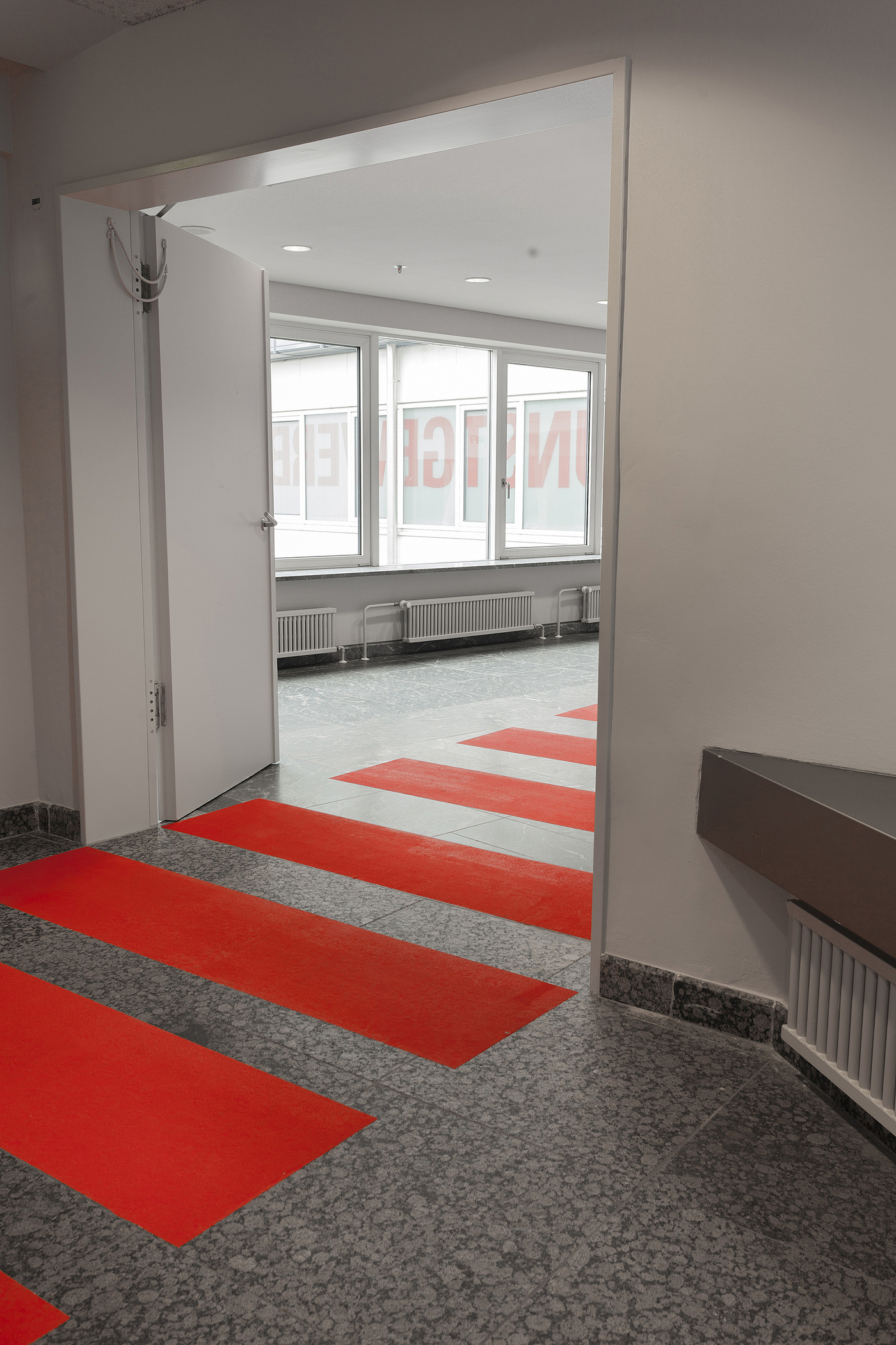
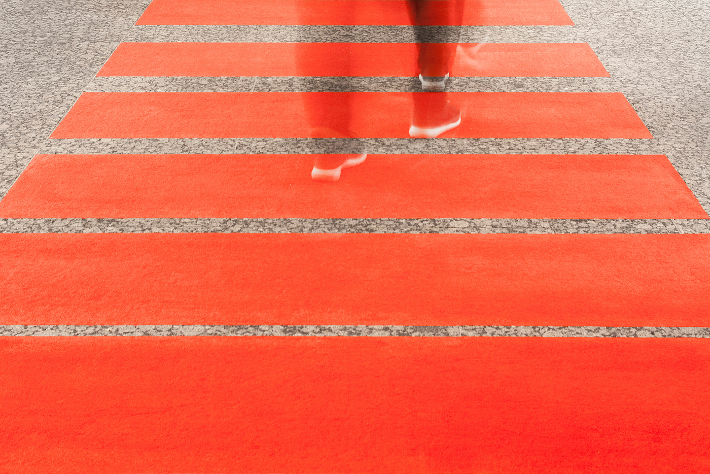
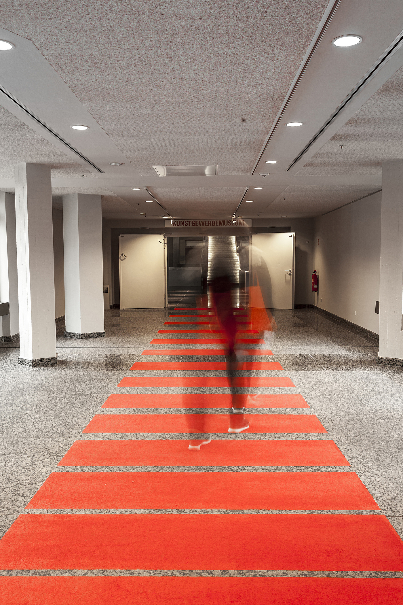
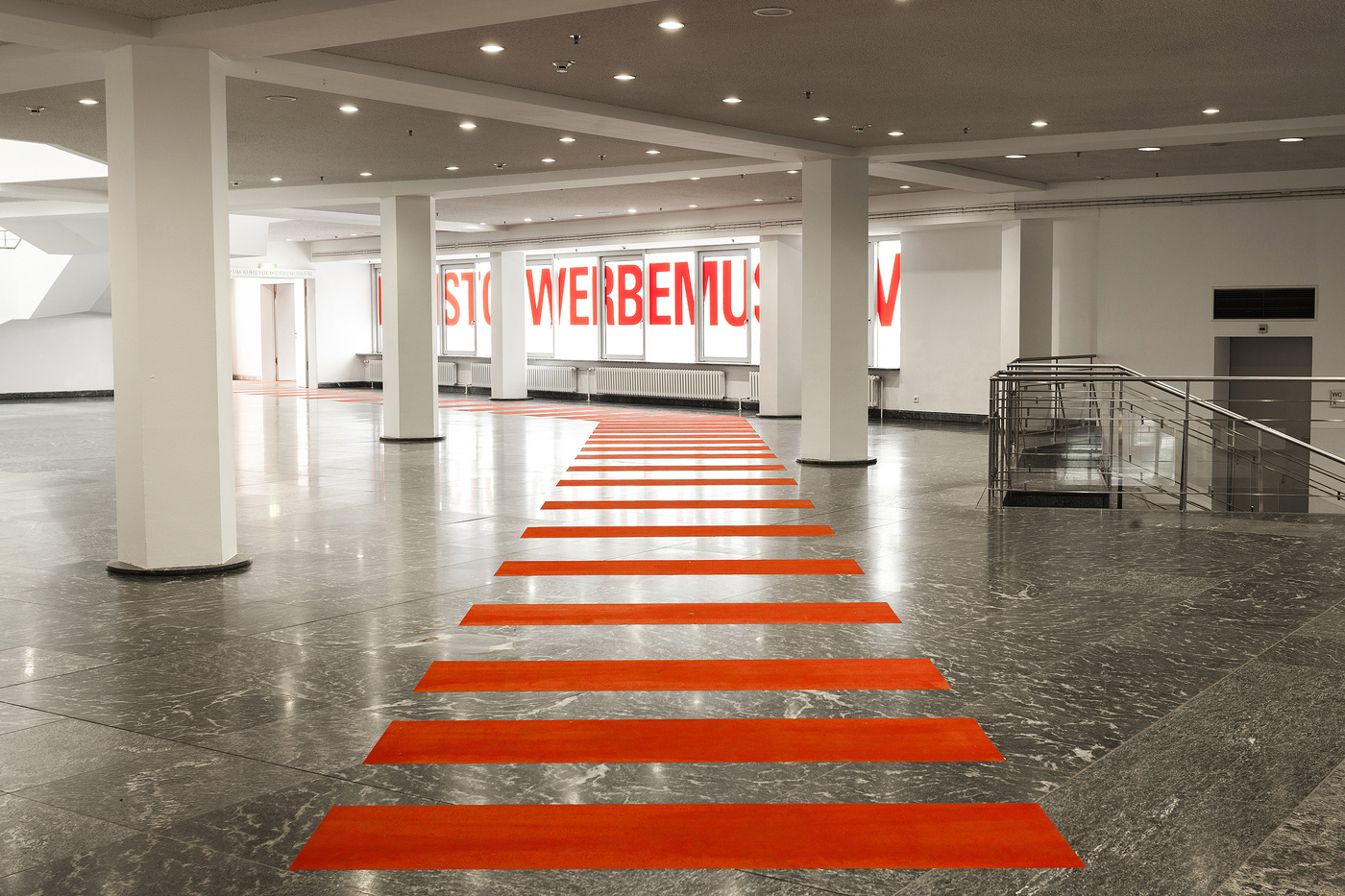
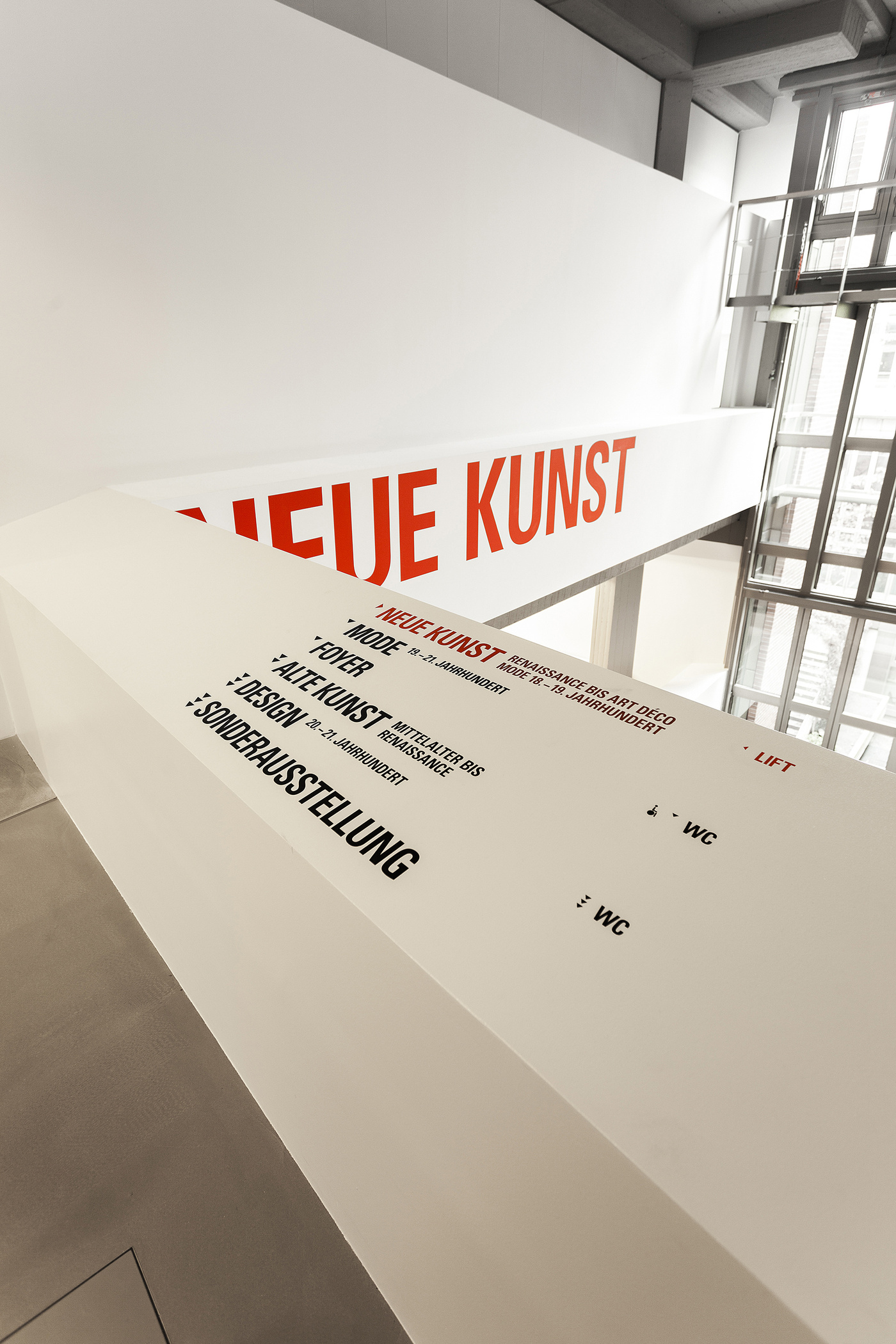
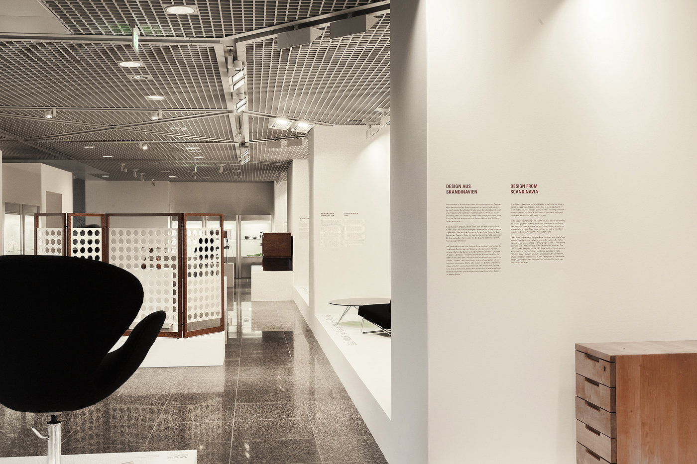
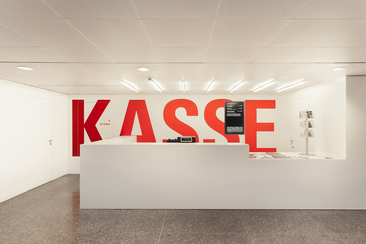
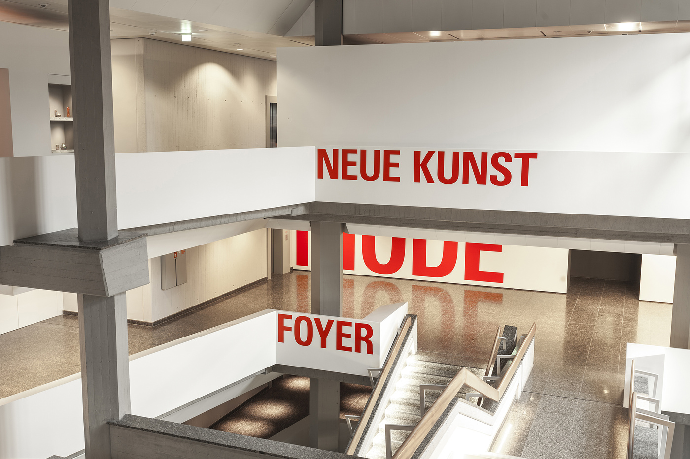
- Kuehn Malvezzi was clearing the space, coming up with the solution of creating a white spine throughout the building to make clear how the different levels open up to the visitors.
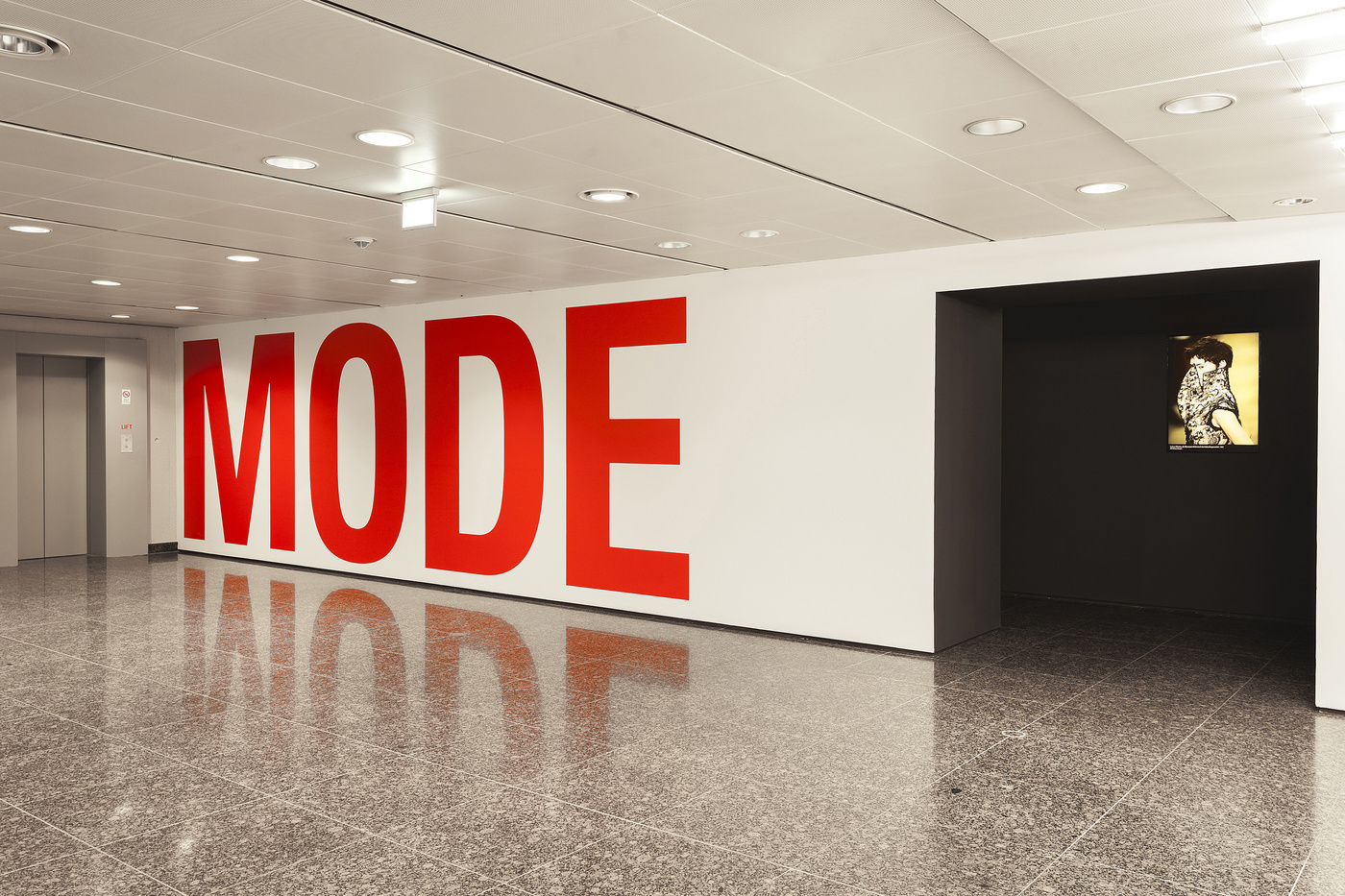
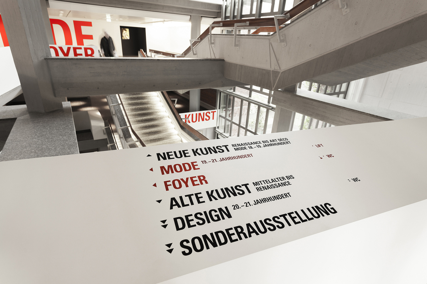
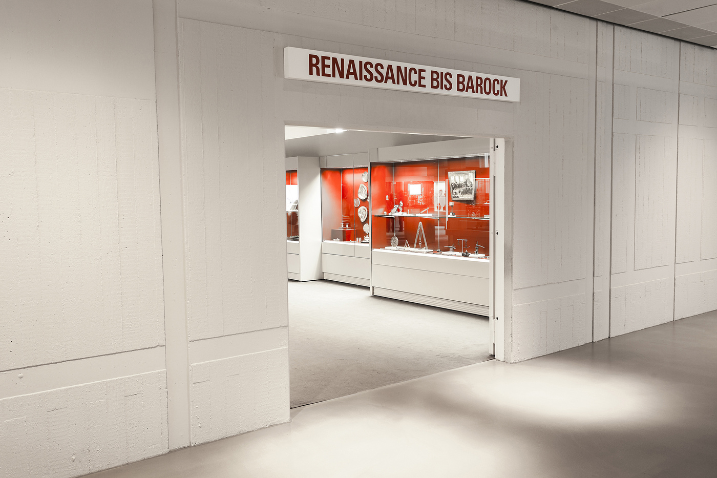
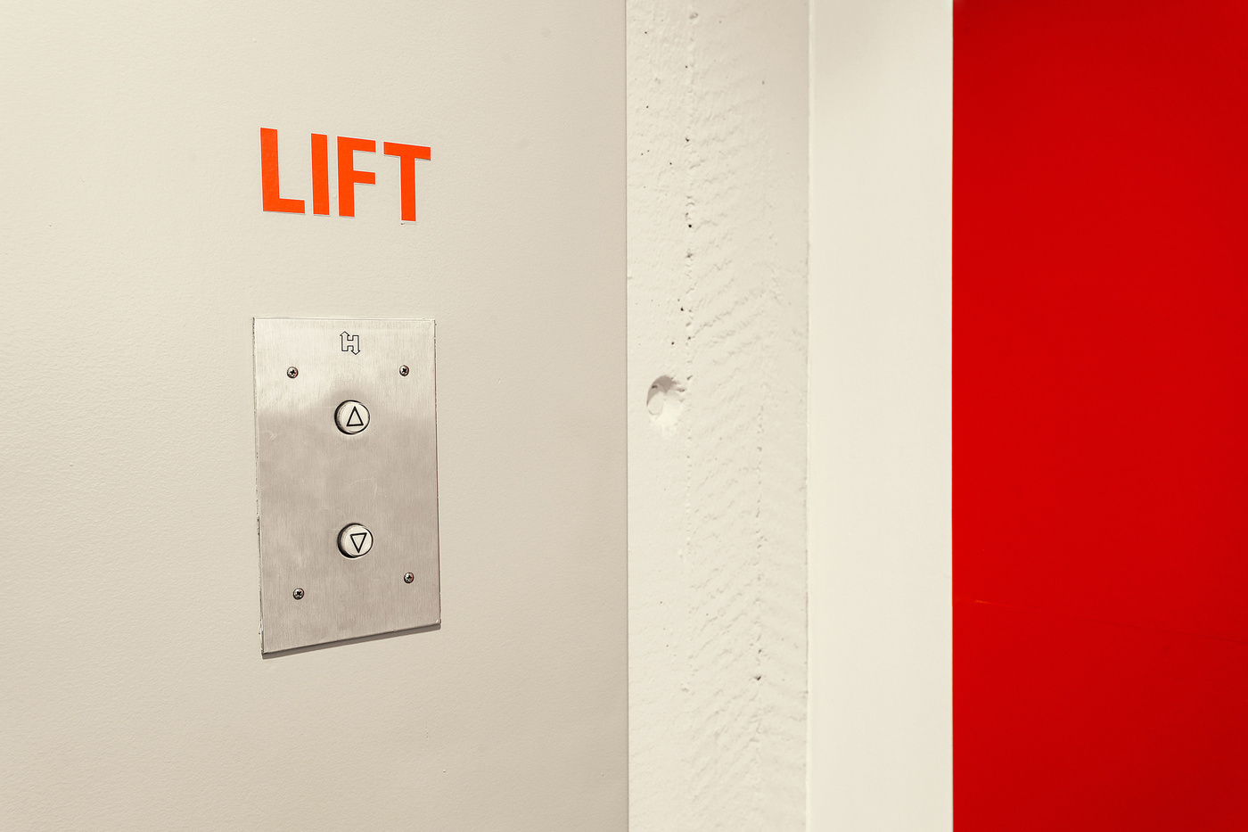
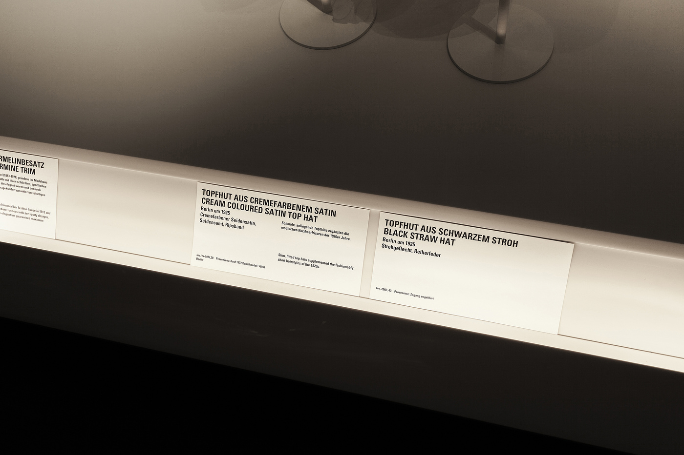
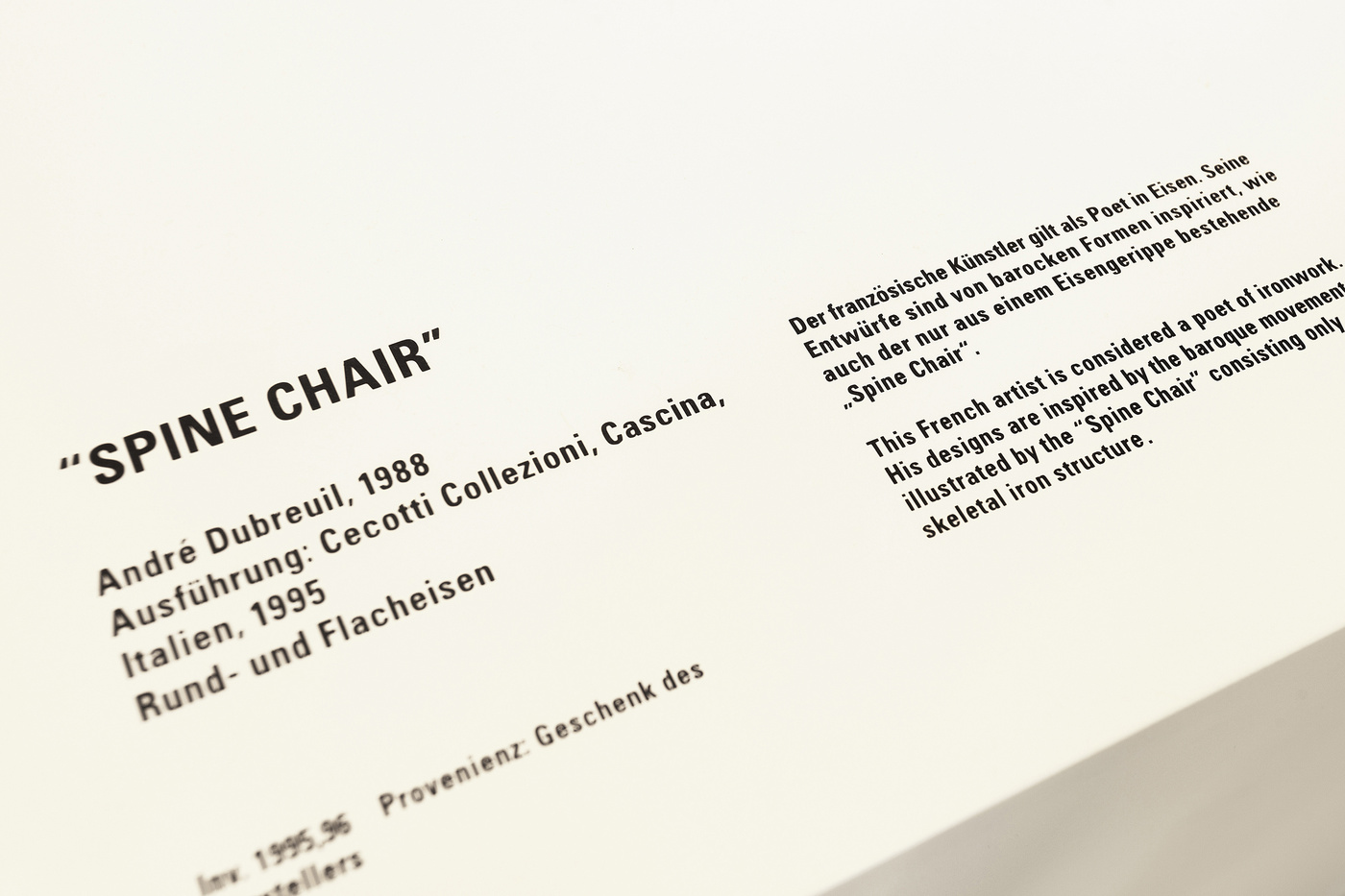
To support this approach, we developed a clear message. Each level was titled on the outside of the balconies what it will hold. Be it New Art, Design, the Foyer or the newly established Fashion Collection. Now it was easy to find and visible from all angles. It went as far as this. We needed to work cost effective, so the staff could print the labels themselves with a template we’ve developed - the closer you get to the objects, the darker the red colour gets, to the point where the labels are printed black on white.
This was only the first step and the first approach. There a several departments in the building we have not touched yet ... next steps will follow soon, the visitors are hoping.
Result
- The museum had 500% more visitors within the first year after reopening.
The visitors didn’t ask the staff as much where they could find certain objects anymore.
Raving reviews in the papers and design press.
The house we built - a new home for art fashion and design
Kuehn Malvezzi & Staatliche Museen zu BerlinFor years we’ve been working on this guidance system for the Museum of Applied Arts Berlin .... it just reopened after the massive renovation .... we’re really proud of this, since we’ve been redefining everything from the guidance system down to the labels in the display ....
A Home for Art, Fashion and Design
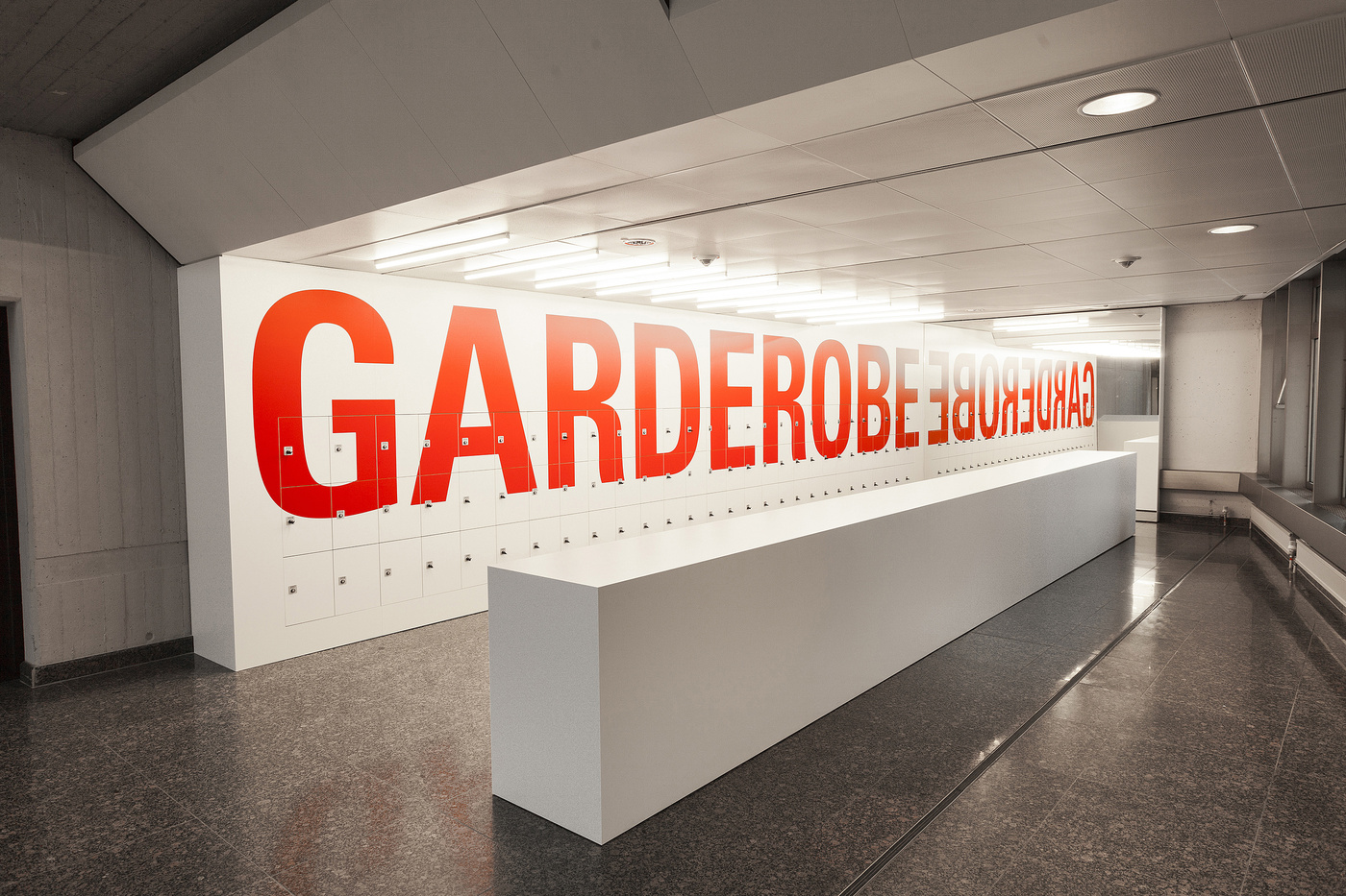
On 22nd November, after extensive renovations, the Kunstgewerbemuseum (Museum of Decorative Arts) in the Kulturforum will greet the world in dazzling, new attire. Many parts of the building, designed in 1996 by Rolf Gutbrod in the spirit of post-war modernism, have been remodelled by the architectural firm of Kuehn Malvezzi. In the foyer, the ticket desk, information desk and cloakroom have been housed in white, cube-shaped installations, whose simplified form allows them to retreat into the background, leaving the staircase to occupy a space of its own. The treads of the stairs have been enclosed in a sumptuous casing, emphasising the horizontal and lending a unity to the staircase while at the same time bringing out its sculptural quality. An easy-to-follow signage system explains the spatial arrangement of the building, directing visitors around it by means of red, overhead signs. Also newly designed are the exhibition rooms for the Fashion, Design, and Jugendstil to Art Deco collections. A home for art, fashion and design To present its huge range of exhibits, covering a multitude of styles and materials, the Kunstgewerbemuseum offers a variety of themed tours. The new fashion gallery beckons as soon as you enter. In large showcases, installed in rooms lit dimly for conservation purposes, mannequins model around 130 costumes and accessories. Representing 150 years of fashion history, the display conveys a sense of strolling through a shopping arcade, with the creations of such famous couturiers as Paul Poiret, Elsa Schiaparelli and Christian Dior in the windows. This is the first time that Berlin has had a permanent exhibition covering every aspect of fashion. The core of the display is the international collection of Martin Kamer and Wolfgang Ruf, which was purchased in 2009. Another highlight is the new Design Collection display in the basement. This top-quality selection presents Bauhaus classics alongside the designs of contemporary design celebrities such as Ettore Sottsass, Philippe Starck and Konstantin Grcic. A chair gallery rounds off the tour, with a selection of innovative designs from the 19th century to the present day. The chair illustrates the different possibilities of design better than almost any other object; here the spectrum ranges from the simple and serviceable to the luxurious, culminating in designs where imagination completely overtakes functionality. On the ground and first floors, the museum presents a systematic survey of European masterpieces of the minor arts, from the Middle Ages to Art Deco. On the ground floor are precious Mediaeval devotional objects, including the famous Guelph Treasure, together with magnificent Renaissance artefacts such as the silver treasure of Lüneburg city council. Upstairs, the Baroque passion for collecting is exemplified in the phenomenon of the Kunstkammer - collections of exquisite curiosities and objets d'art housed inelaborate collectors' cabinets. The large cabinet by David Roentgen, an iconic masterpiece of its kind, marks the transition from Baroque to Neoclassical taste. Four 'rooms within rooms' have been created to display the Jugendstil to Art Deco Collection. Inside these intimate spaces are stages for items of furniture and exhibits of outstanding interest, while further objects are displayed in showcases set into their outer walls. Organised thematically, these different display areas are devoted to artistic movements between the 1900 Exposition Universelle in Paris and the end of the 1920s. They form the perfect setting for the ornaments of René Lalique, the furniture of Henry van de Velde and the stained glass of César Klein.
