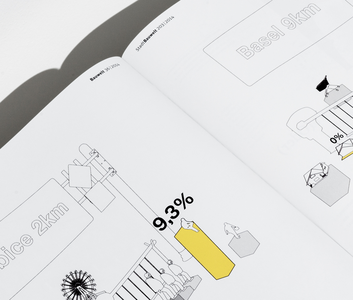
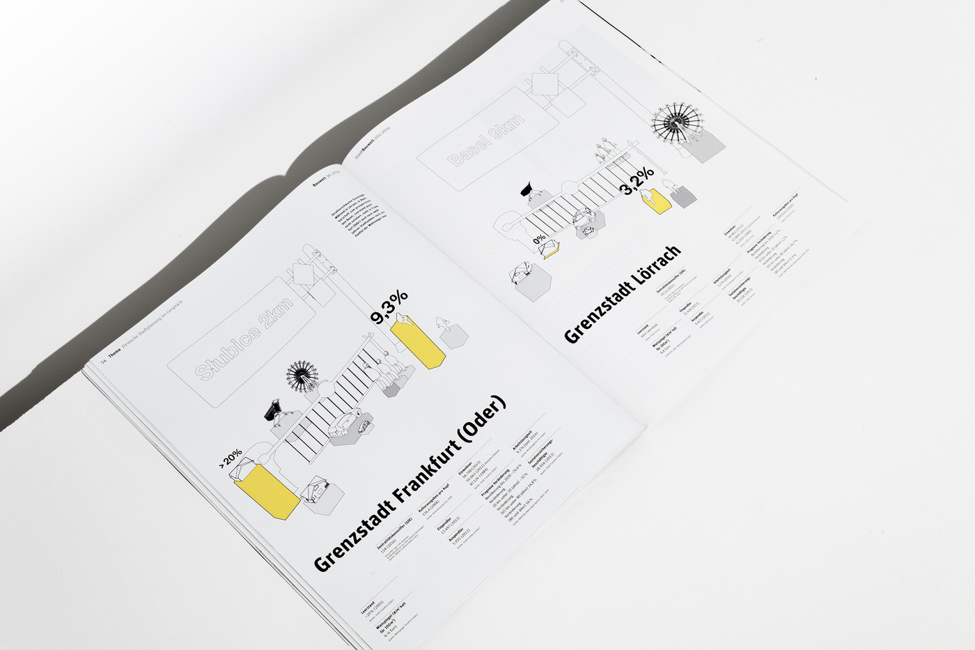
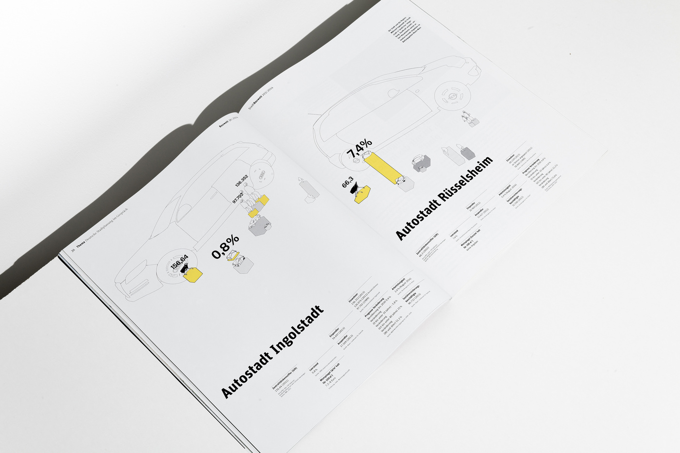
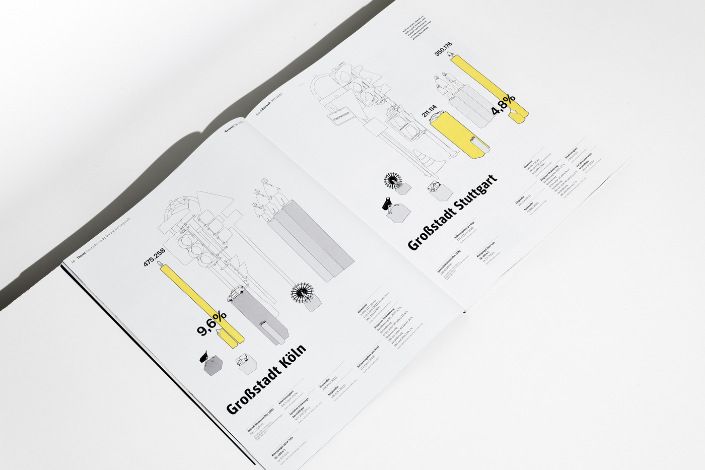
Ever since we are confronted with information graphics, sent in to use for several publications we’re working on, we get a bit annoyed. Is it just us, or don’t they all look in one way or the other the same? There are the flimsy, really hard to read data processed ones, and there are the 3D ones that might look funky but don’t carry much information and their functionality is more window dressing than anything else. Don't the designers, who are working on these graphics, want to understand themselves what this information graphics are about? It’s like typesetting a book without having read the tiniest bit of copy. We now got to the point to develop the information graphics ourselves. Giving every bit of information the space it needs to be understood. And on top of that, as a bonus, we’ve given us the task to generate a corporate design for every client’s information graphics, so they all get more distinguishable from each other. New rules, new game. Bring it on.