Rirkrit Tiravanija and Double Standards have a very long history. In fact, this relationship goes way back before Double Standards was even called Double Standards and it became the studio it is now. And loads further back in the past than that.
We reckon this made Rirkrit say that … working with Chris and his team at Double Standards is like working with family …
… and this statement works both ways!
In 2007 it was time – we moved on from just being friends…
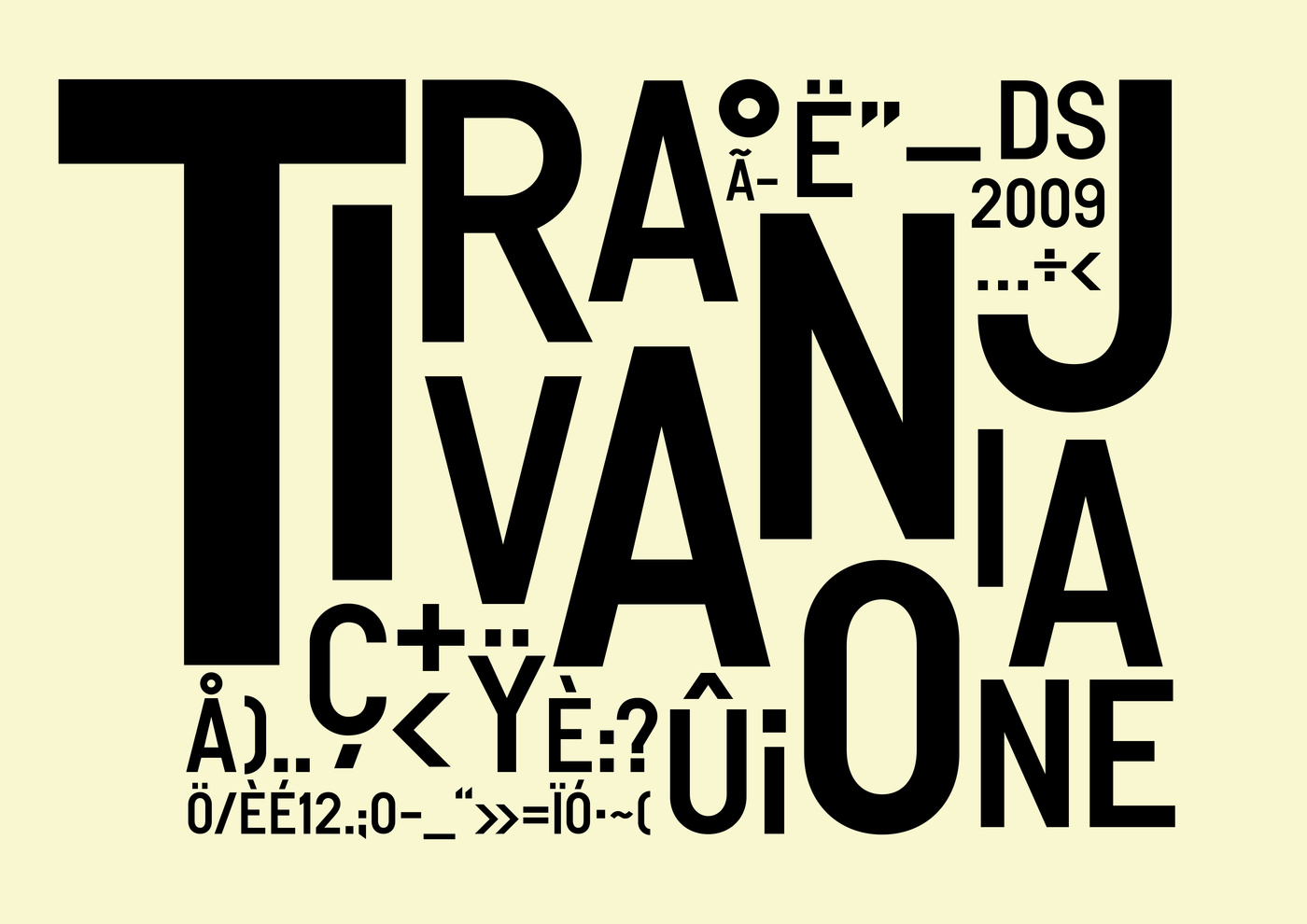
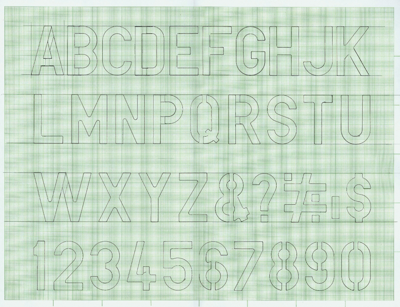
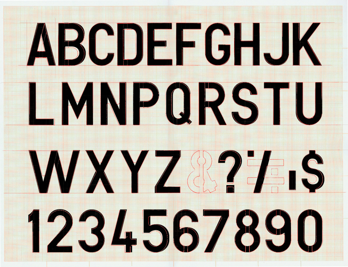
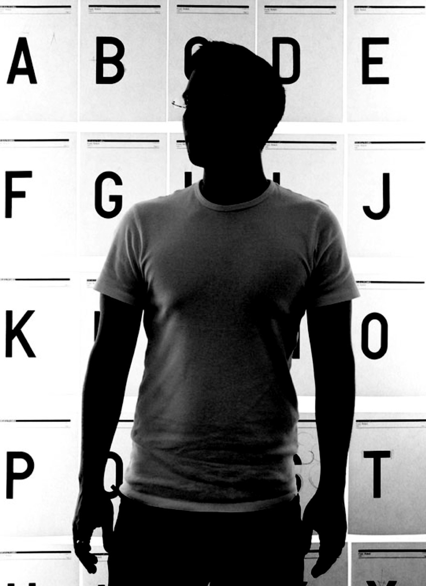
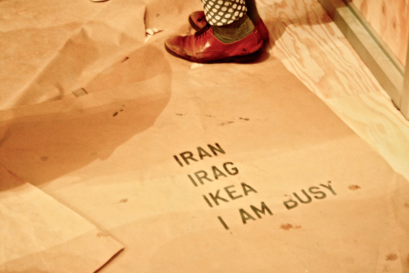
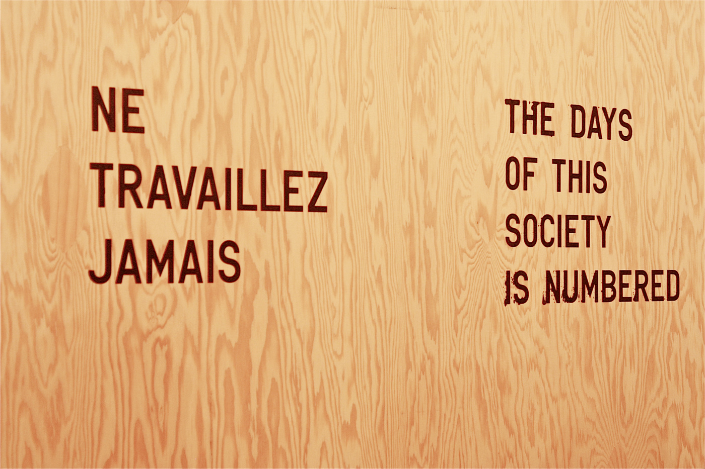
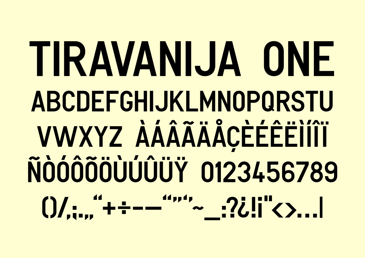
Rirkrit called us early 2007 with the request if we could turn a typeface he is using for his paintings and printed matters into a real font so he could use it properly stopping tinkering around with illustrator files, spending hours just to get a sentence typeset for a print. We weren’t quite sure what to expect but agreed, certainly. The idea of an artist’s own font was very tempting and we were awaiting eagerly an email with Rirkrit’s drawing. It turned out to be a stencil Rirkrit found on some flea market somewhere, and instantly fell in love with. The problem with the typeface was (this goes for many stencils out there) that it looked sort of great when drawn directly on paper or a canvas, but looked awful when drawn exactly in FontStudio. So, it took us quite some time to get it right. The width and stroke weight of some of the letters was right off and don’t get me started on the curves, that we had to begin adjusting all the letters singly ending up building groups and weighing them out between those combinations. There it was …. many hours of André’s typographer’s eye later …. TiravanijaOne was born. But we felt there was more to come …. and there was ….. more Rirkrit Tiravanija projects are to be found here! Look up Artobserved for Rirkrit’s exhibition ‘Fear Eats the Soul’ at Gavin Brown in New York to see the typeface in use.
