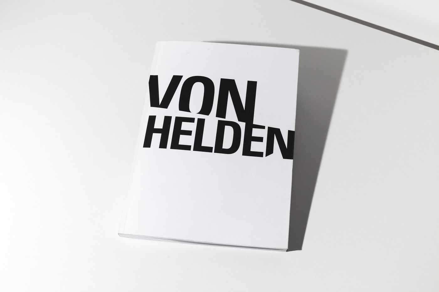
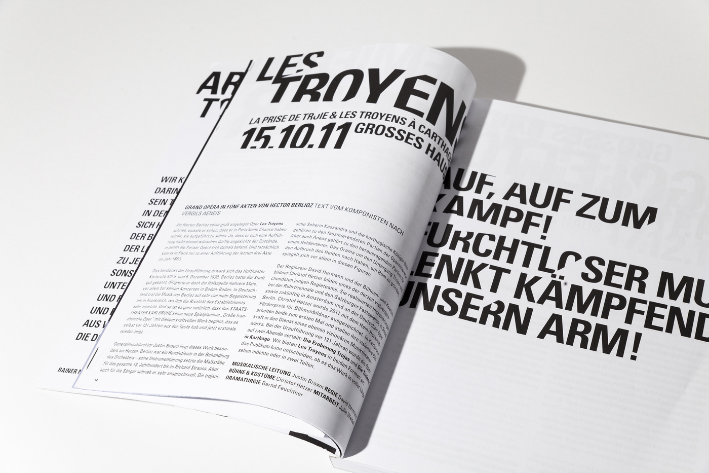
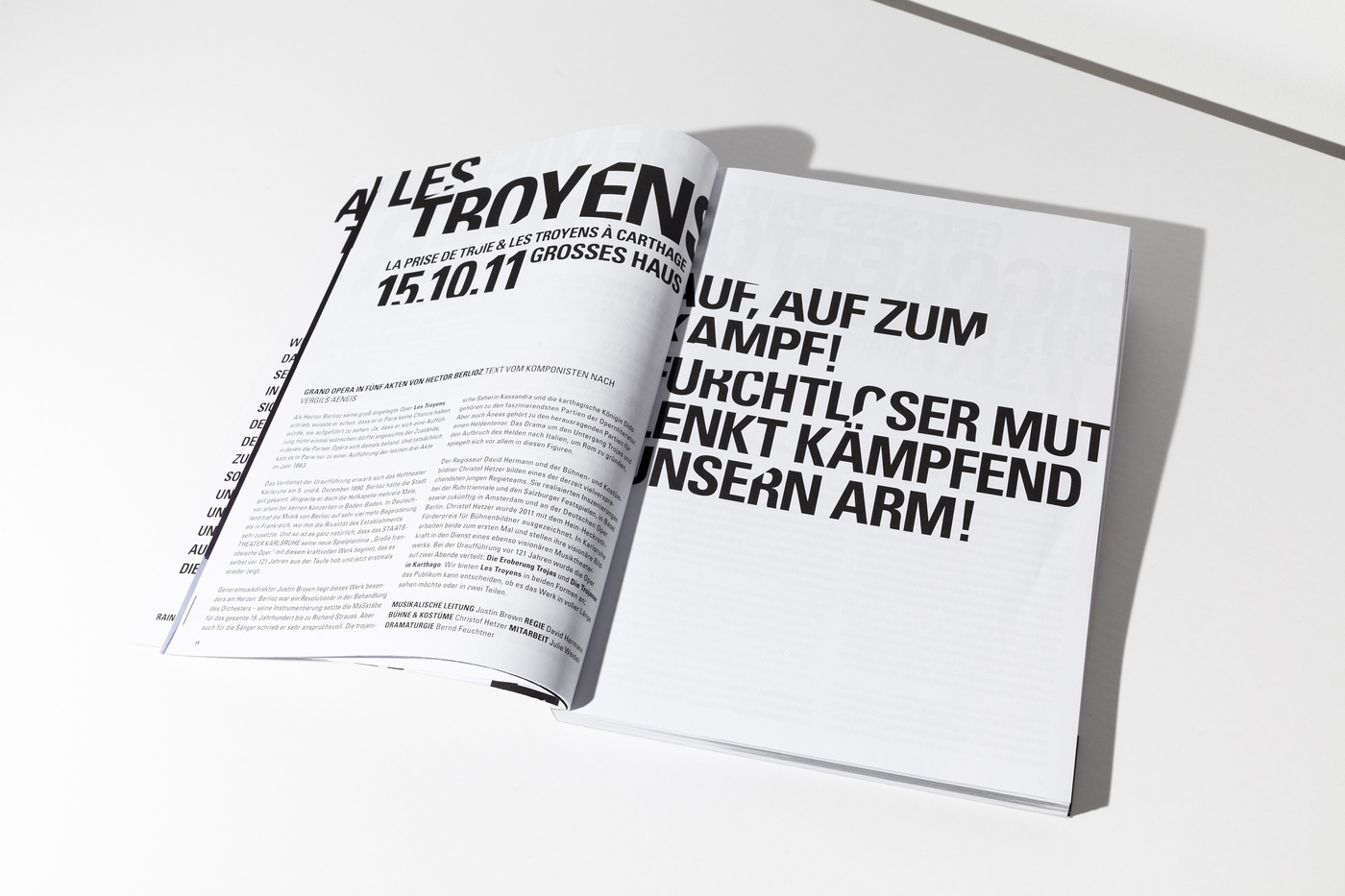
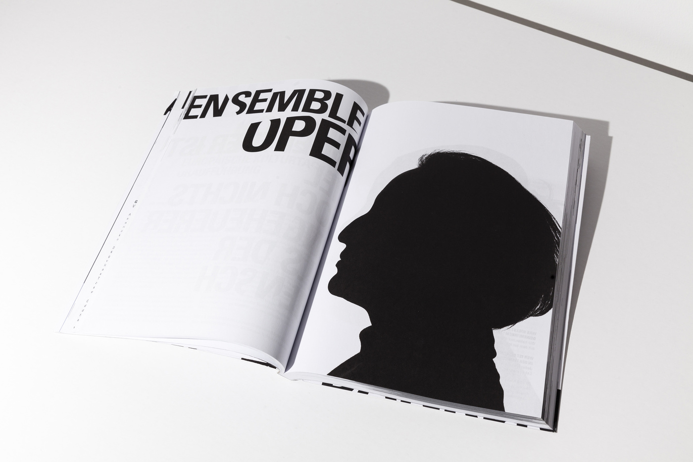
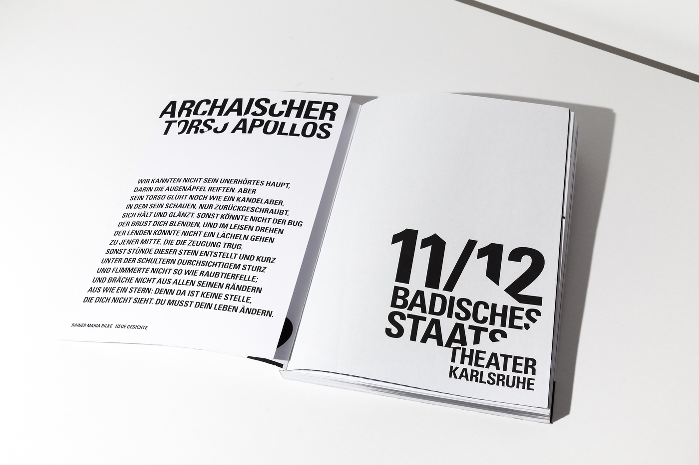
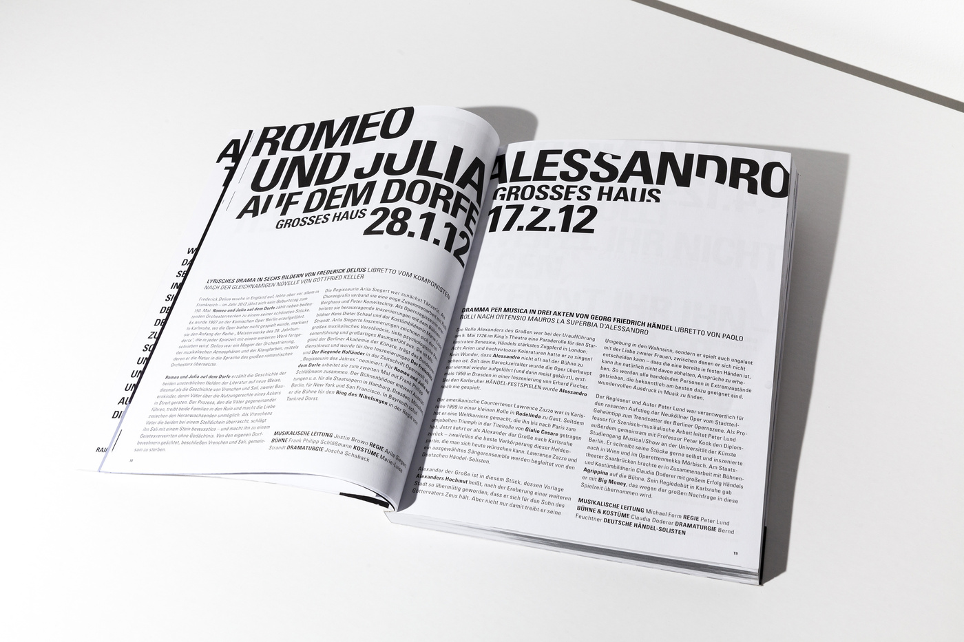
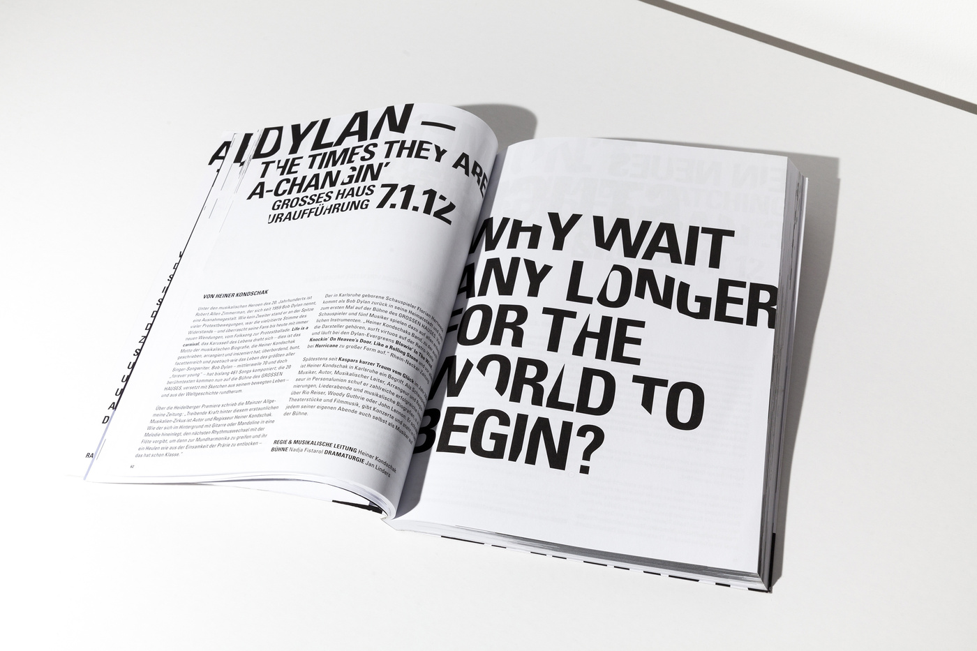
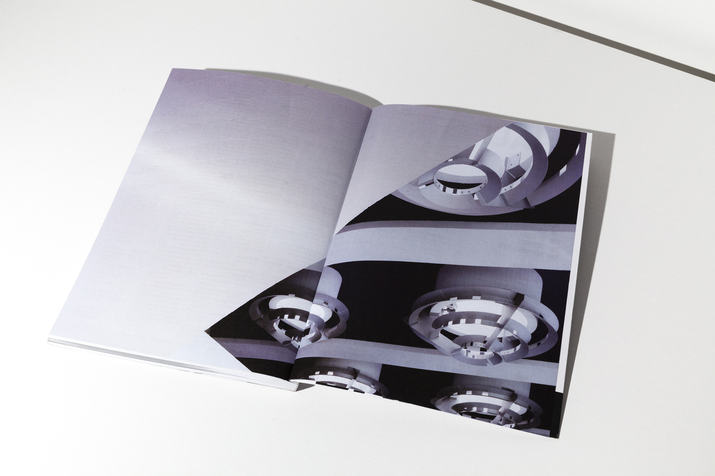
Usually we’re opposing the idea of using particular characteristics of architecture. Well, let’s say we don’t like melting buildings into an icon to use it as a logo. It seems to us just too simple to turn an already characteristic landmark into a graphic element ... you know all these uninspired signs. But in the case of the Badische Staatstheater Karlsruhe we had to, yes, had to, make an exception. We met Peter Spuhler, the director of the theatre, for the first time to take a look at the institution and the surrounding area, when he told us how much disliked the building was by the citizens of Karlsruhe. At first glance, it is quite a shocking picture how monolithic this bloc is situated in the city. There is roughly nothing appealing in the closest vicinity around the theatre that would make you want to stay longer that you would have to. This didn’t change much after we’ve entered and were standing in the lobby. But one thing was striking us. At first we didn’t realise what we were taking pictures of, but it became more and more clear that this is leading us to something useful. It were the crossing lines of the architecture, the sharp edges, that lead us to the conclusion that this is the route we wanted to take. Using the architecture as a sort of die, a cutter that punches out the typography creating a strange pattern by filling the space between the lines with words the architecture was leaving us with. It is, admittedly, somewhat odd you’ve got to work with ... but in the series, and using it in full extend to every little printed matter and detail, it absolutely works. Well, in the beginning the audience was wondering what this graphic garble was about, but now, of what we’re hearing, they got used to it and found a new love to their Badisches Staatstheater Karlsruhe.


